Graphic and Type Design
Heidelberg/Lausanne
GER/CH
A typeface is about words, words are about language and language is about culture. A crossing point between type and graphic design as a basis for system - oriented and conceptual design in an attempt to understand typography in its history, details and cultural context. This helps me to find precise and systematic approaches in the creation of typefaces and graphic design. I design visual concepts for clients in the fields of culture, lifestyle and architecture. Focused on clear and contemporary aesthetics, I develop visual solutions for on- and offline communication. I design typefaces, corporate identities, books, posters, magazines as well as websites. Based on this foundation I am currently working as a freelance designer in Heidelberg (GER) and in Lausanne (CH) after my recent graduation in the Master's program in Type Design at ÉCAL.
A
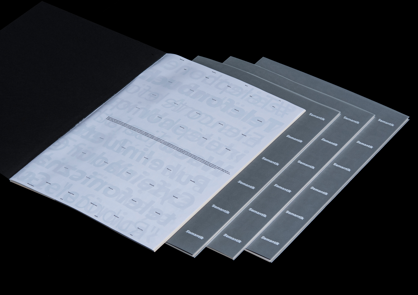
Semantik
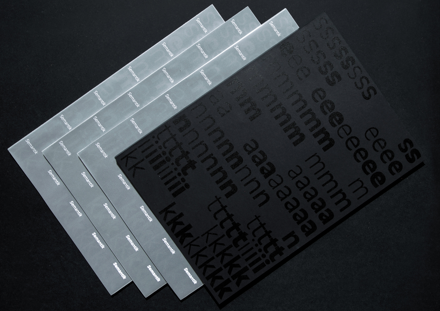
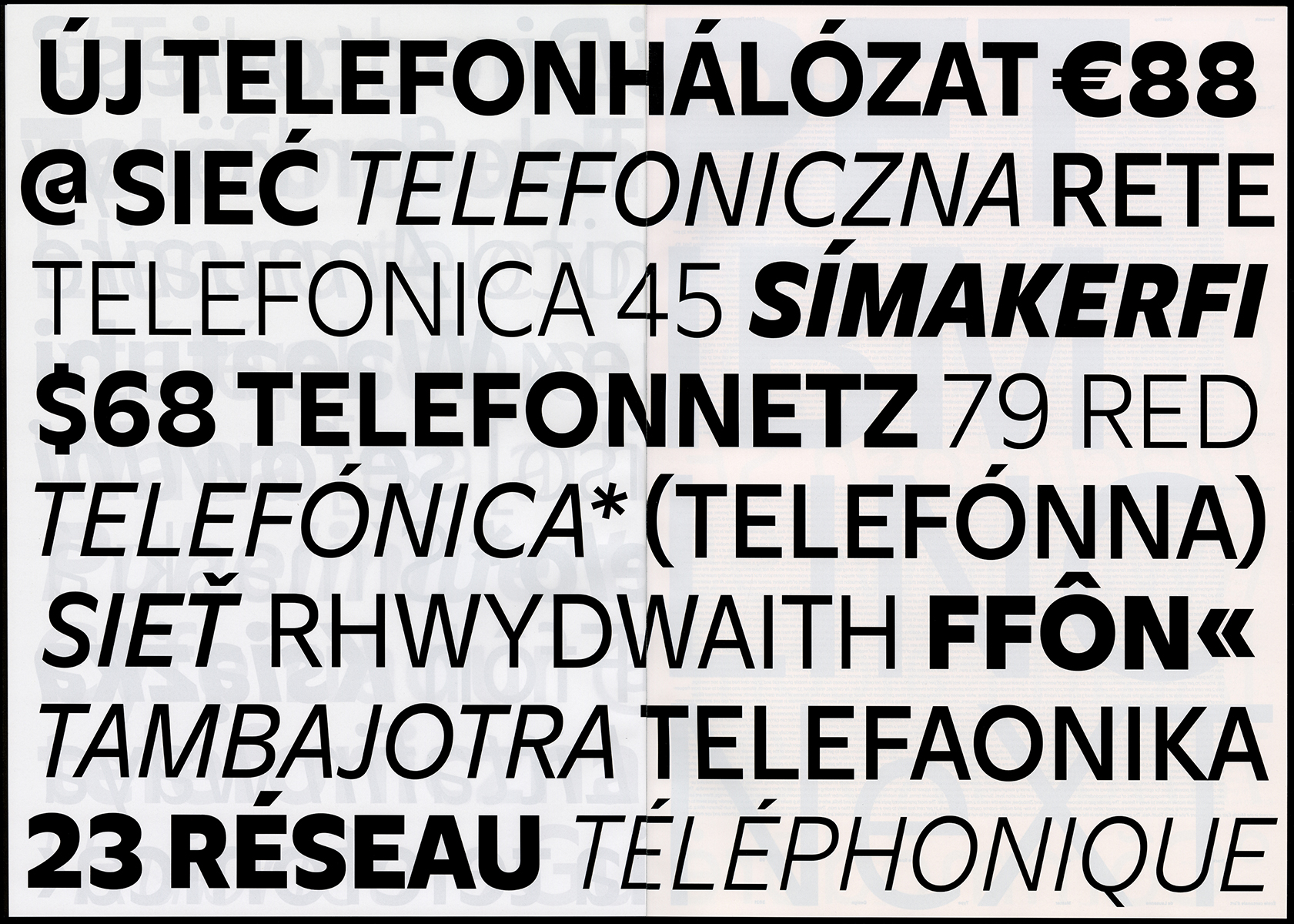
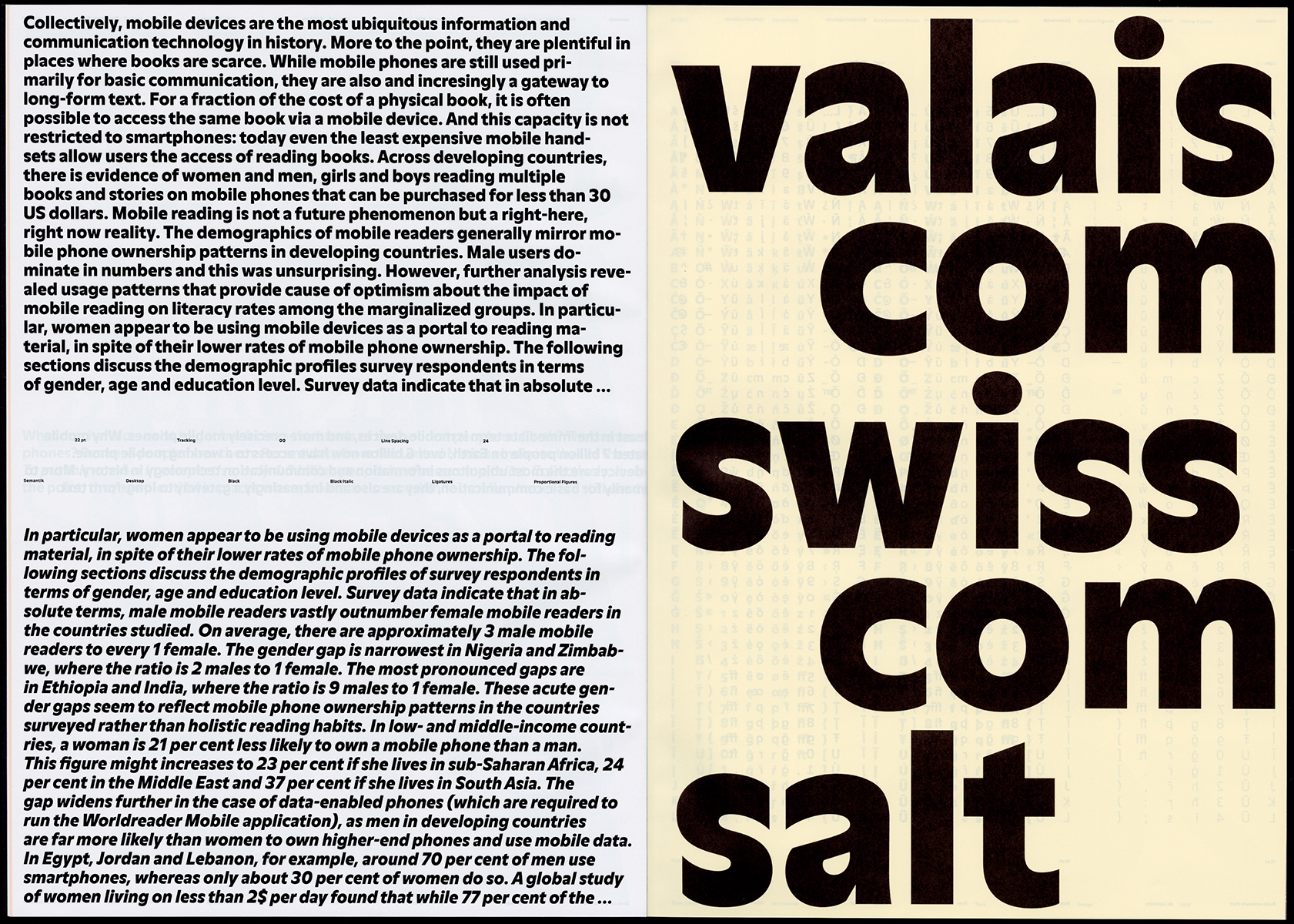
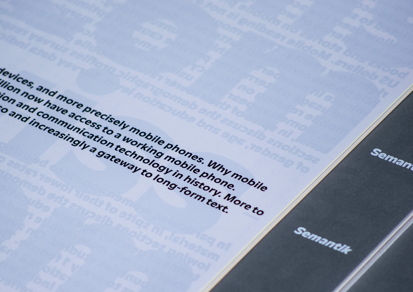
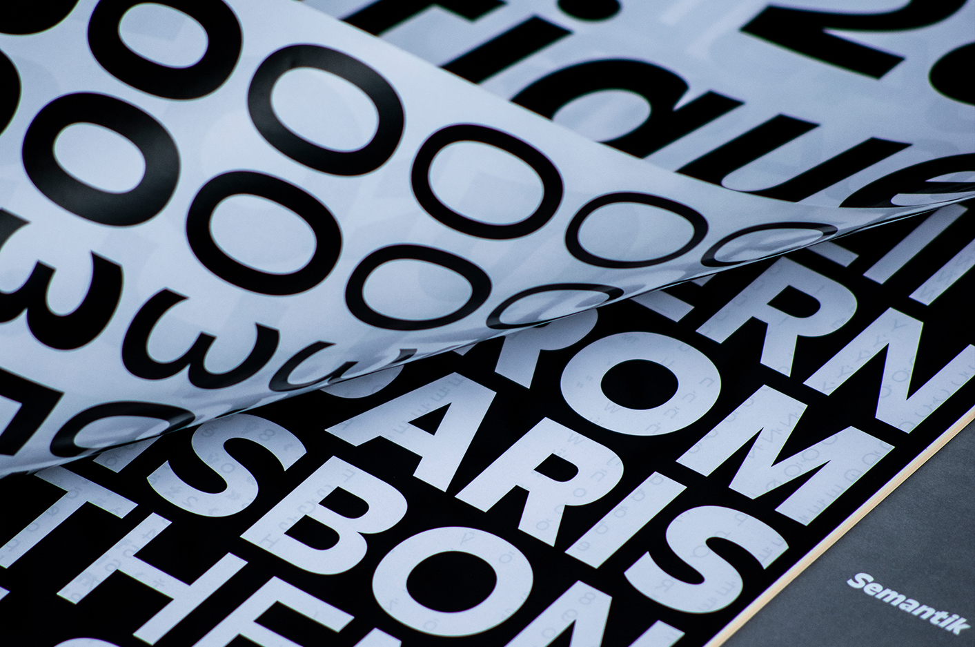
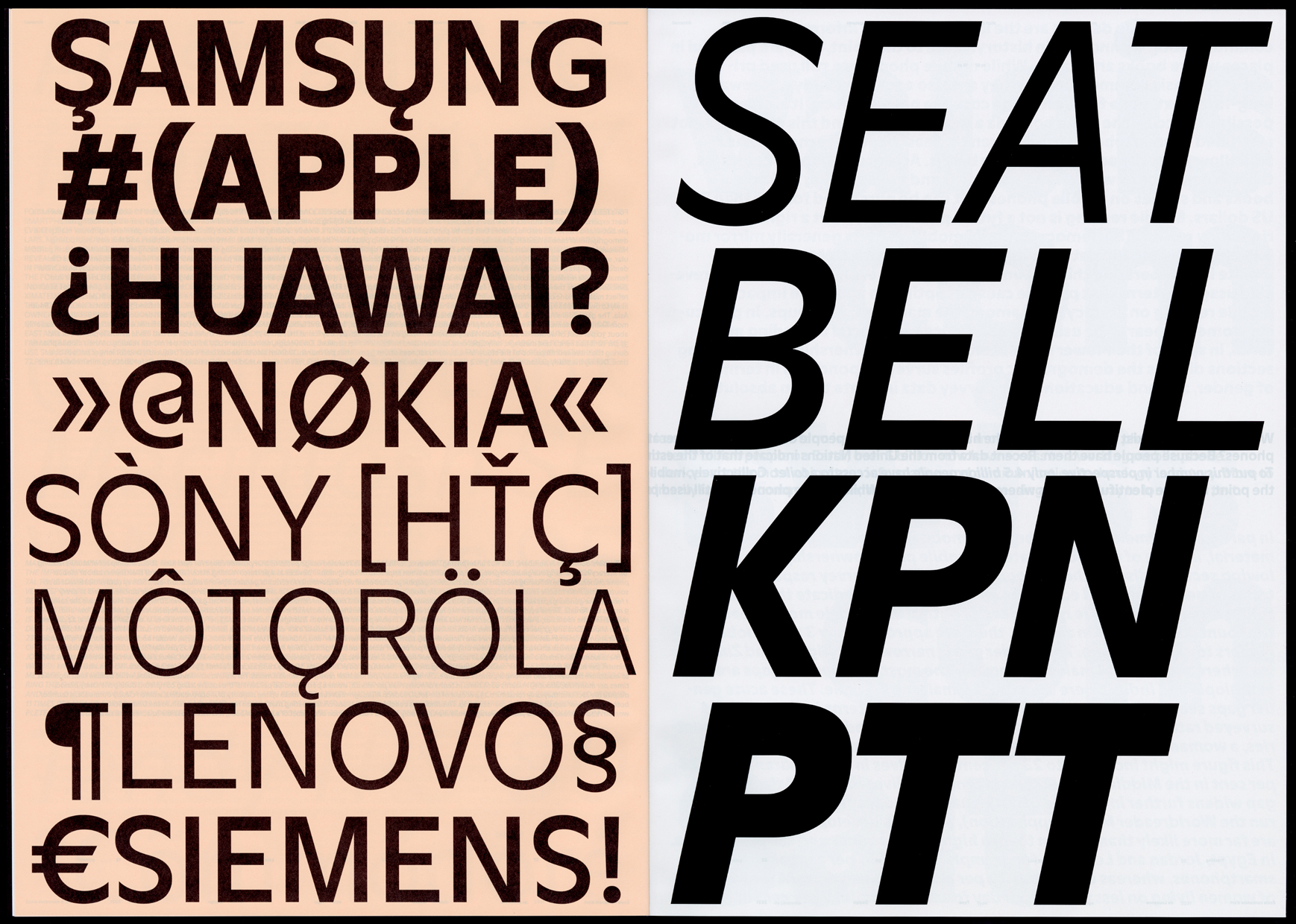
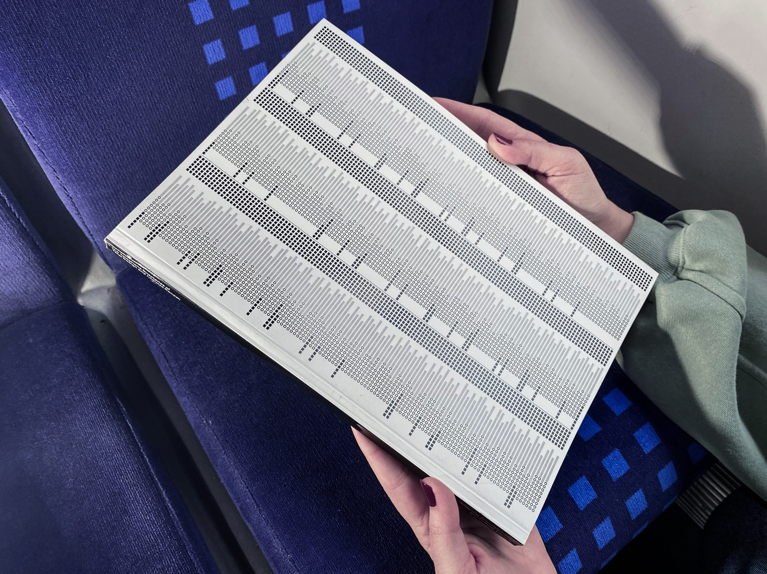
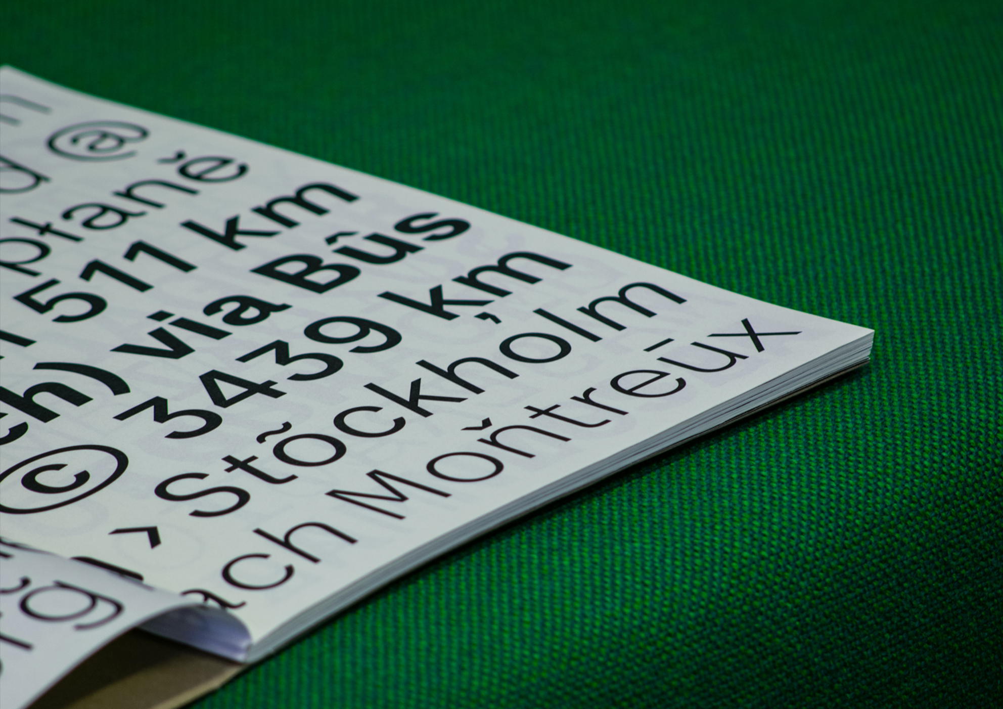
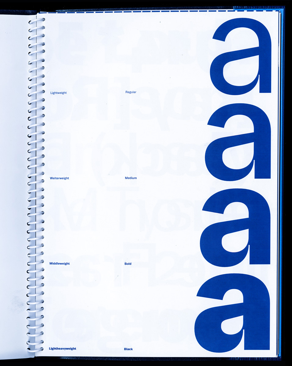
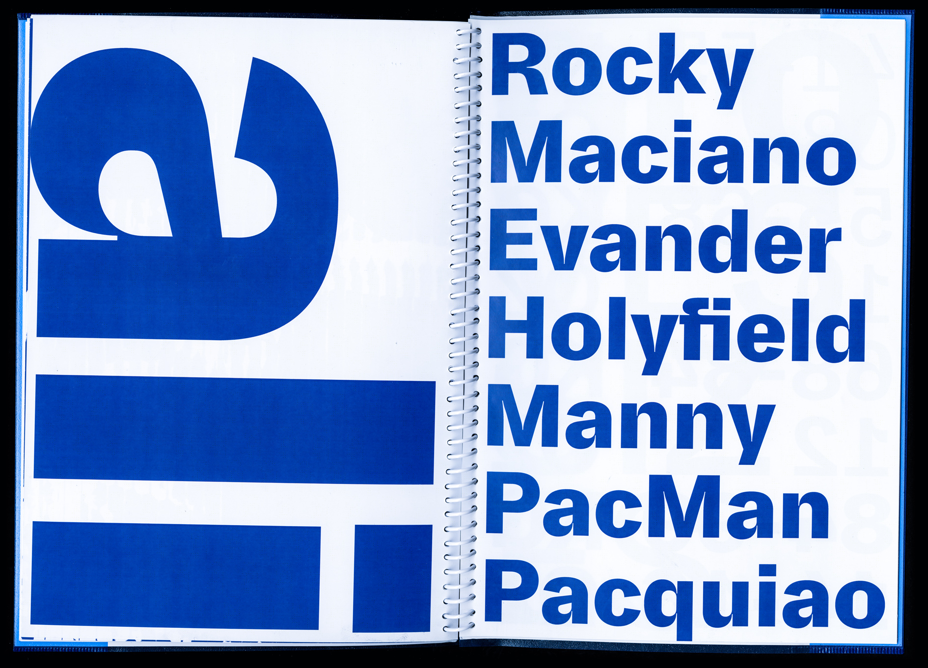
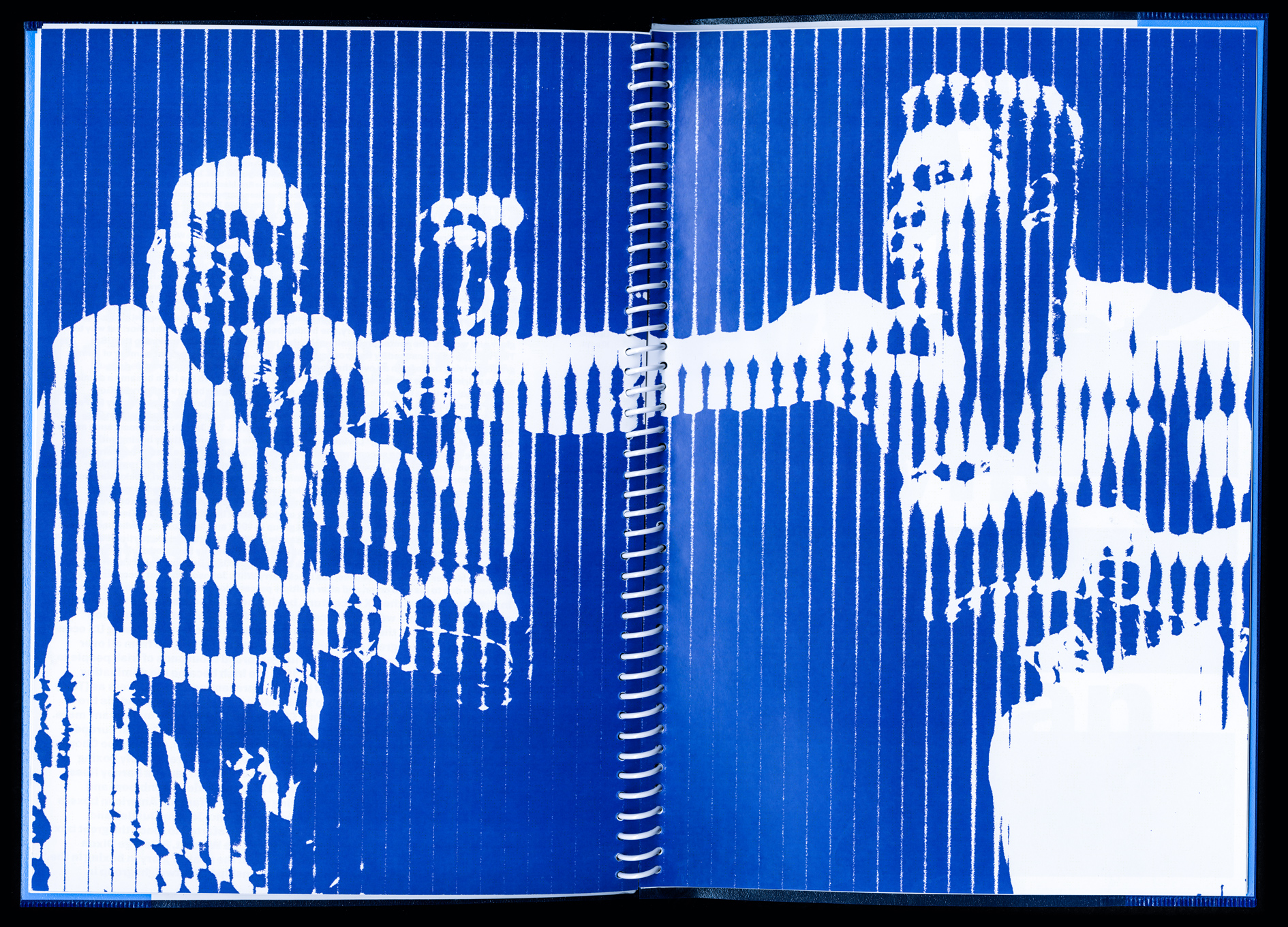
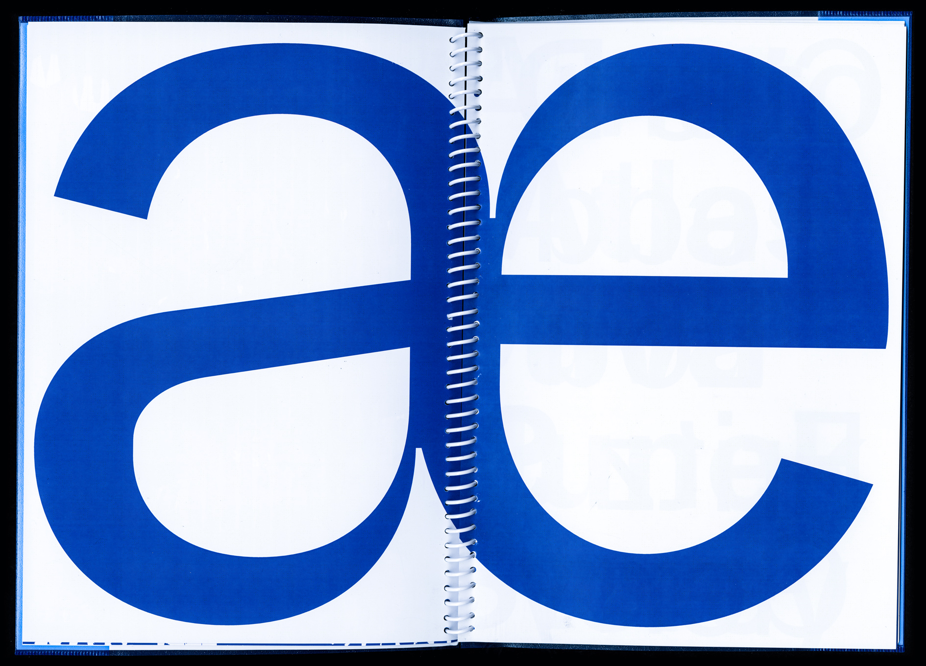
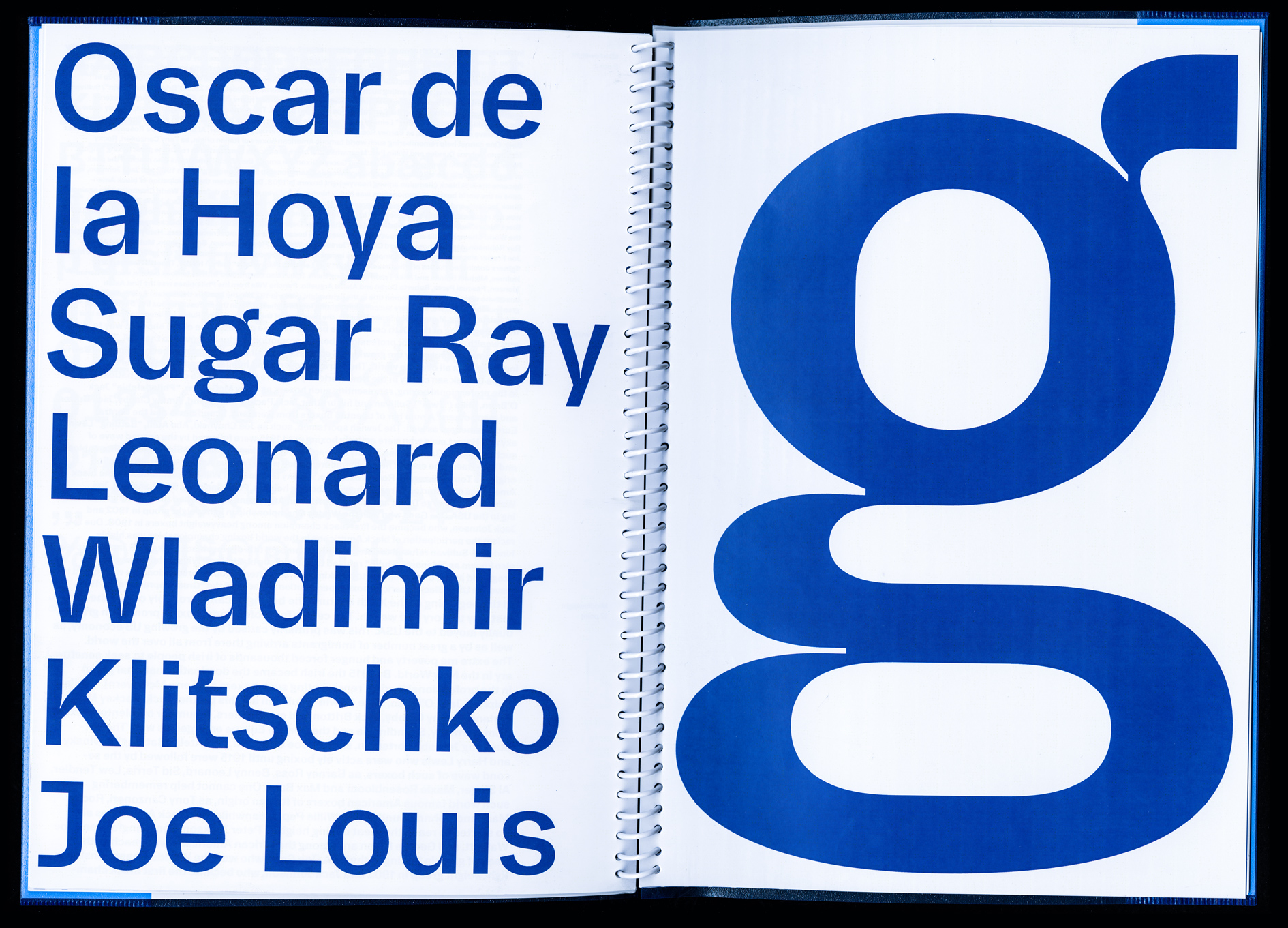
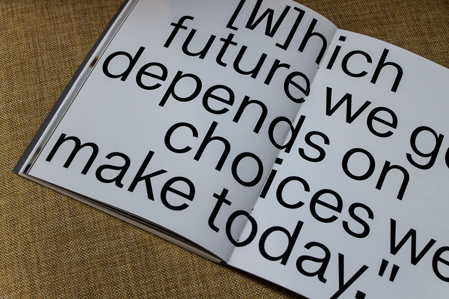
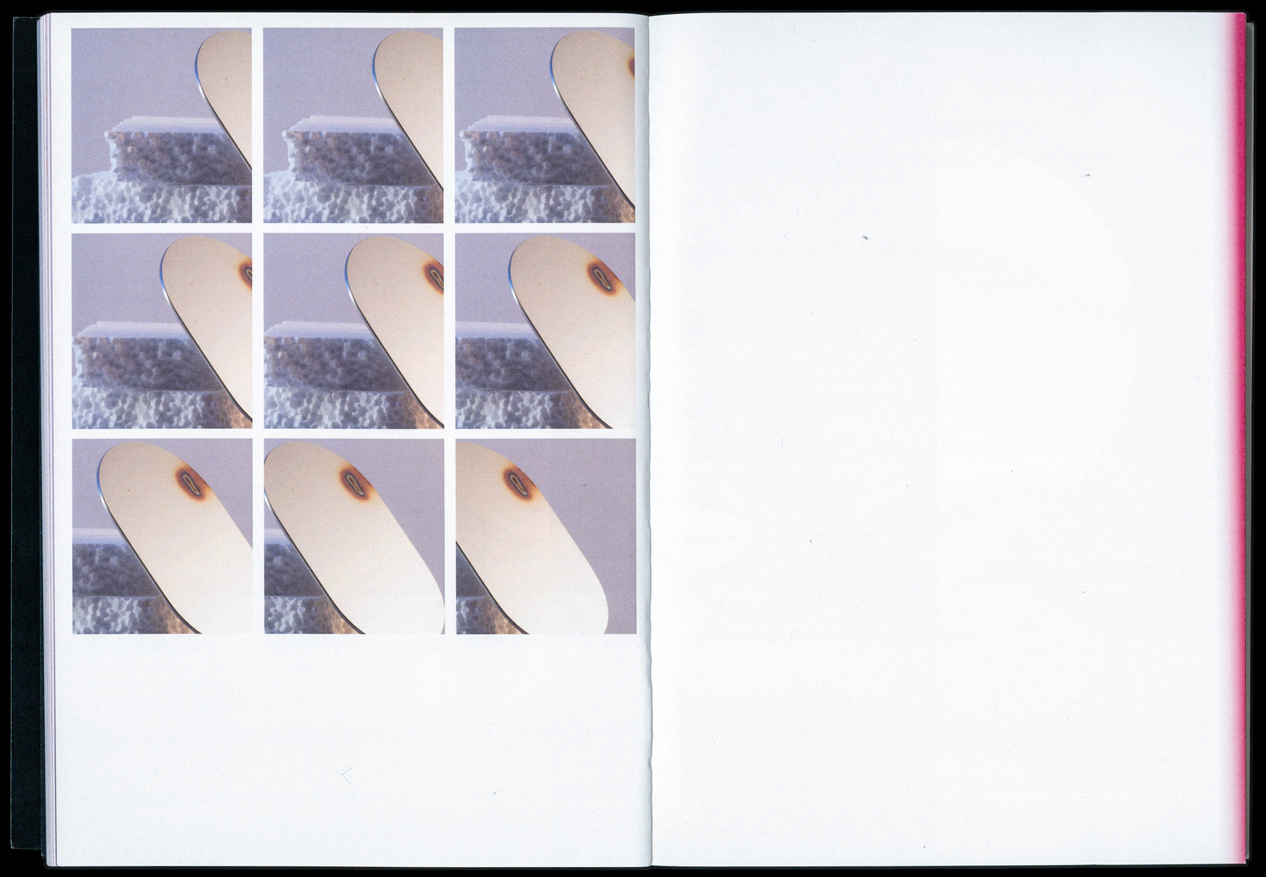
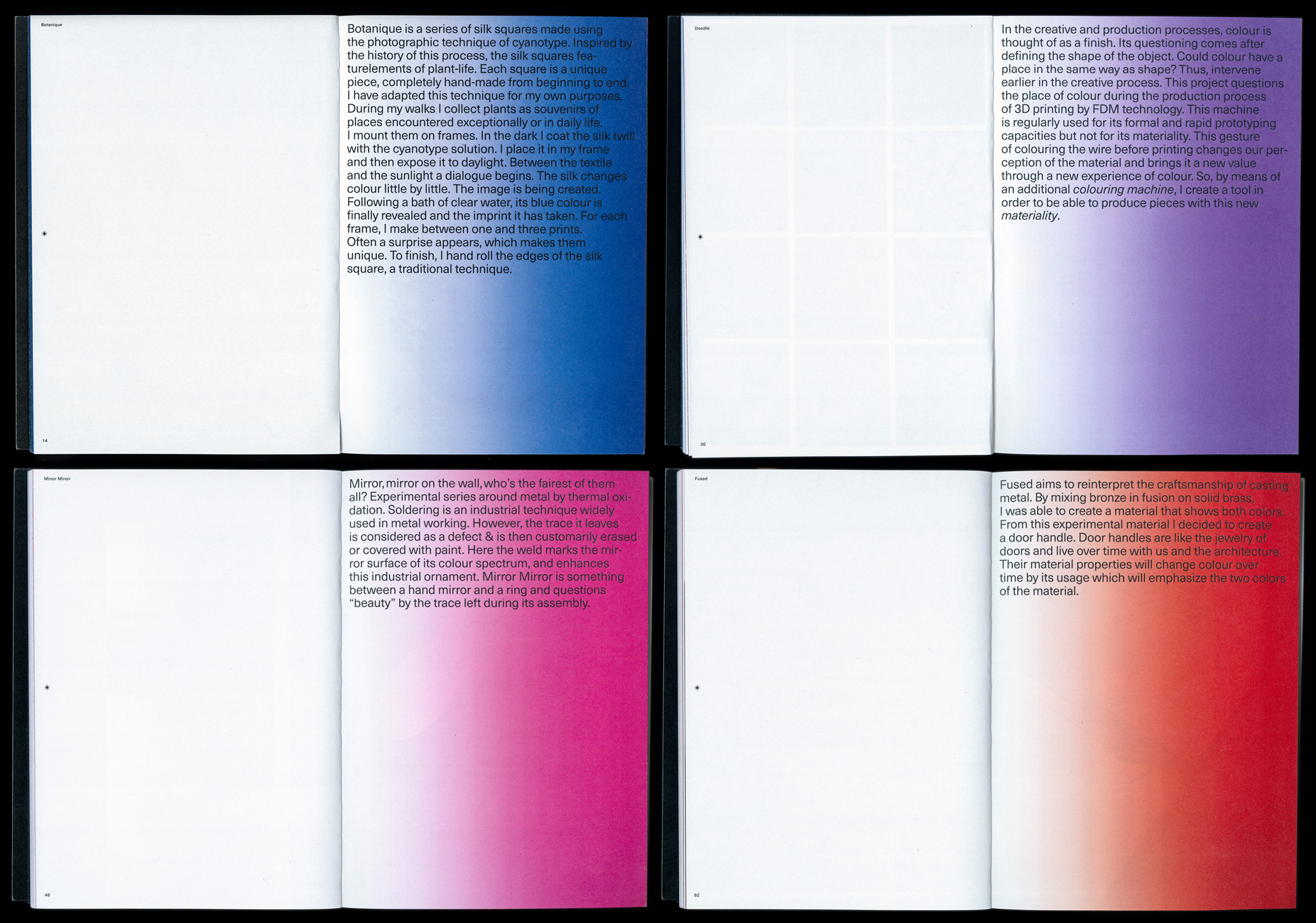
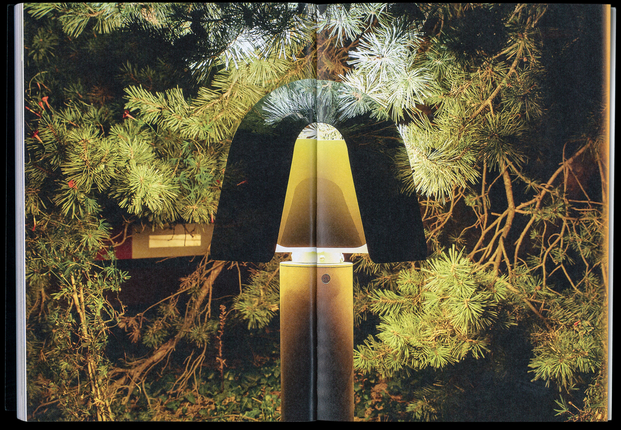
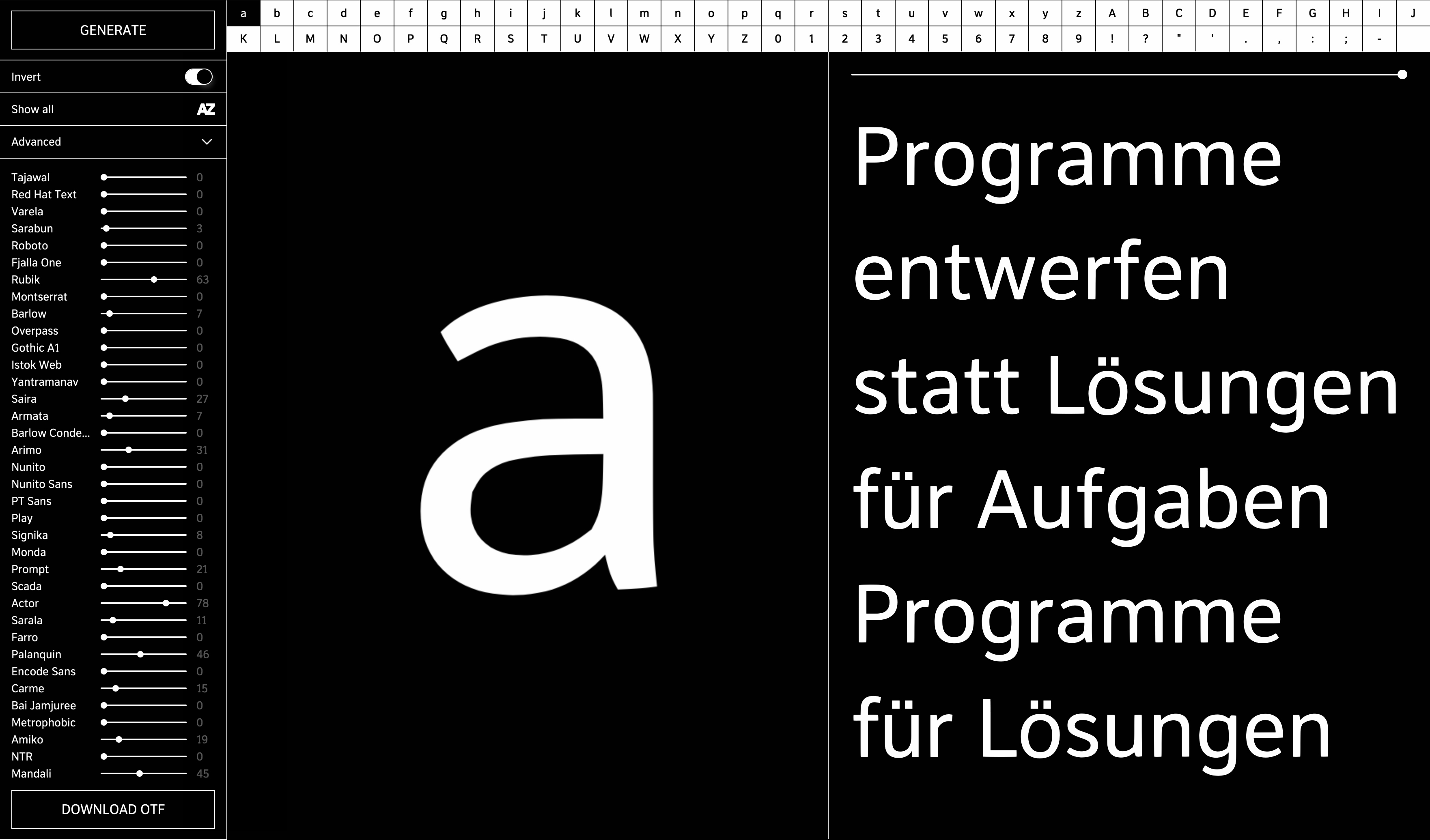
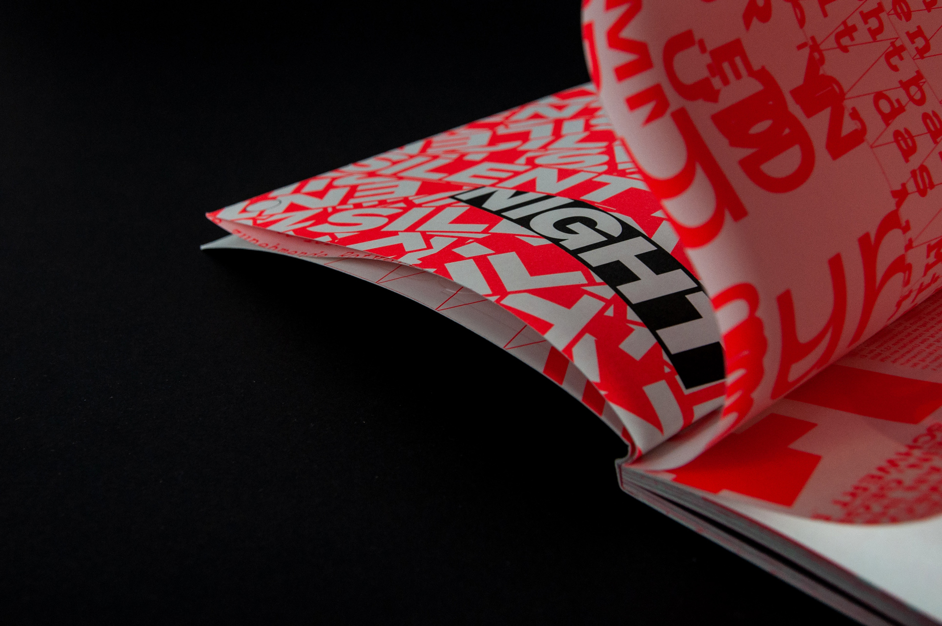
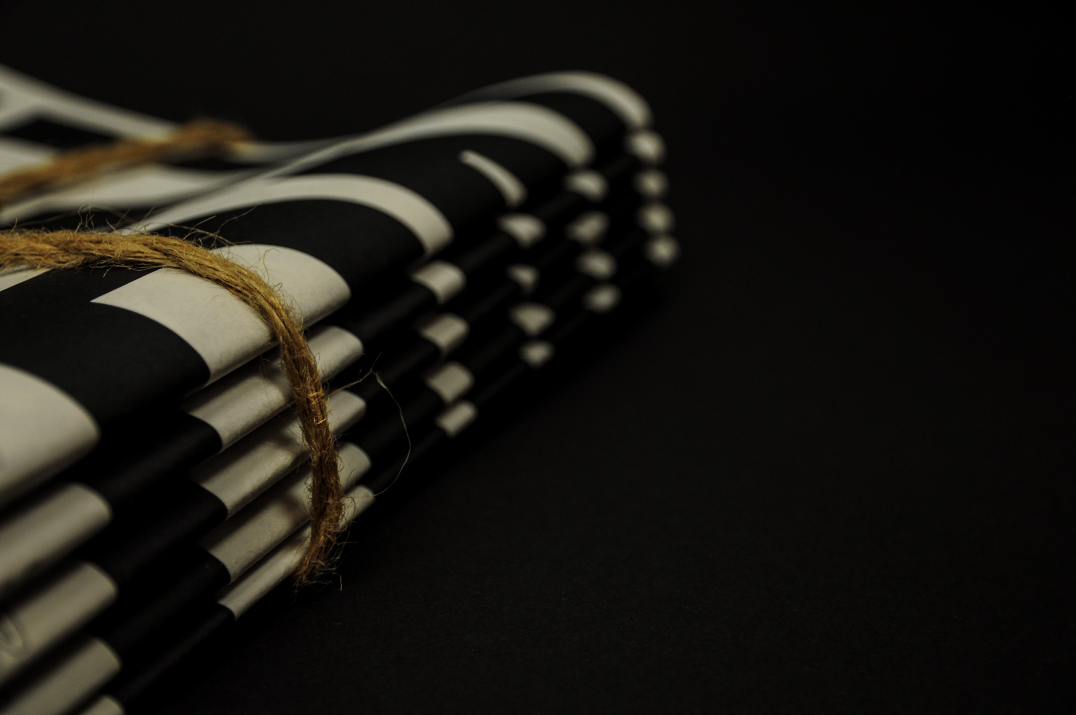
Semantik is a typeface family which resulted from the research into typefaces for Telephone Directories and revisits the ’heavy-top’ emphasizing to increase legibility. Semantik is loosely based on Ladislas Mandel’s Nordica and Colorado, as well as Roger Excoffon’s Antique Olive. The project reexplores the technical aspects and stylistic elements of typefaces for Telephone Directories in a screen-based environment, improving legibility in the contexts of both continuous reading on screen and reading while scrolling. The typeface adjusts to the diverse screen environment as a variable font with a responsive axis, that adapts between Desktop and Mobil. The variable-axis is regulated via javascript by the different screen or column width, ranging from a desktop, a tablet or a smartphone device. Semantik contains in total 30 separate styles, which include five weights with matching italics suited for Desktop, Mobil and List each.
img-001 Semantik Specimen, Cover
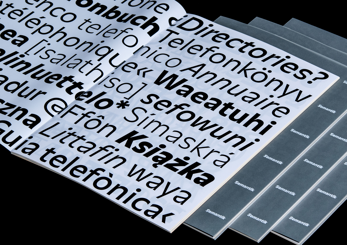
img-002 Semantik Specimen, Image Spread
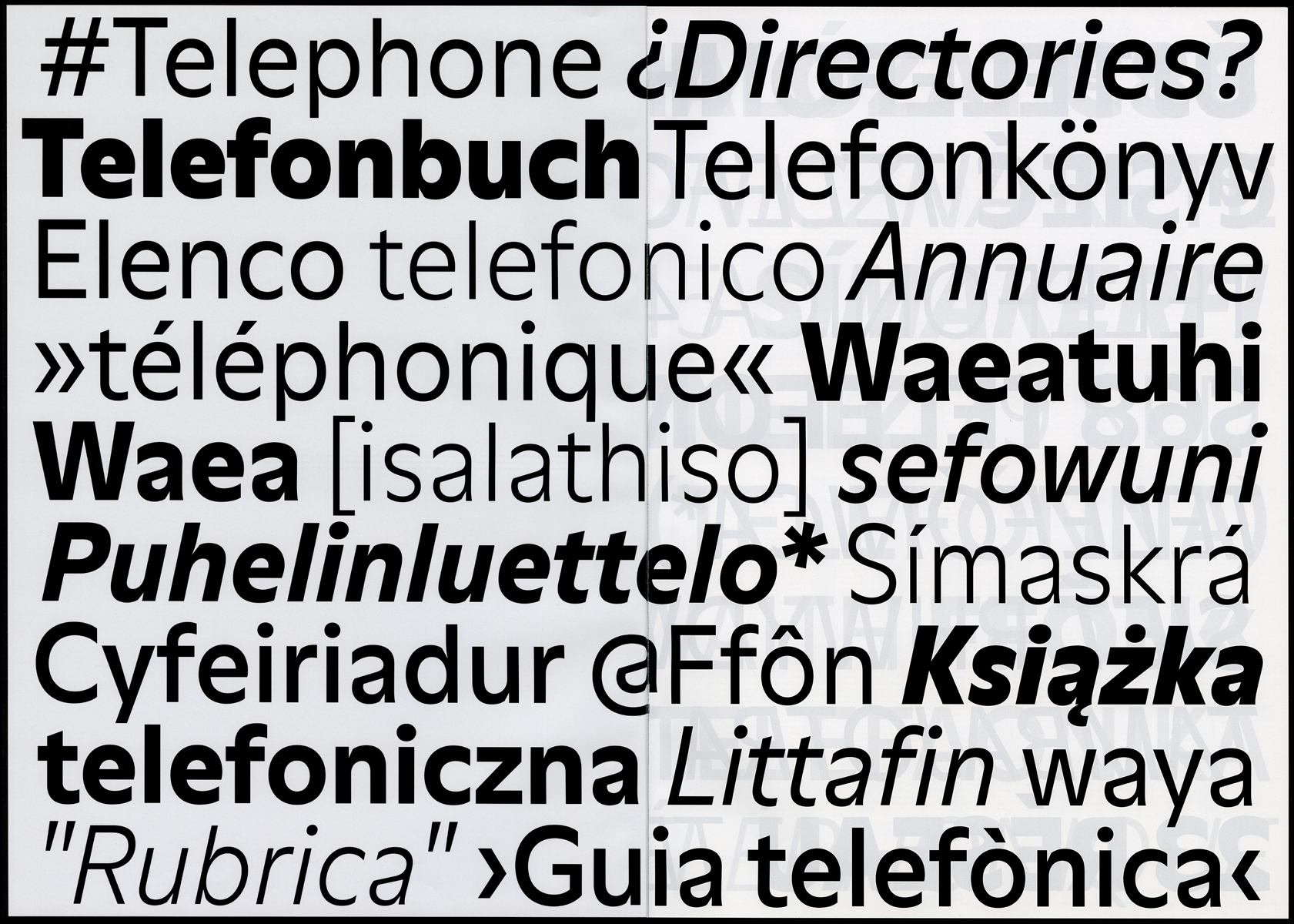
img-003 Semantik Specimen, Inside Spread
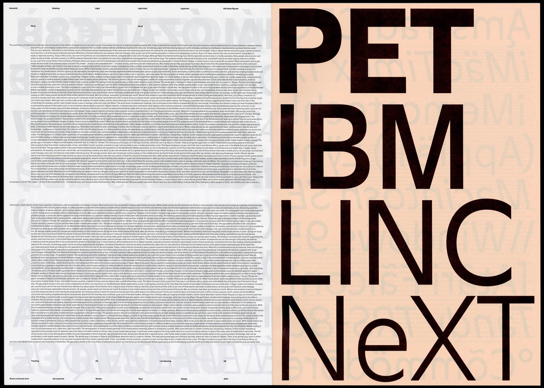
img-004 Semantik Specimen, Inside Spread
img-005 Semantik Specimen, Inside Spread
img-006 Semantik Specimen, Inside Spread
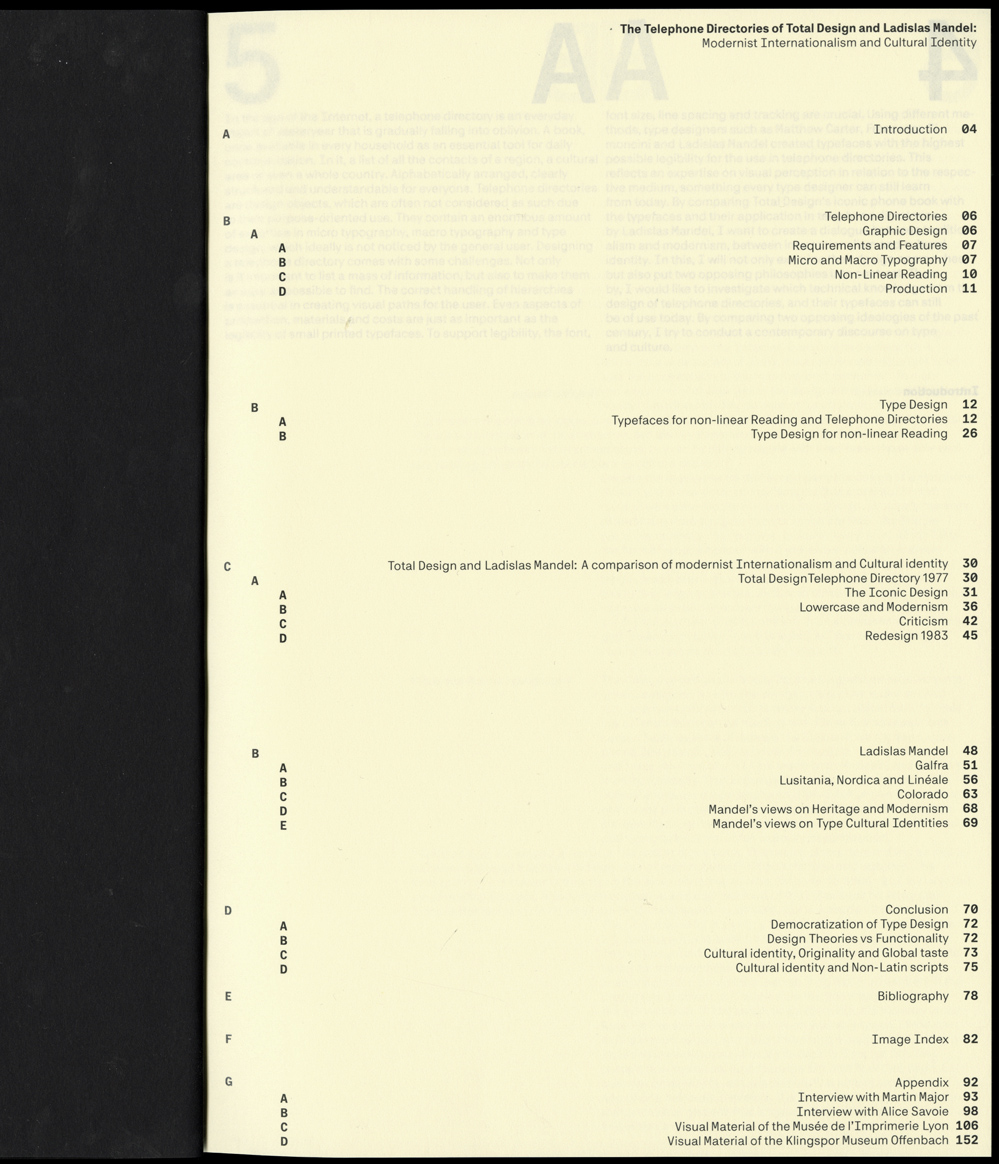
img-007 Semantik Specimen, Table of Content
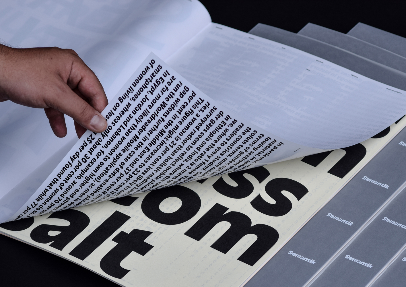
img-008 Semantik Specimen, Image Spread
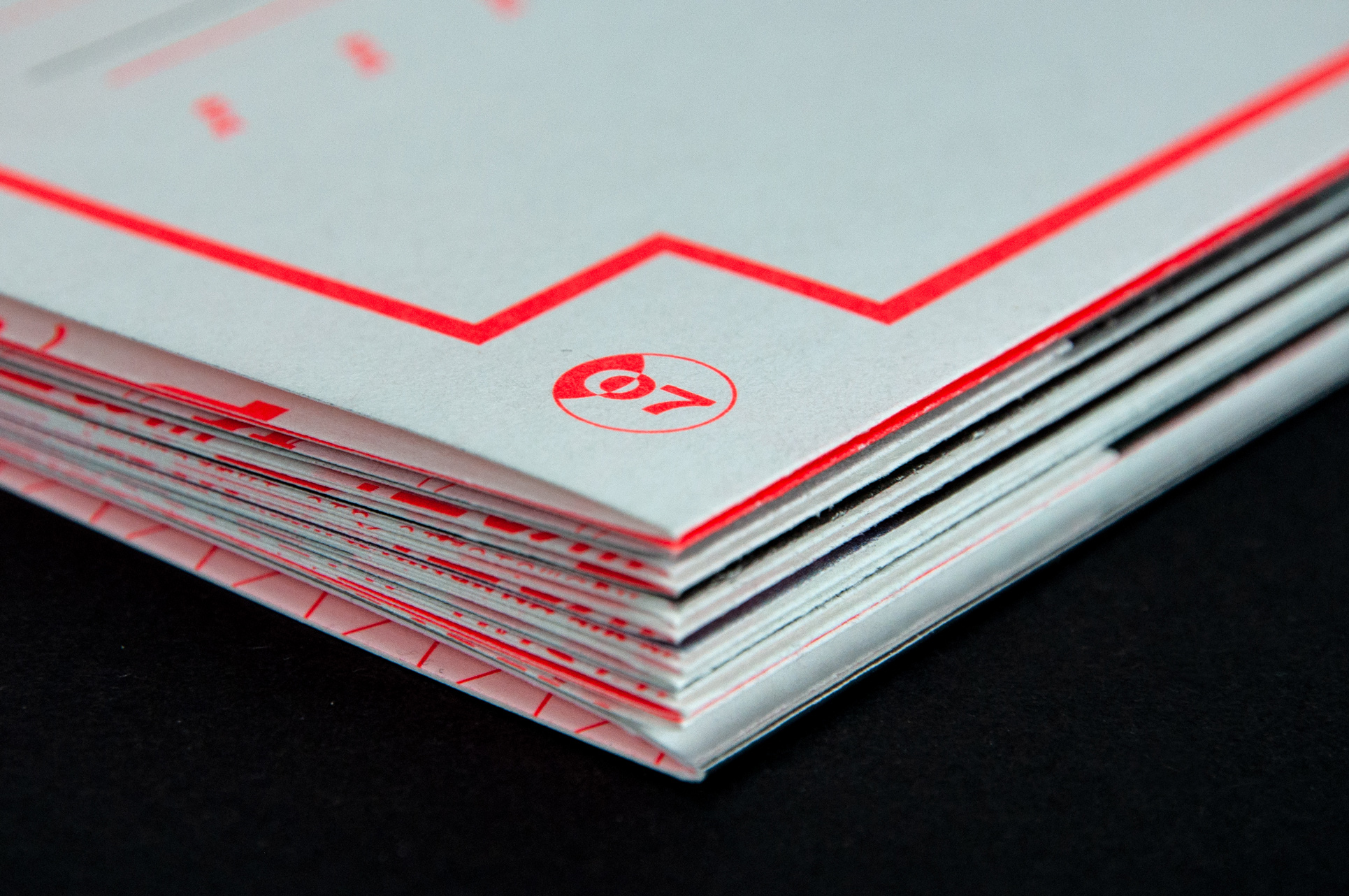
img-009 Semantik Specimen, Closeup
img-010 Semantik Website Specimen
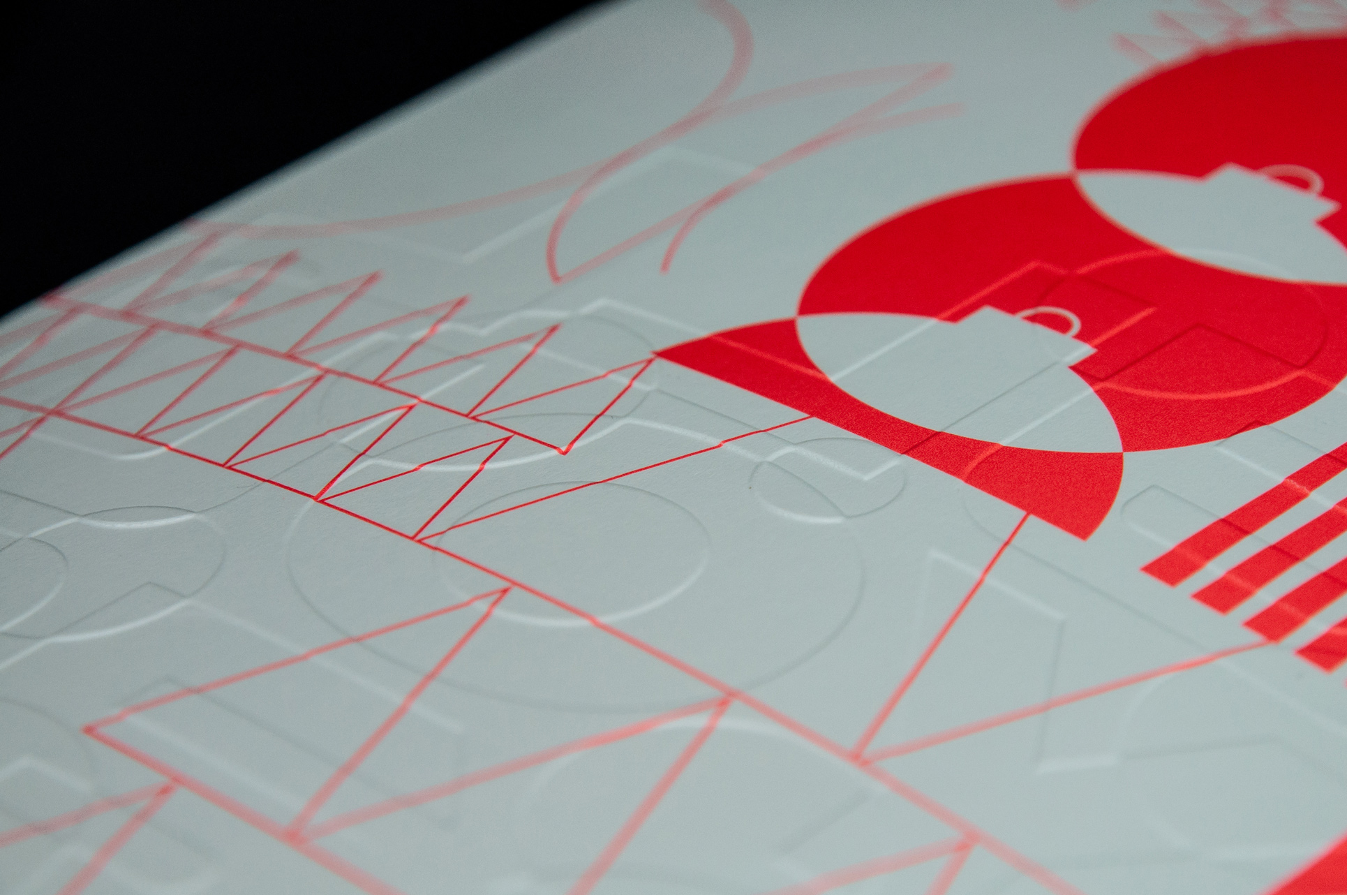
img-011 Semantik Specimen, Closeup
img-012 Semantik Specimen, Inside Spread
B
Master Thesis
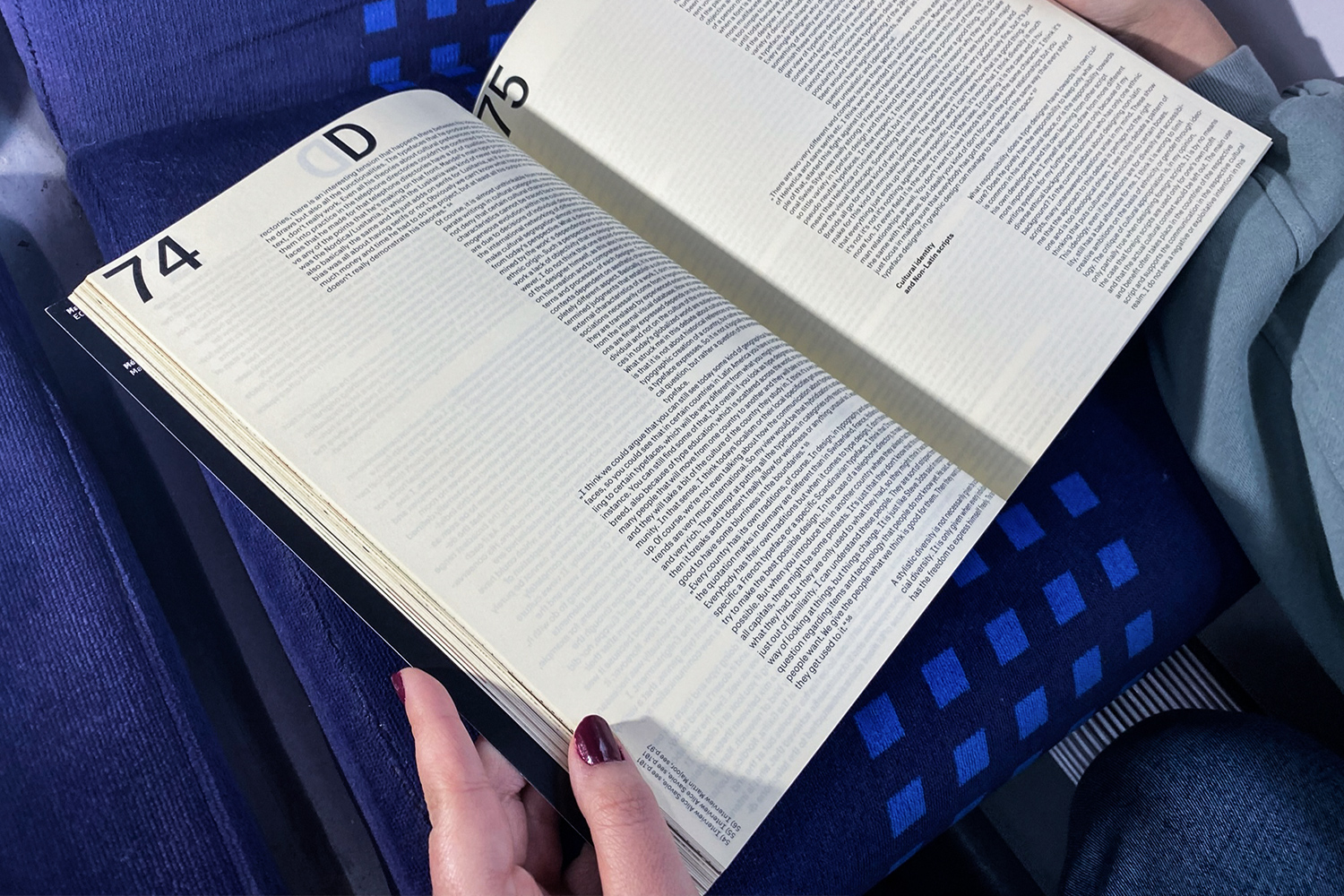
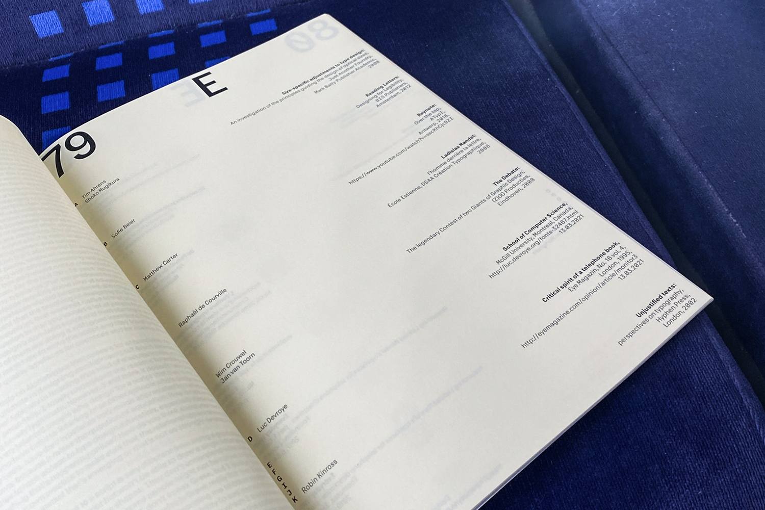
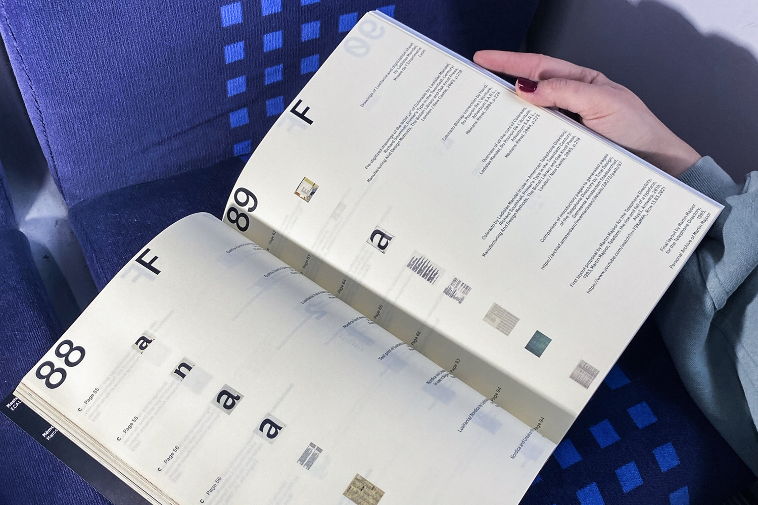
The Telephone Directories of Total Design and Ladislas Mandel: Modernist Internationalism and Cultural Identity A telephone directory is an everyday object of yesteryear that is gradually falling into oblivion. A book, once available in every household as an essential tool for daily communication is a direct representation of different cultures and their use of typefaces. By comparing Total Design's iconic phone book with the typefaces and their application in telephone directories by Ladislas Mandel, I created a dialogue between traditionalism and modernism, between internationalism and cultural identity. In this, I examined their design approaches, but also put two opposing philosophies into contrast. Thereby, I investigated the technical knowledge from the design of telephone directories and their typefaces which can still be of use today. By comparing two opposing ideologies of the past century, I tried to conduct a contemporary discourse on type and culture.Typeface in use: Platte Grotesk
img-013 Telephone Directories; Cover
img-014 Telephone Directories; Table of Content
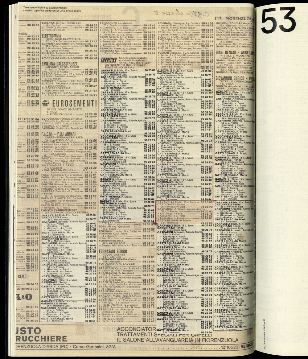
img-015 Telephone Directories; Testsheet of Galfra by Ladislas Mandel
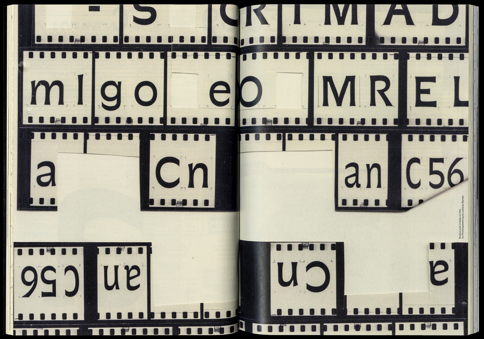
img-016 Telephone Directories; Nordica by Ladislas Mandel
img-017 Telephone Directories; Spread
img-018 Telephone Directories; Image Directory Spread
img-019 Telephone Directories; Spread
img-020 Telephone Directories; Nordica by Ladislas Mandel
img-021 Telephone Directories; Image Directory Spread
img-022 Telephone Directories; Closeup
img-023 Telephone Directories; Closeup
img-024 Telephone Directories; Closeup
C
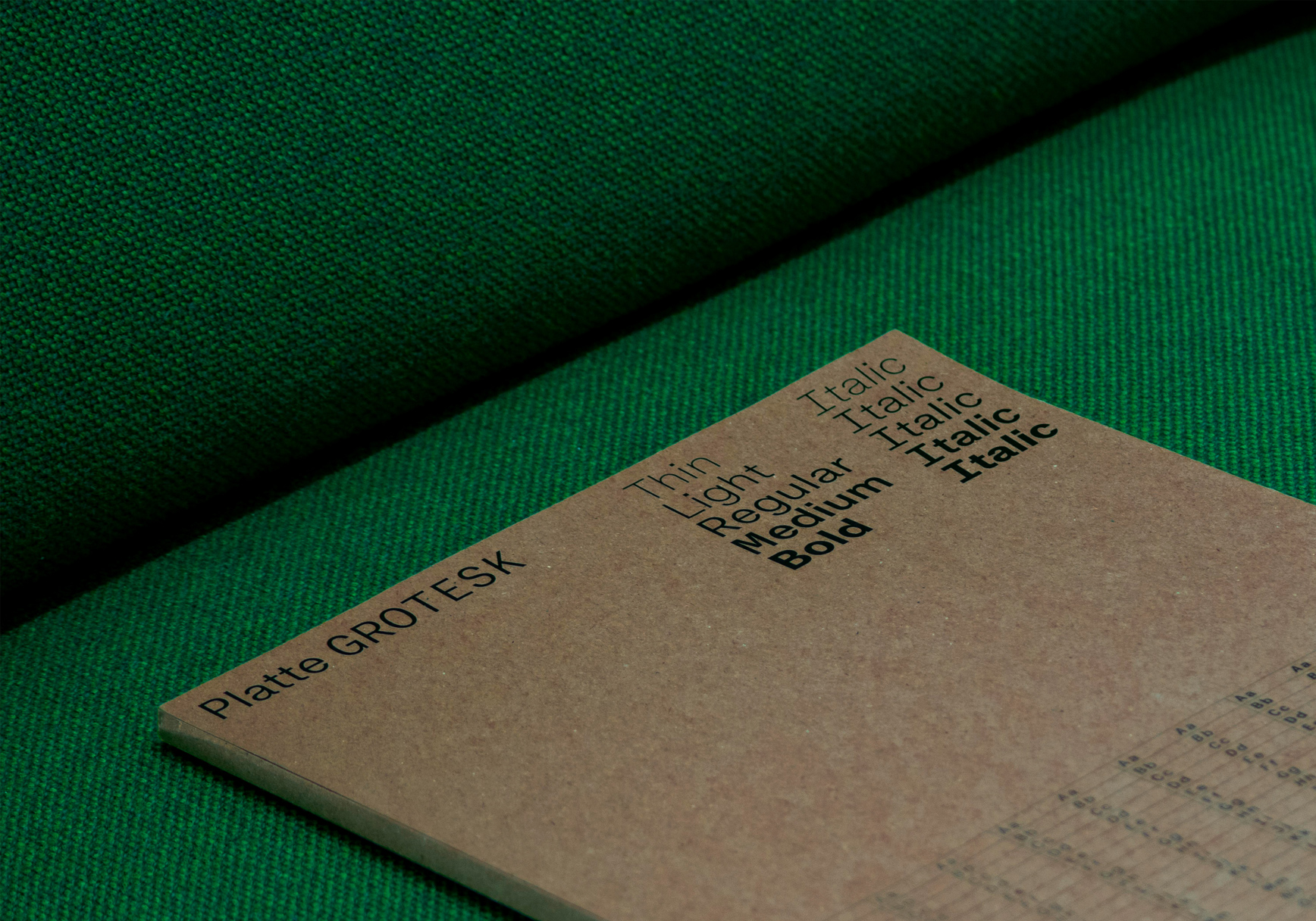
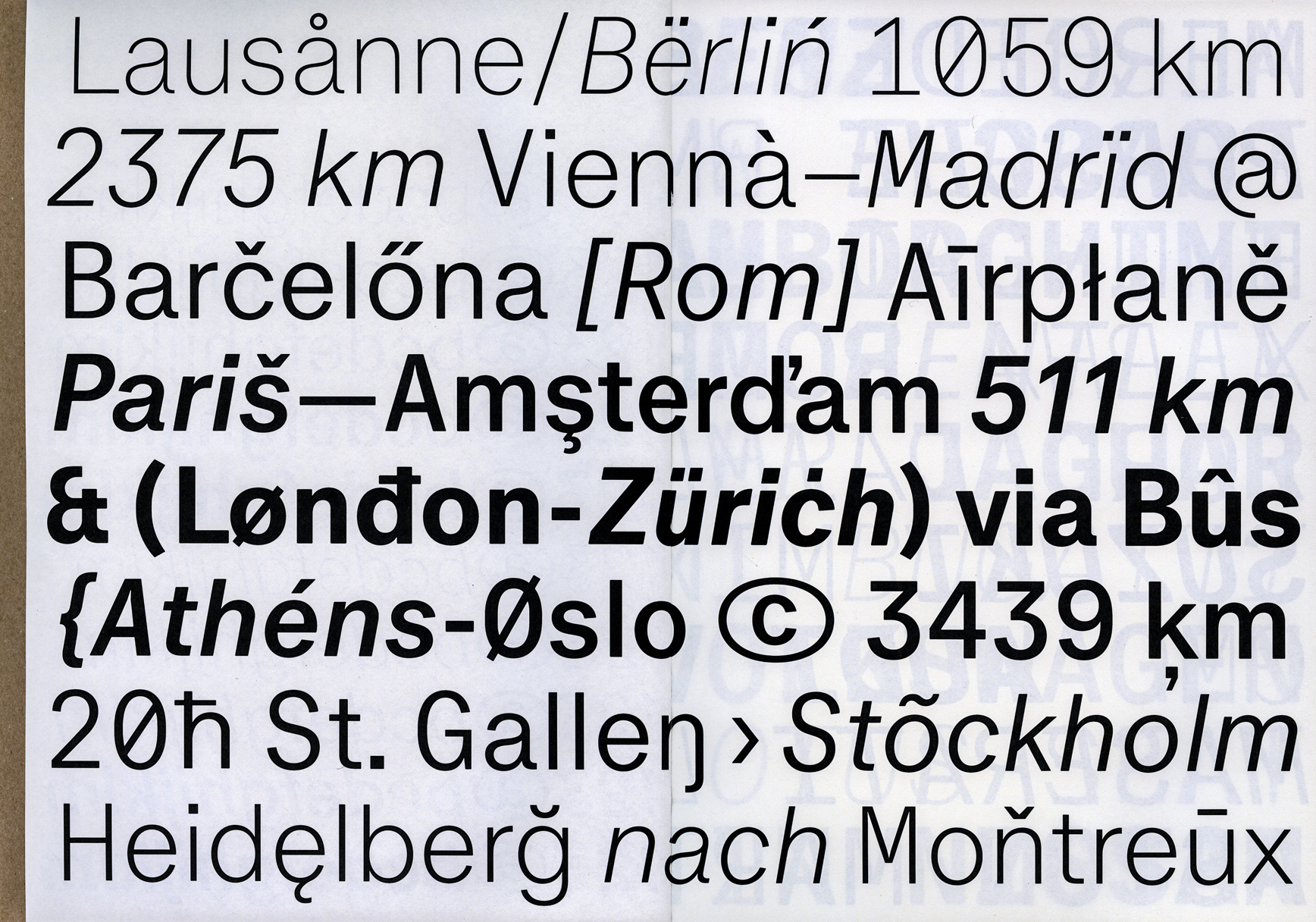
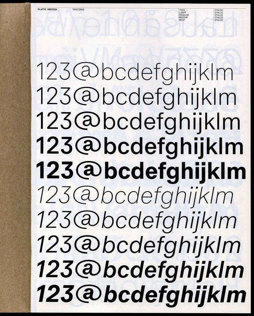
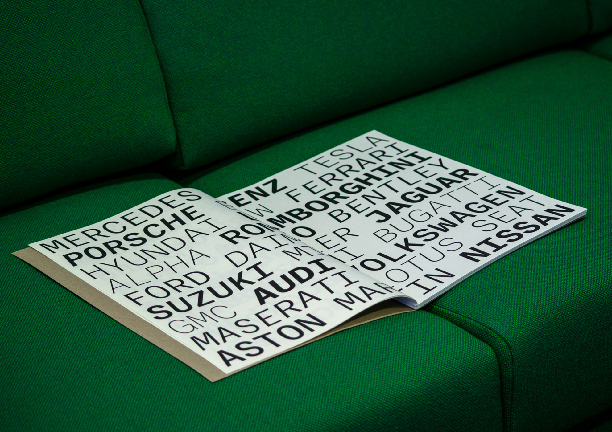
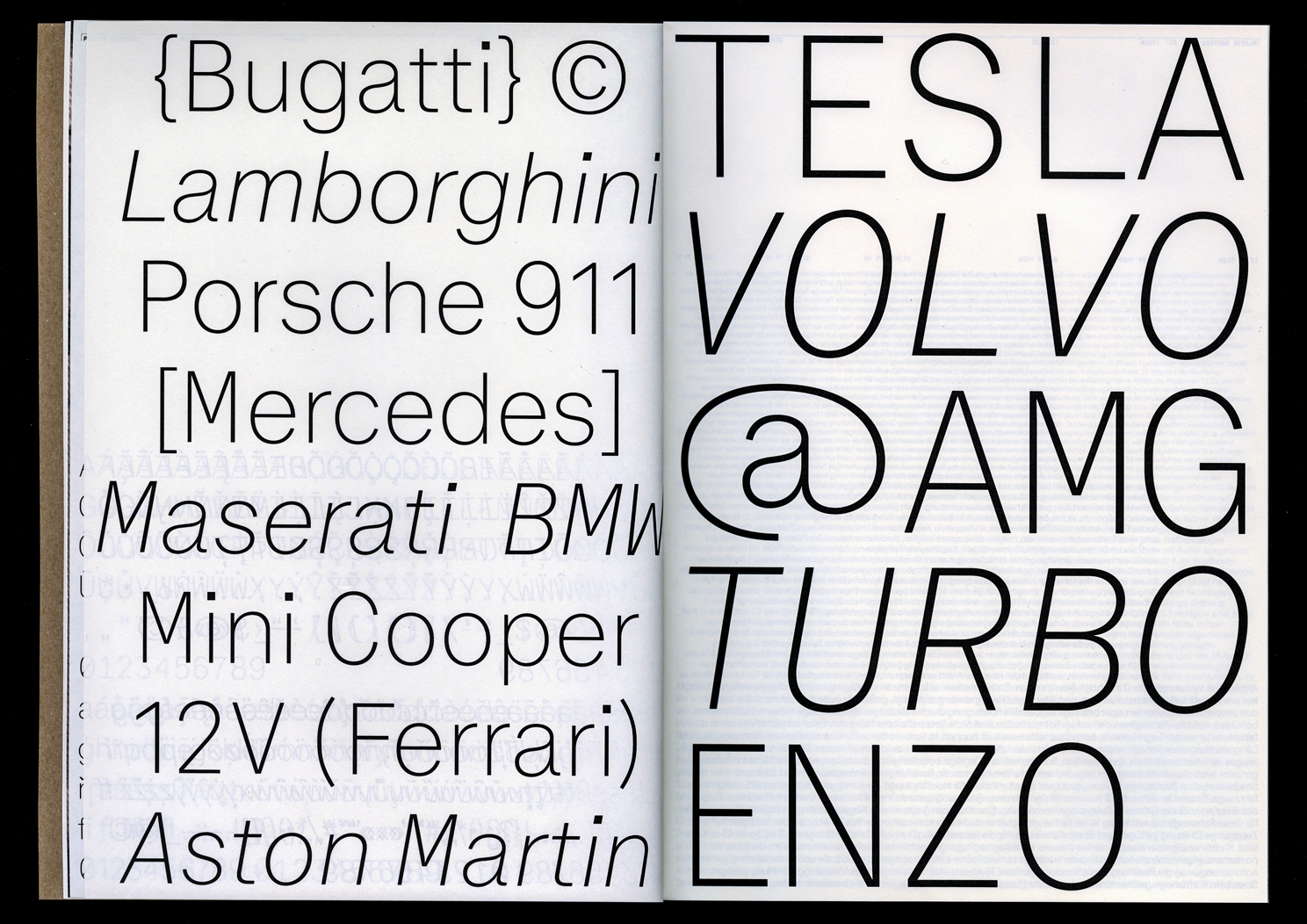
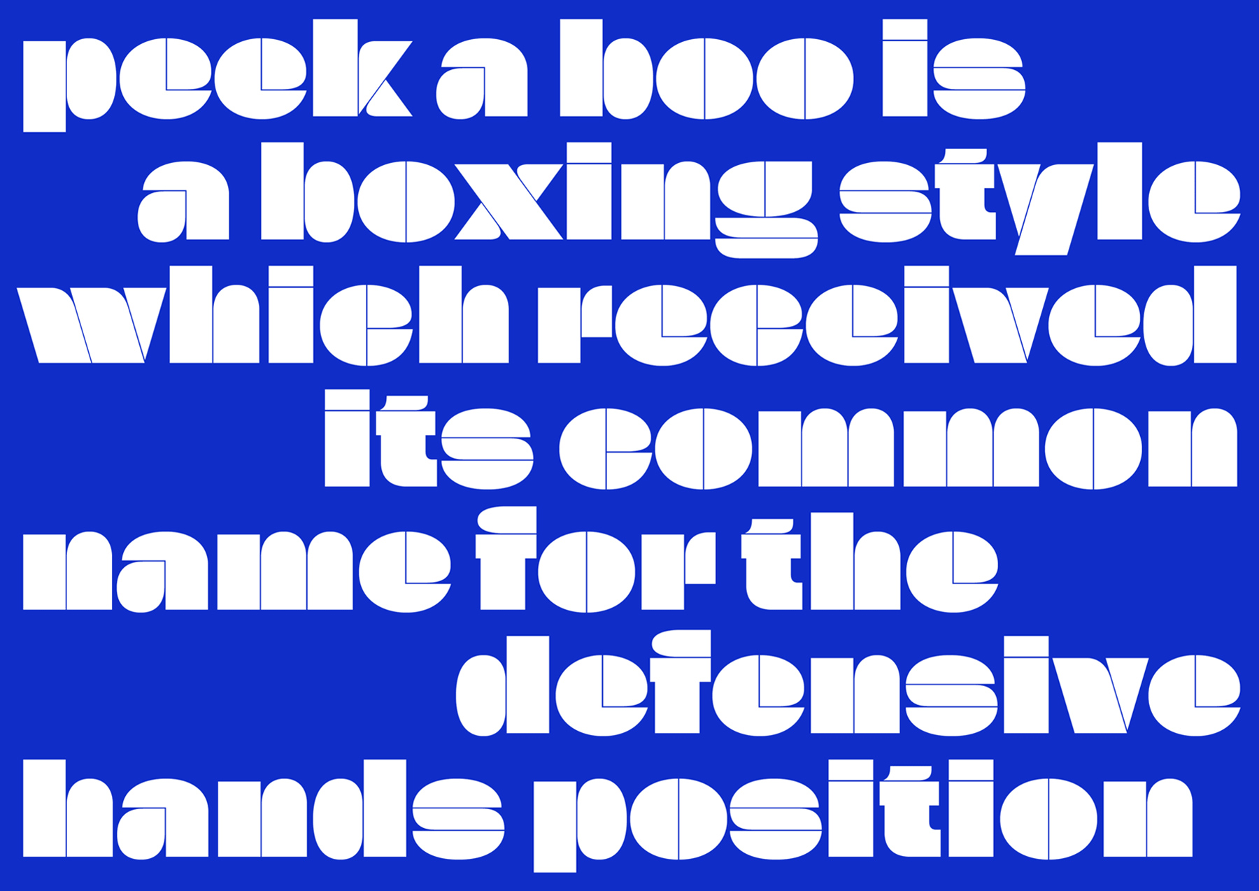
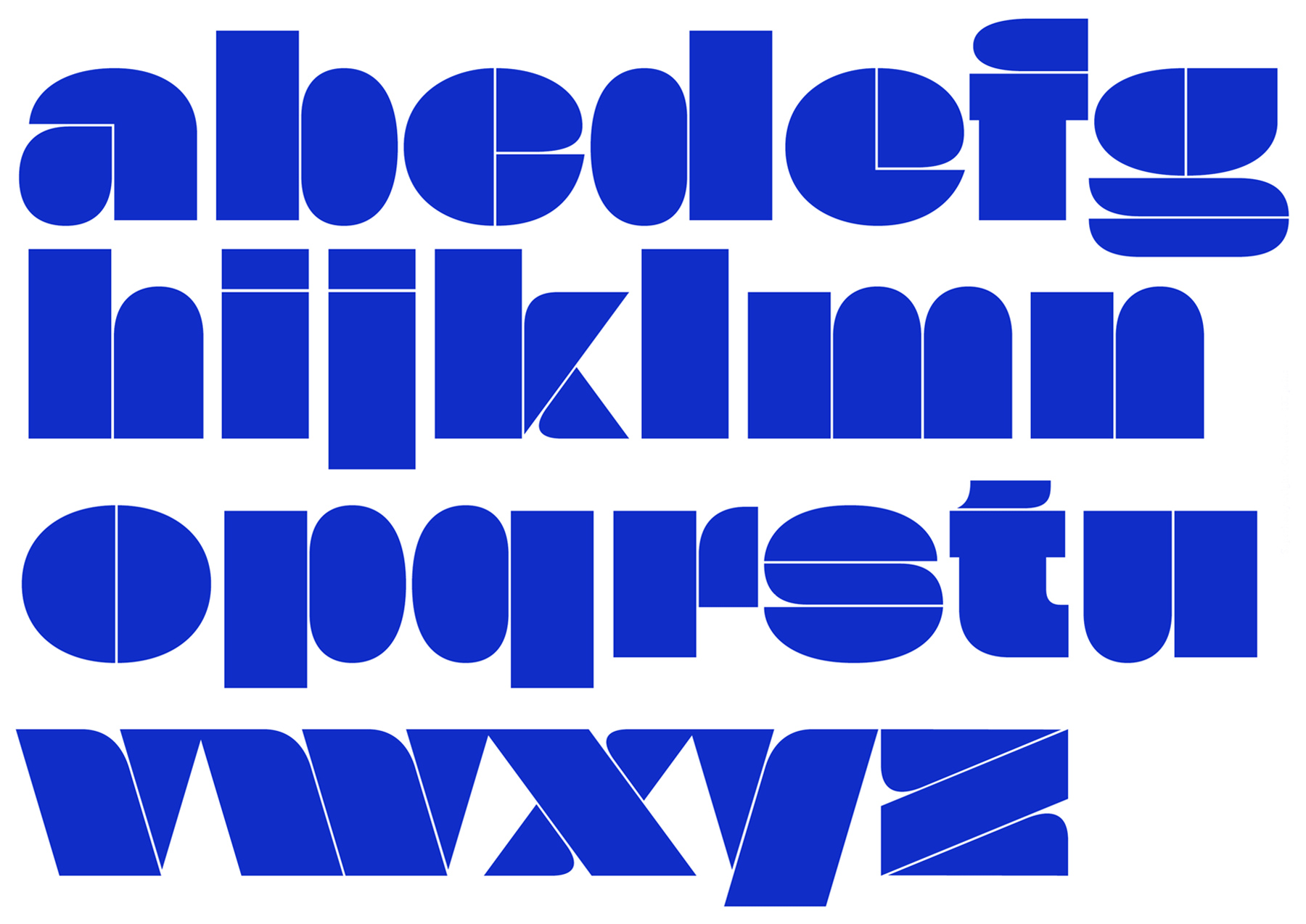
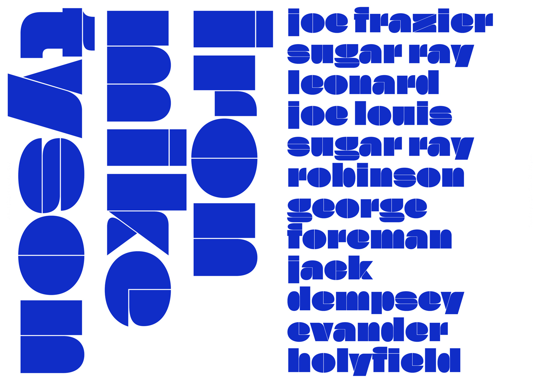
Platte Grotesk
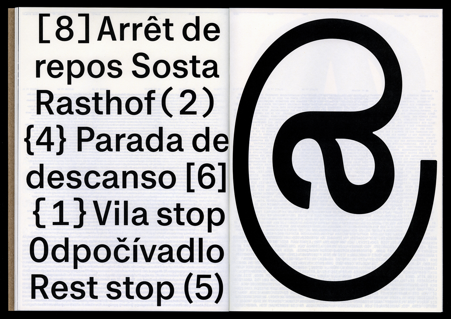
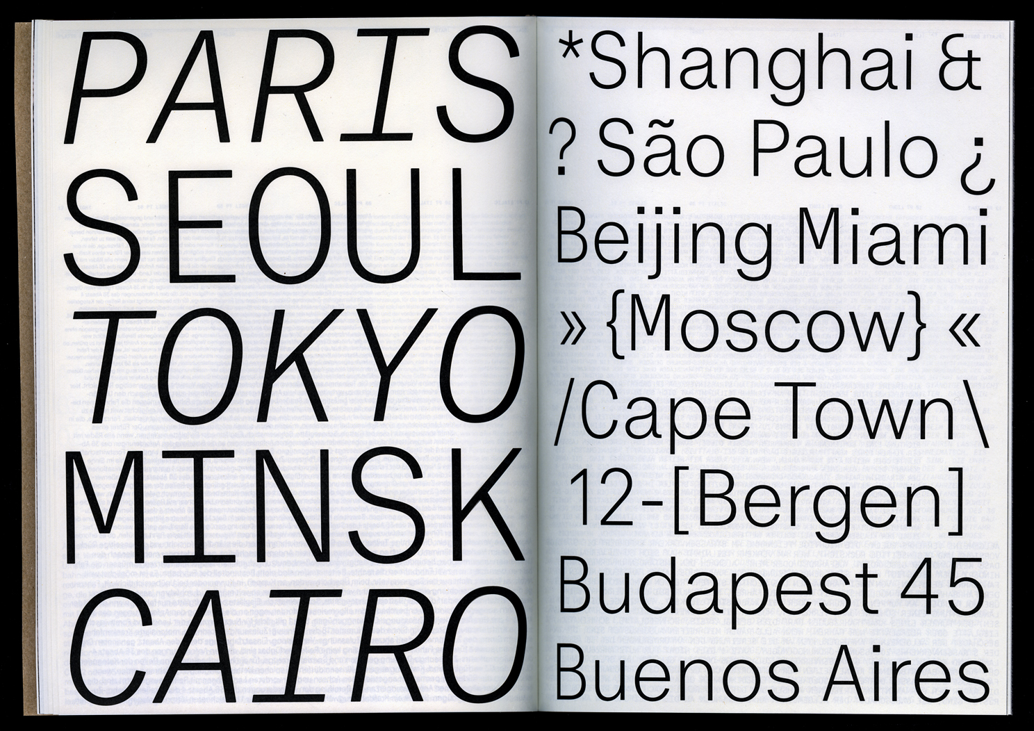
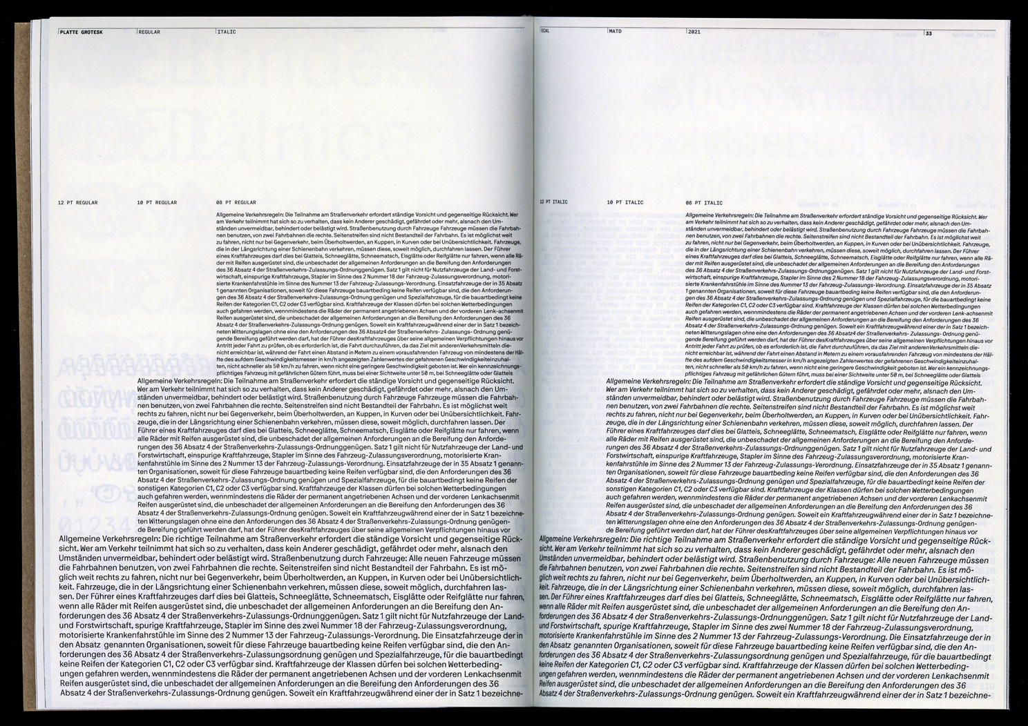
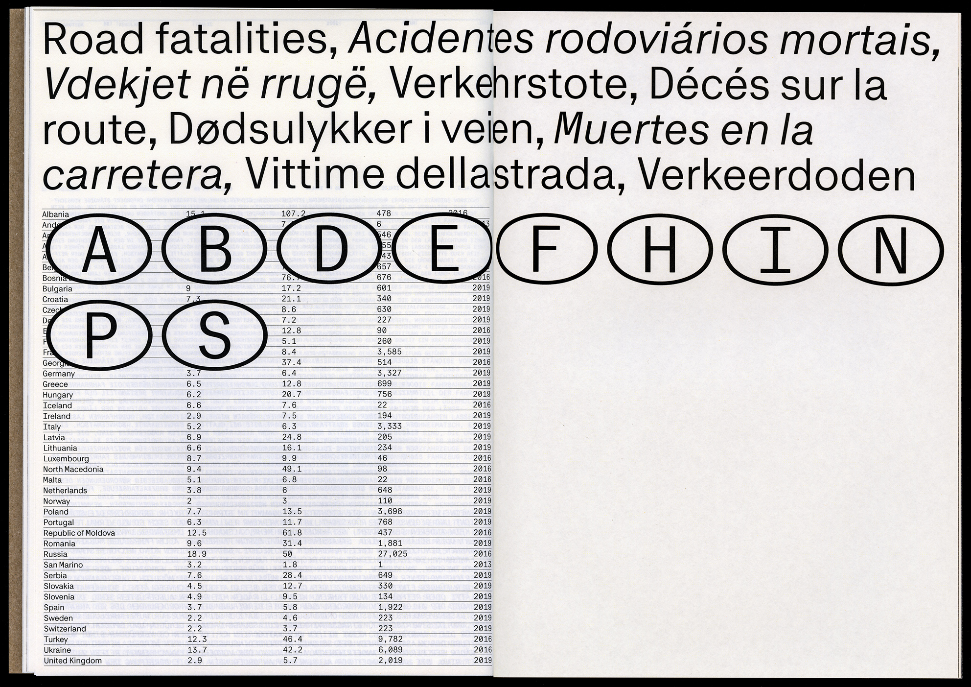
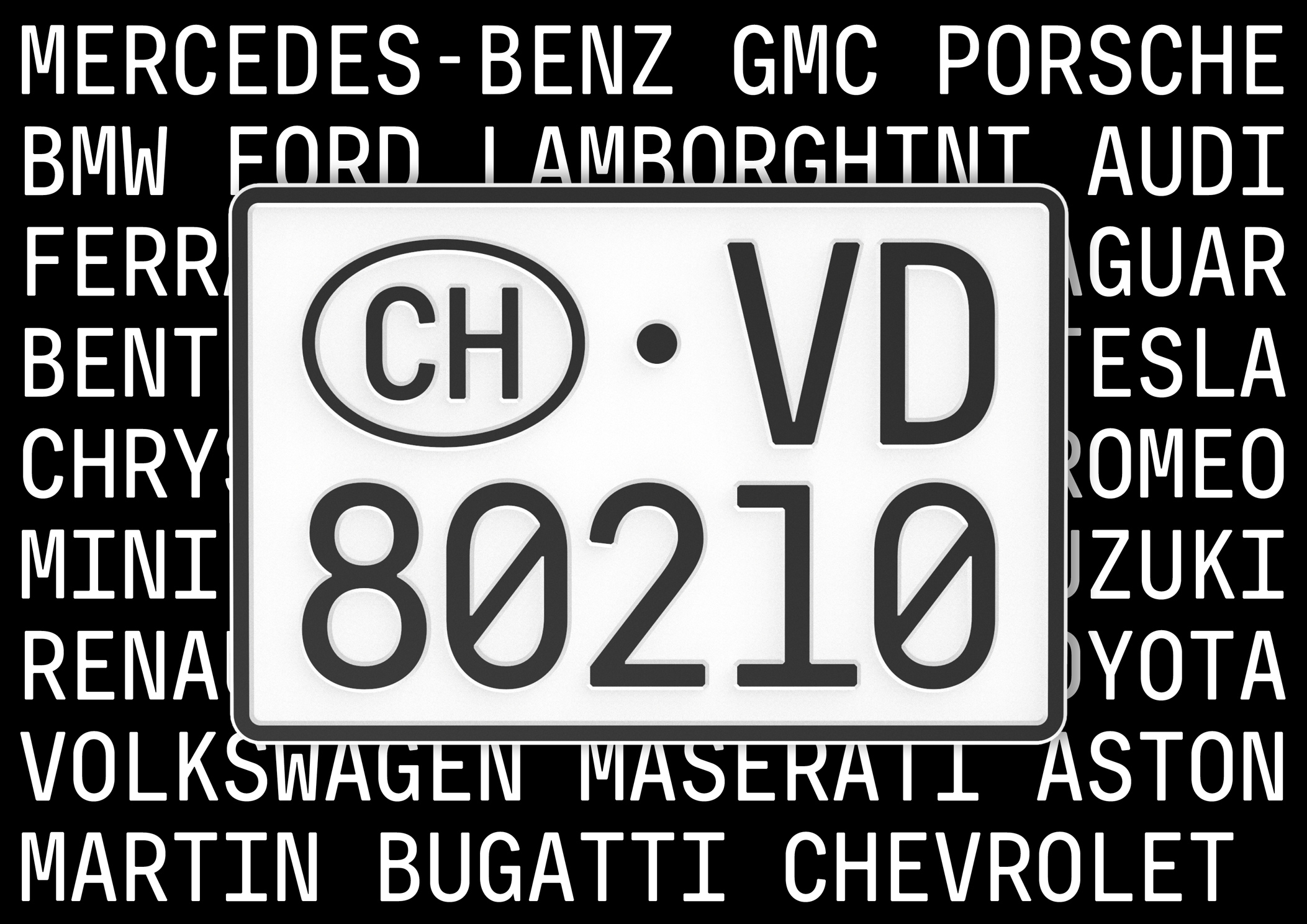
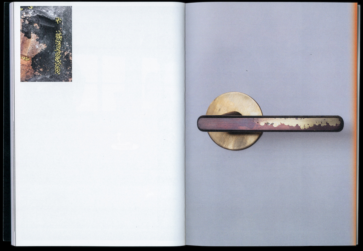
Platte Grotesk is a typeface family with a unique feature. Monospace uppercase and proportional lowercase. The idea to create a text typeface with such a feature came from researching license plates of the occupation zones in post-war Germany. The name as well as the high contrast of the typeface are a reference to early Grotesk typefaces of the late 19th century. Platte Grotesk has several case-specific features and alternates due to the monospace design of the capitals. The typeface produces an interesting texture in which the uppercase letters are only noticeable as different at second glance. The character of the typeface changes completely as soon as it is placed in all-caps and with that to a full monospace typeface. The play with elements of traffic and transport is reflected in some many type features. This project started under the supervision of Kai Bernau at ECAL and is currently still evolving as different versions are being developed.
img-025 Platte Grotesk Specimen, Closeup
img-026 Platte Grotesk Specimen, Inside Spread
img-027 Platte Grotesk Specimen, Table of Content
img-028 Platte Grotesk Specimen, Image Spread
img-029 Platte Grotesk Specimen, Inside Spread
img-030 Platte Grotesk Specimen, Inside Spread
img-031 Platte Grotesk Specimen, Inside Spread
img-032 Platte Grotesk Specimen, Inside Spread
img-033 Platte Grotesk Specimen, Inside Spread
img-034 Platte Grotesk Specimen, Image Spread
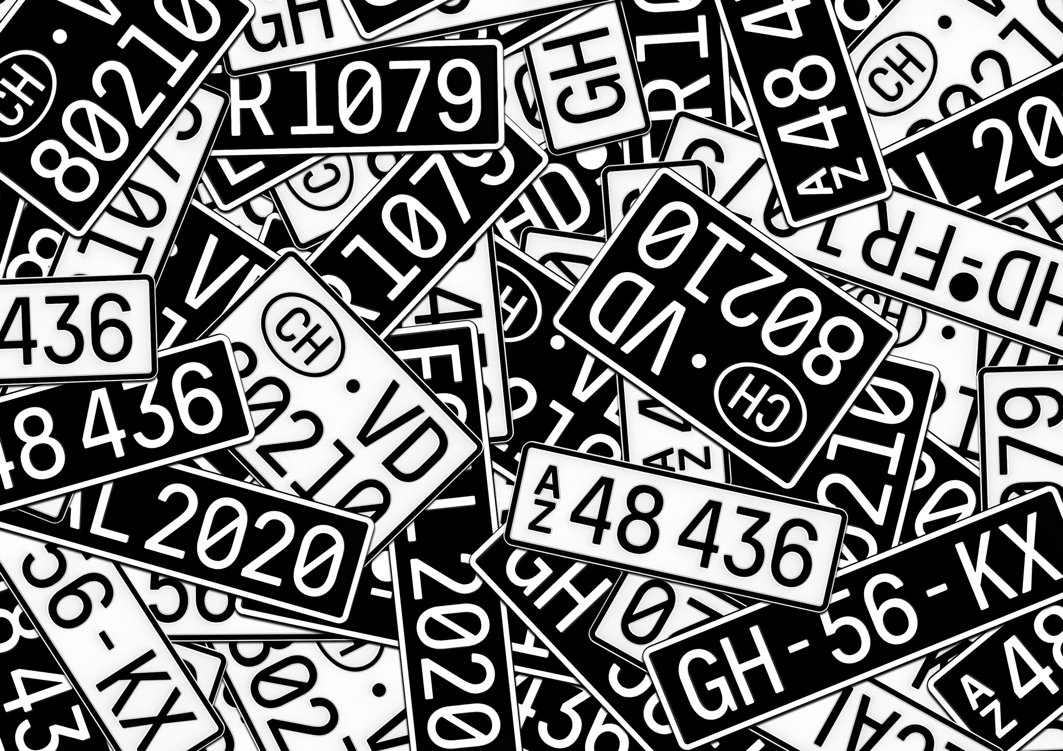
img-035 Platte Grotesk Display, License Plates
img-036 Platte Grotesk Display, License Plates
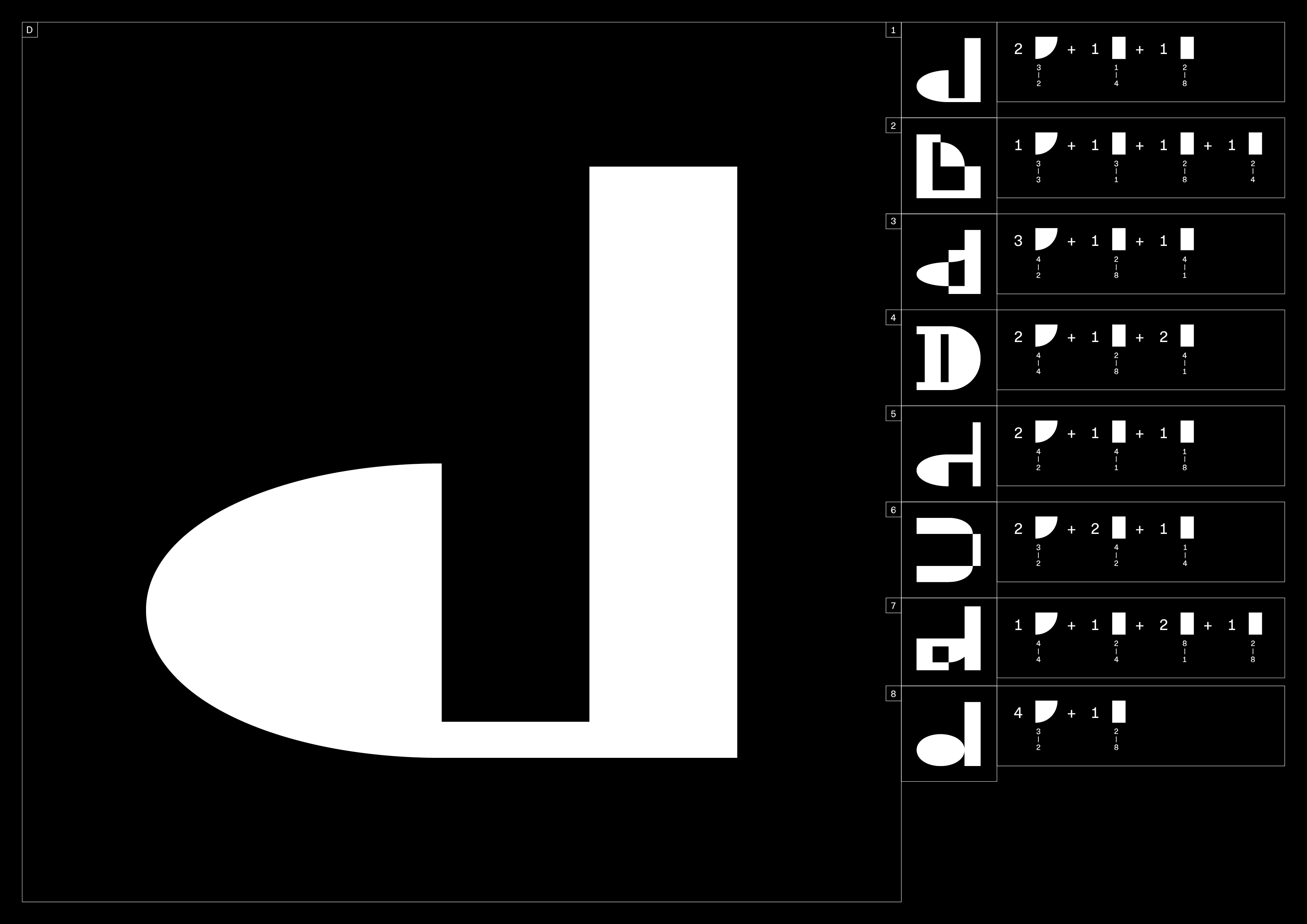
D
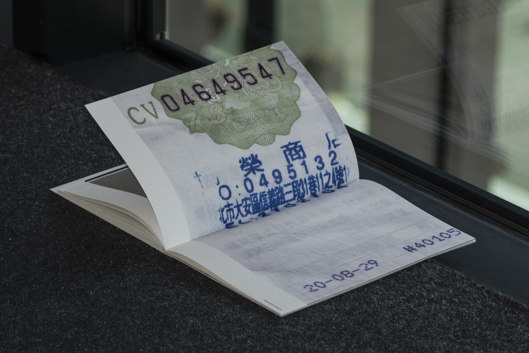
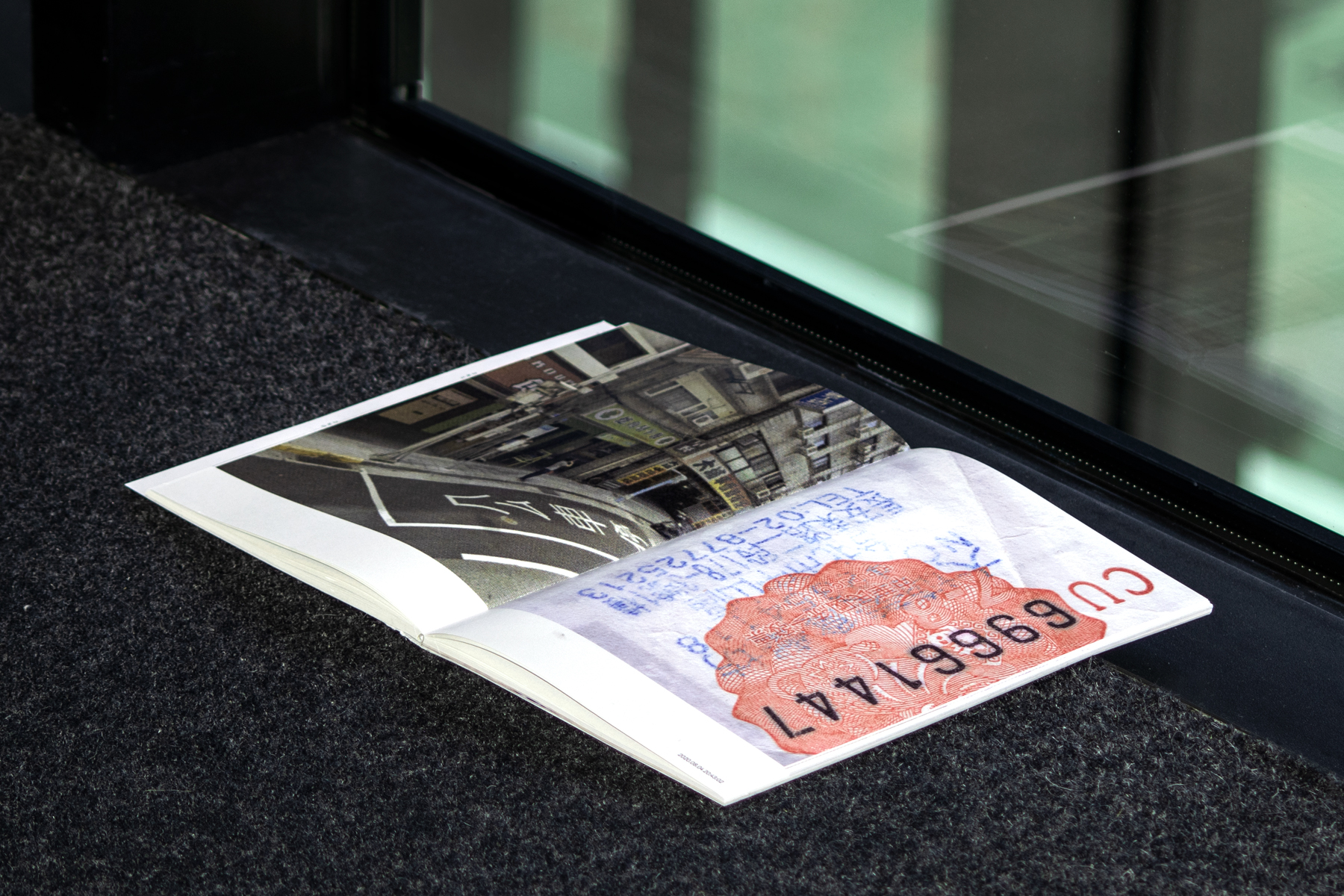
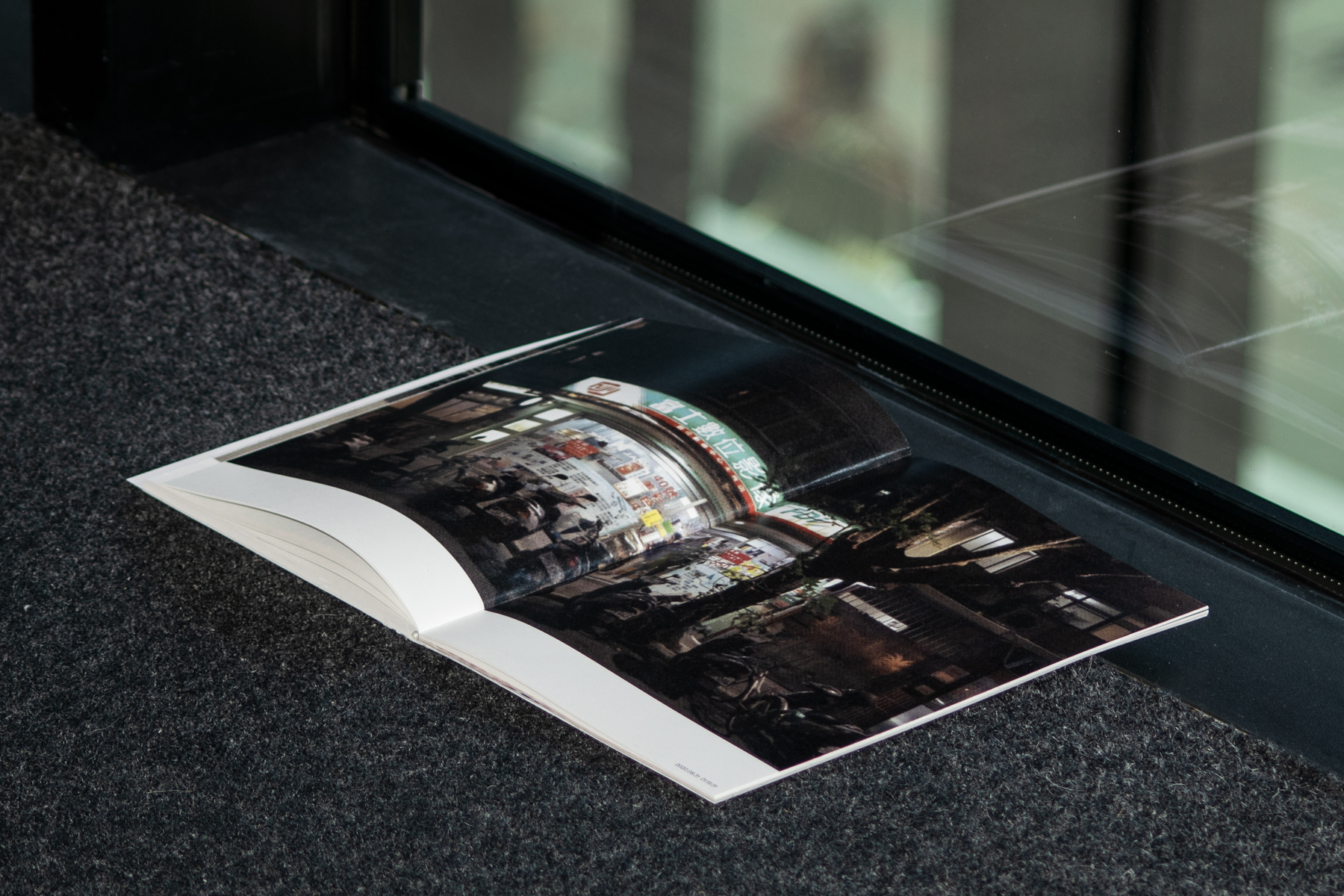
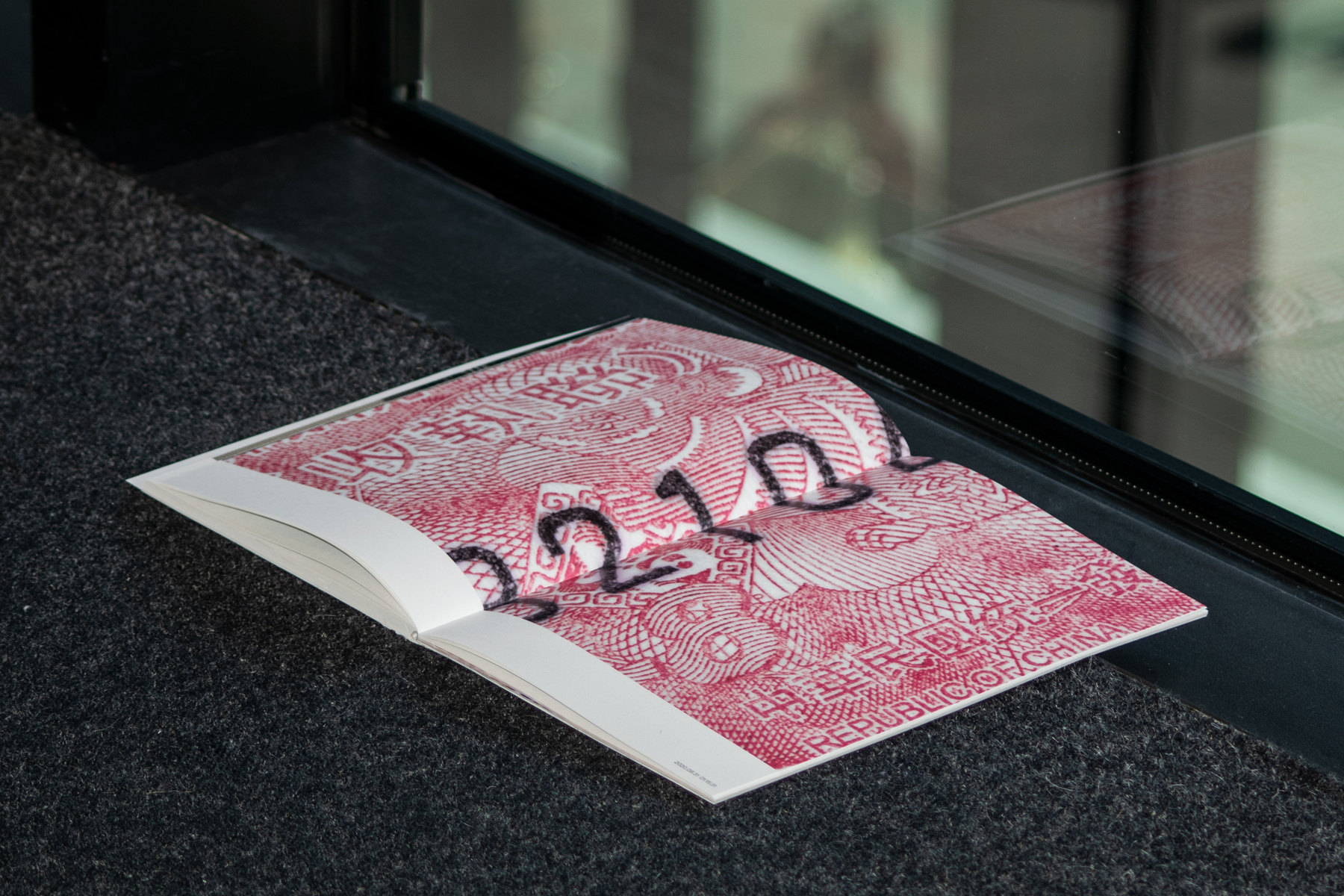
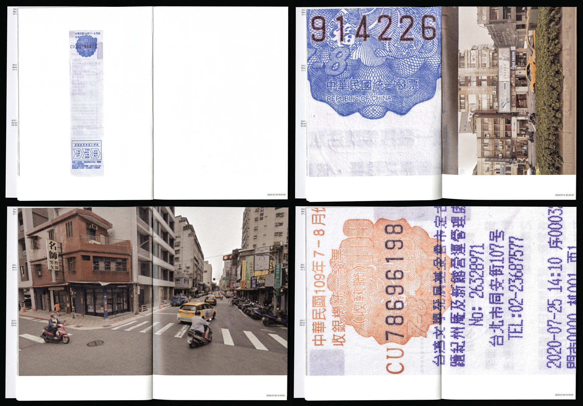
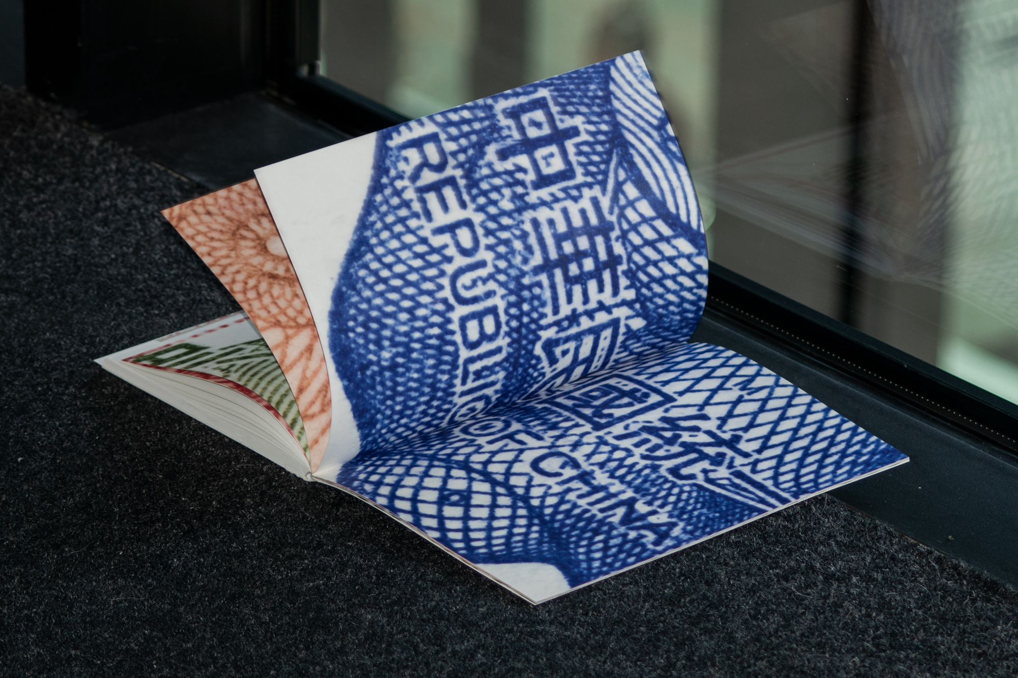
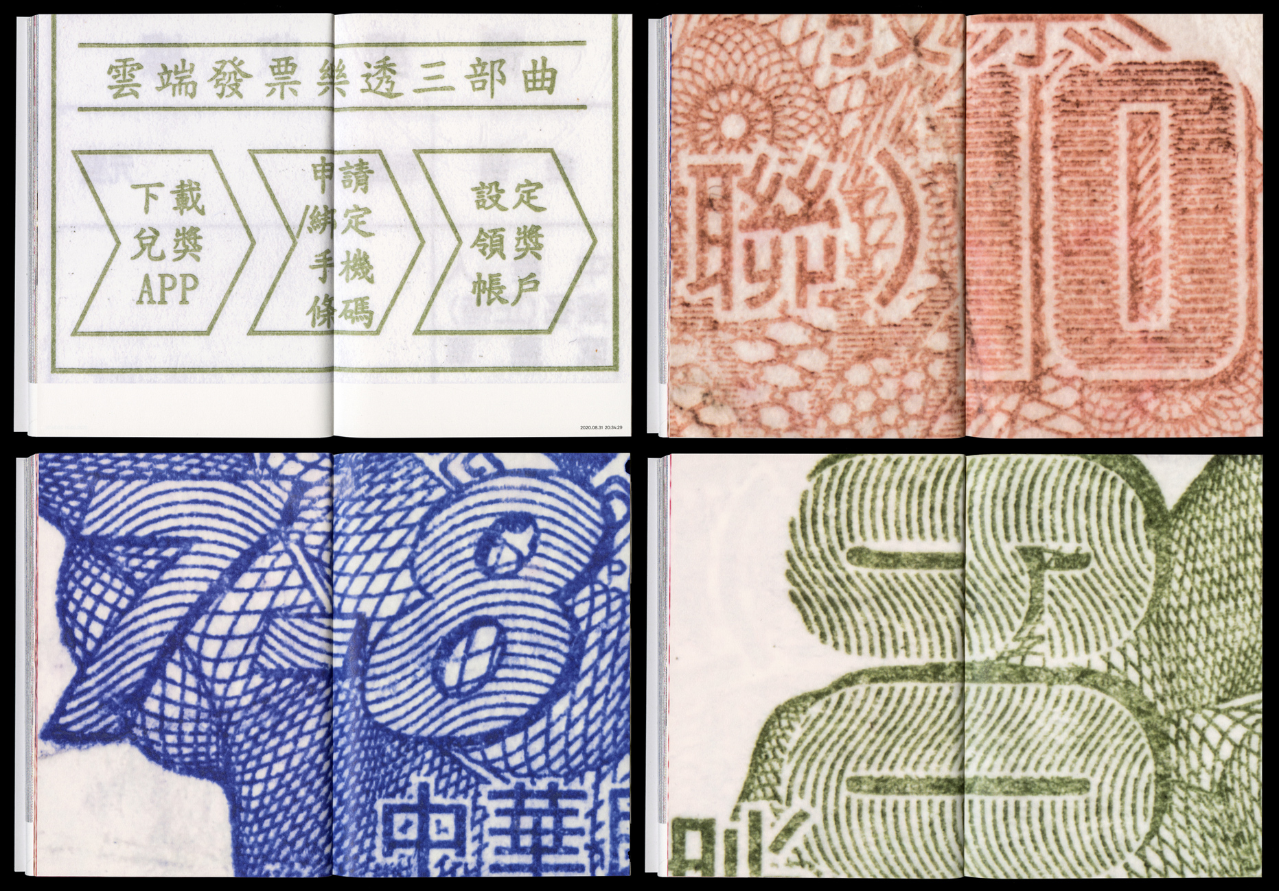
Receipts from Taipei
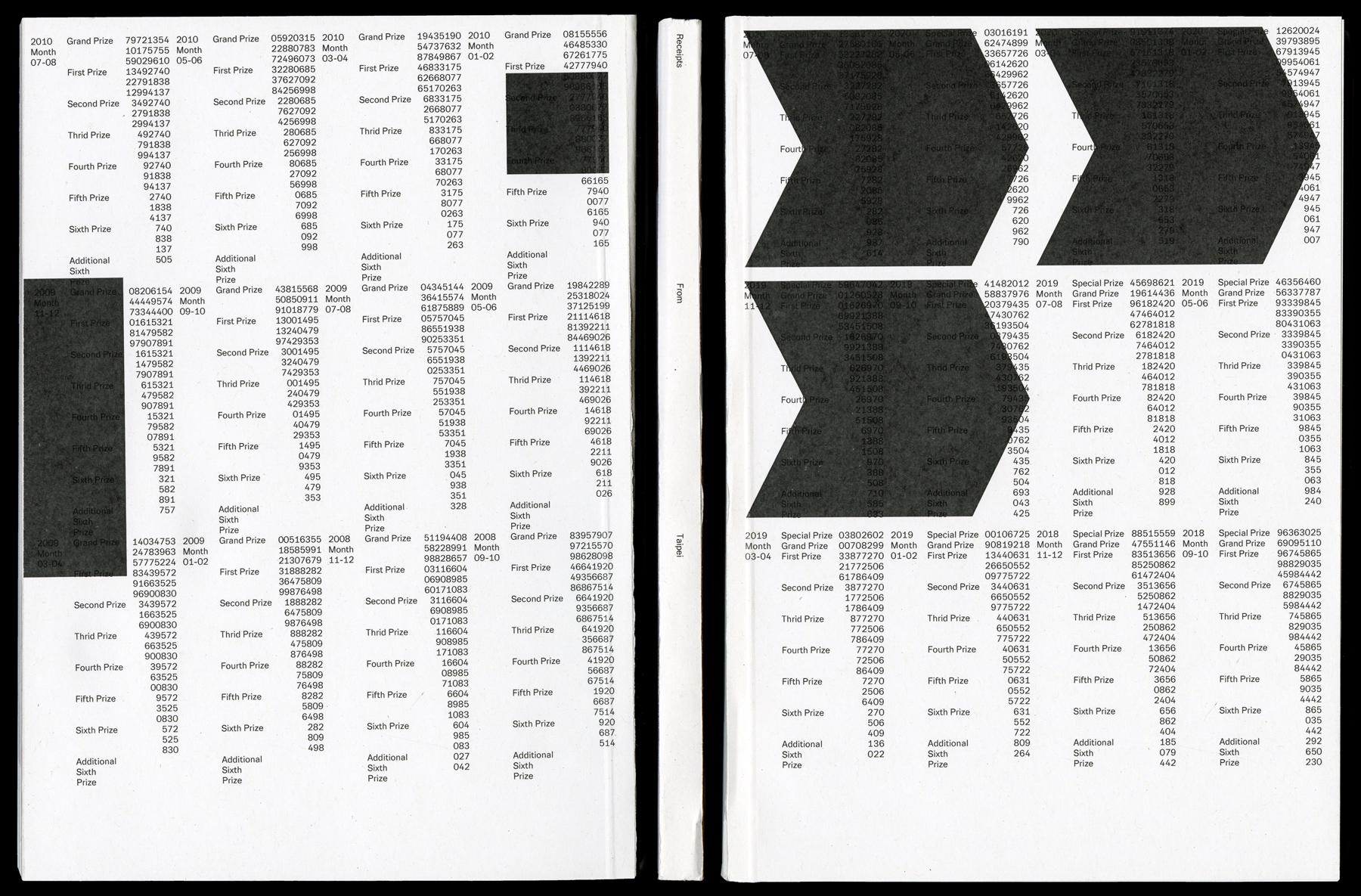
A receipt is a unique singular object. It shows a certain number, given to you at a certain place, in a certain year, on a certain day, at a certain time. A unique object which is not replicable. Taiwan’s invoice system is unique in the world in the sense that every receipt must follow the same printed format specified by the government. In addition, an accompanying lottery-like mechanism is implemented to give different prizes to some invoice holders periodically as an incentive for citizens to request receipts upon transaction. This projects documents Taiwan’s printed receipts which slowly fall into oblivion, due to its replacement through digital versions. The book can be seen as an abstract mapping of interactions of trade over a certain time. It connects each receipt to the time and place of its origin. In the Editorial Design I tried to take an every day object and place it in a different context, so that it is seen with new eyes and tells its own unique story. Typeface in use: Ando
img-037 Receipts From Taipei, Cover
img-038 Receipts From Taipei, Image Spread
img-039 Receipts From Taipei, Image Spread
img-040 Receipts From Taipei, Image Spread
img-041 Receipts From Taipei, Image Spread
img-042 Receipts From Taipei, Inside Spread
img-043 Receipts From Taipei, Image Spread
img-044 Receipts From Taipei, Inside Spread
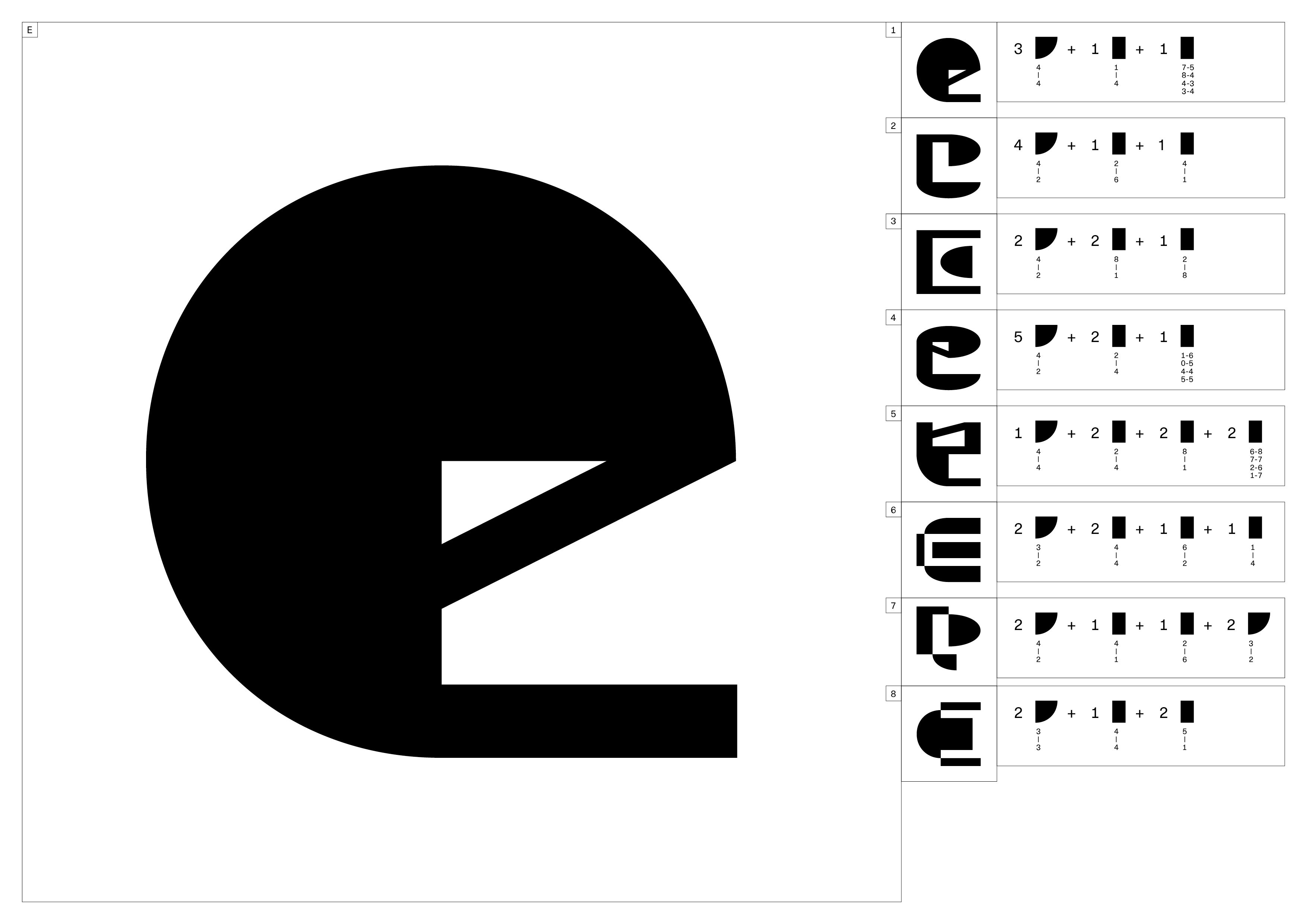
E
Ando
Ando is a typeface family inspired by the Japanese architect Tadao Andō. His buildings show a massiveness and sensitivity at the same time. Their brutalist and raw appearance gets complemented by their calmness they radiate. Ando’s complex choreography of light lets the space surrounding or creating it operate. Barnett Newman paintings, directly distinguishable by the vertical line/ or lines create a similar effect. The line creates an opening of the painting, almost like an opening in space and time. With a bulky Grotesk typeface family with very squarish countershapes and a round outer shapes I tried to show the duality of massiveness and sensitivity, of humanity and nature of brutalism and minimalism. In an attempt to reflect the complex use of light in Ando’s buildings I used fine lines in the junctions derived by Newman’s paintings which become in the ultra black cut of the typeface the counters. Ando is still a work in progress which is currently in further development.
img-045 Ando Specimen, Cover
img-046 Ando Specimen, Tavle of Content
img-047 Ando Specimen, Inside Spread, Heavyweight
img-048 Ando Specimen, Inside Spread
img-049 Ando Specimen, Inside Spread, Lightweight
img-050 Ando Specimen, Inside Spread, Lightweight
img-051 Ando, Interpolation, Lightweight to Superheavyweight
img-052 Ando, Superheavyweight
img-053 Ando, Superheavyweight
img-054 Ando, Superheavyweight

img-055 Ando, Superheavyweight
img-056 Ando, Superheavyweight
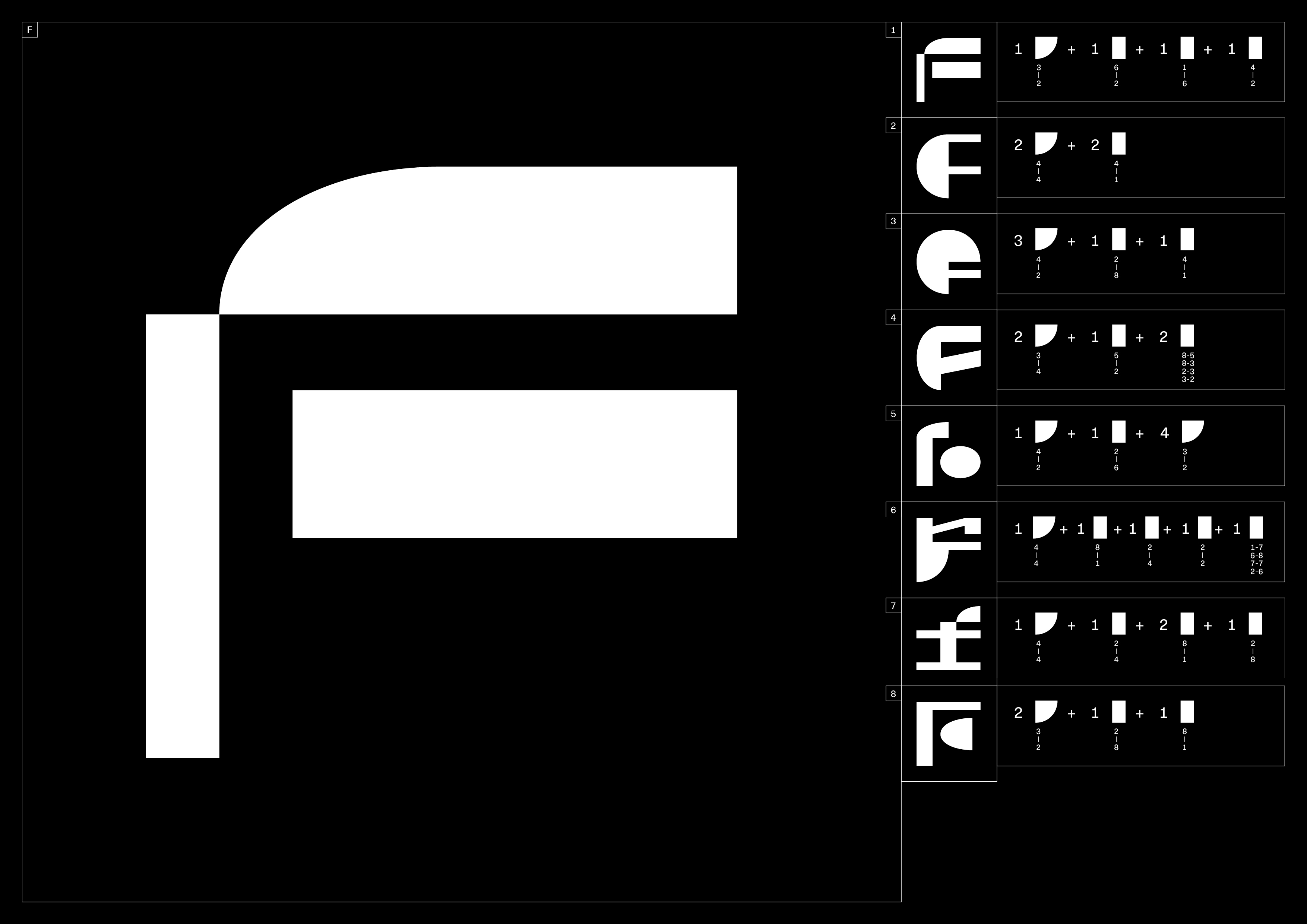
F
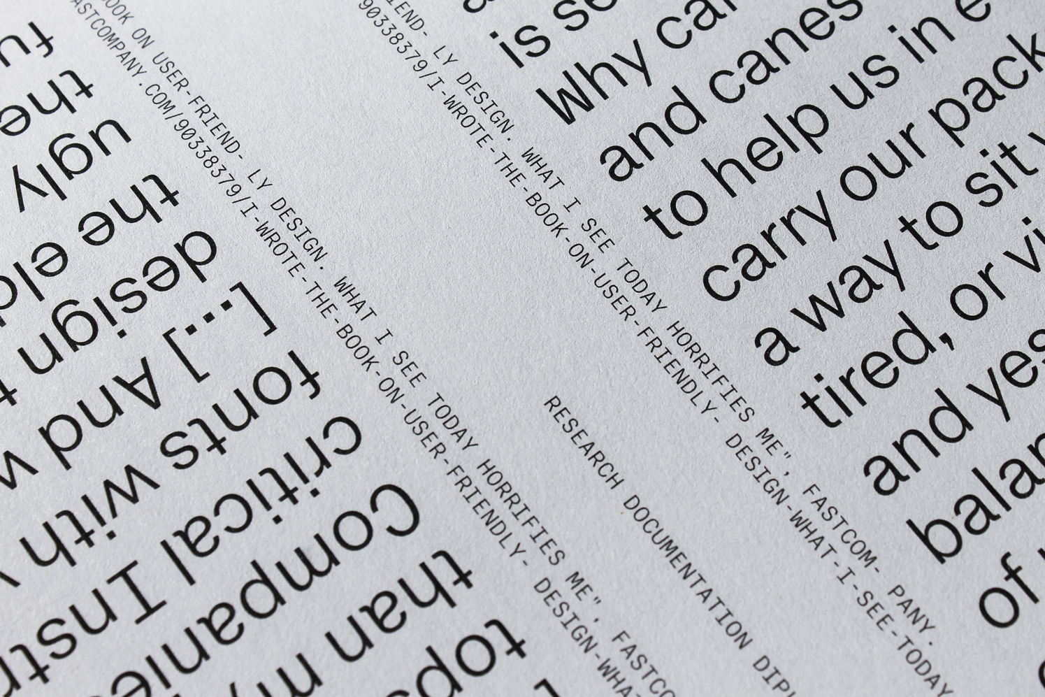
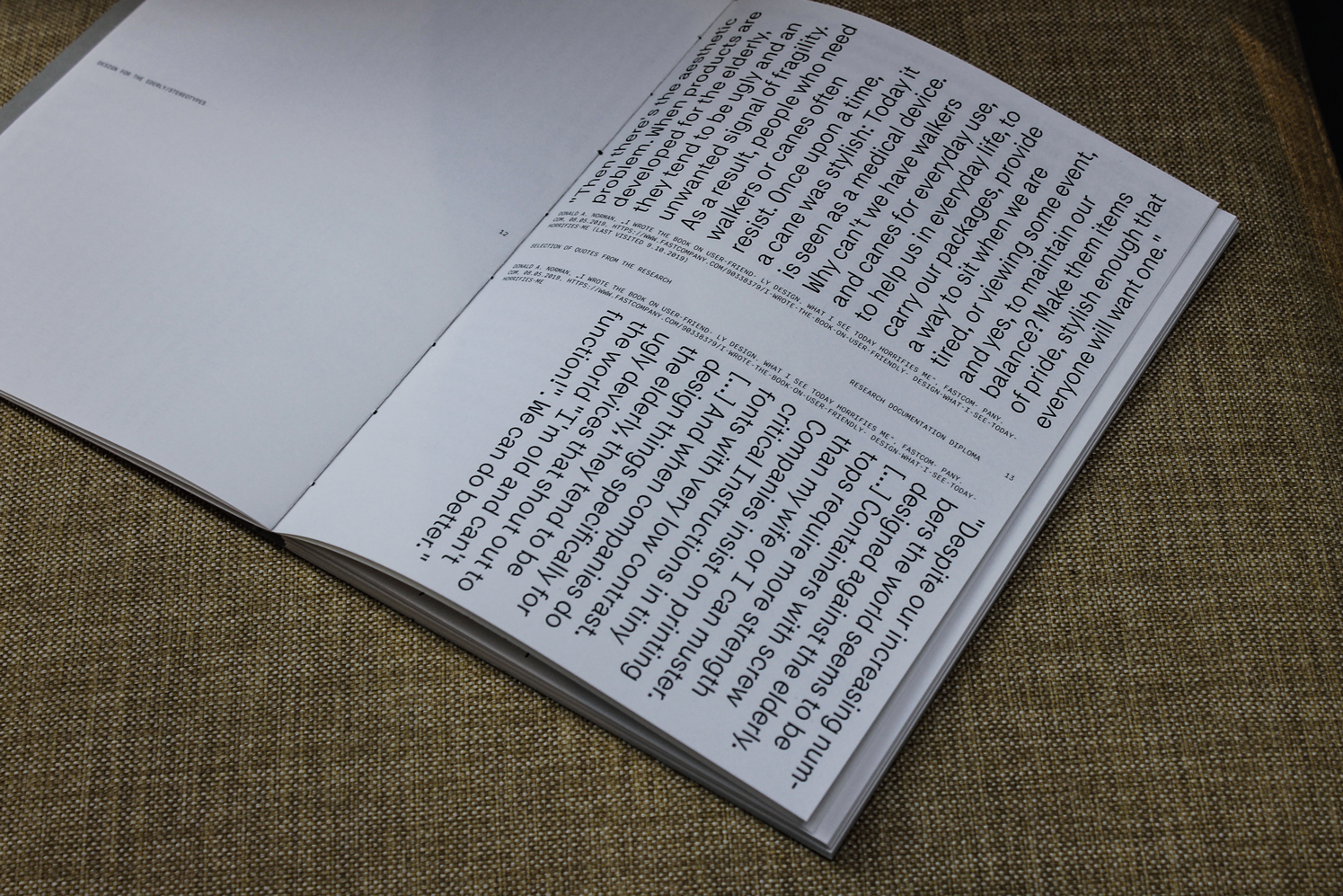
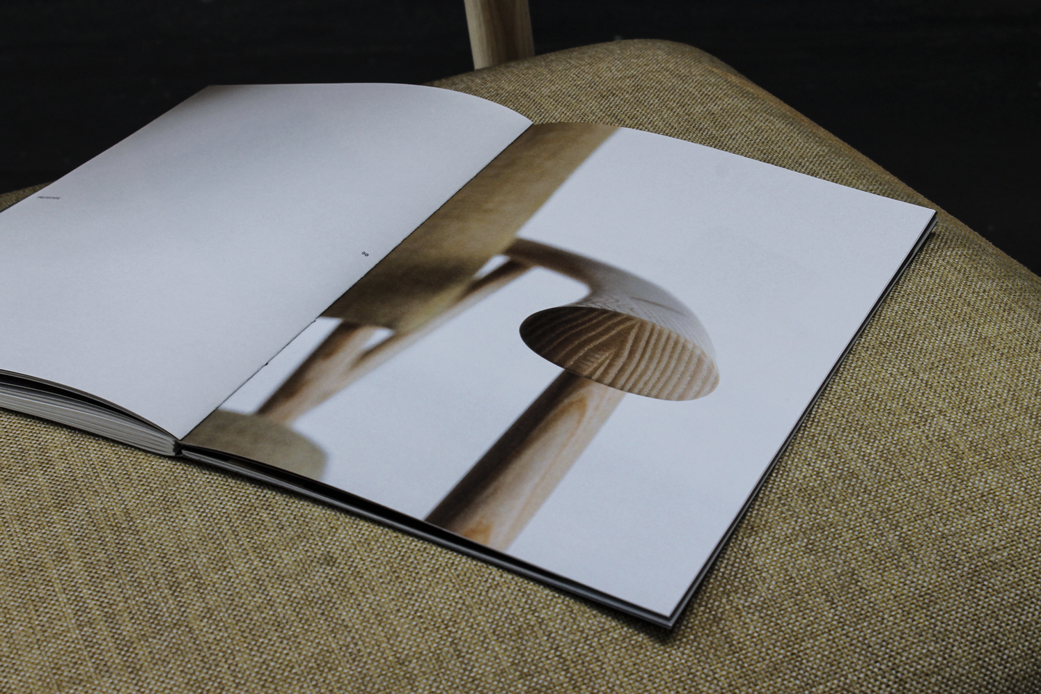
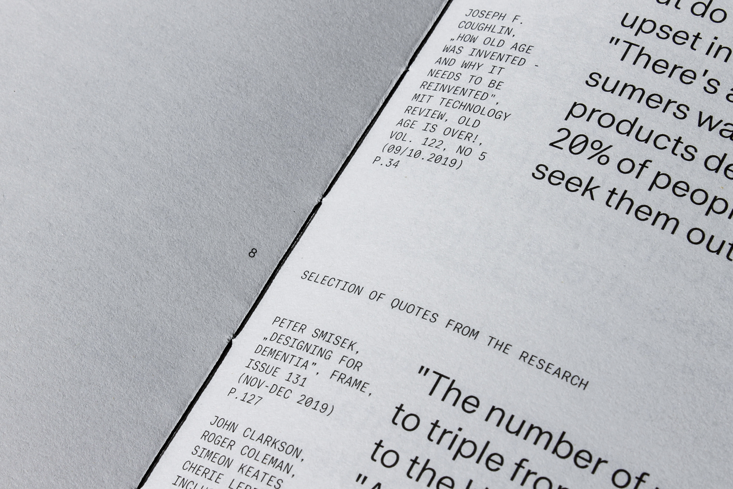
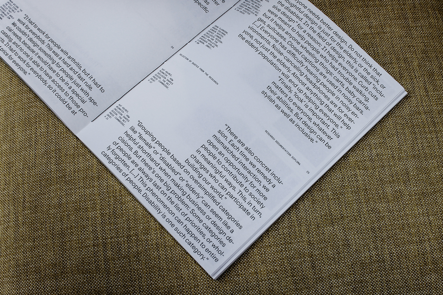
Lotte Diploma Documentation
Project documentation for Lotte – aiding independence in old age is the diploma project in the master in product design at ECAL by Sarah Hossli. We should all be able to get up and sit down on our own regardless of age or ability. However, due to age-related impairments this becomes challenging for many elderly people, limiting their freedom in everyday life. With its extended armrests that go all around and serve as a handrail, this armchair enables the user to get up intuitively in a position with minimal resistance. The design has been developed based on research carried out in care homes, prototype testing with residents, evaluations from medical and care experts, and the technical expertise of the Swiss furniture manufacturer Girsberger / Customized Furniture. The editorial design documents the process, the research and the result of this project. It reflects the with the typographic alignments on the subject matter in which it places certain elements in the centre of attention and highlights what is normally not. Typeface in use: Platte Grotesk
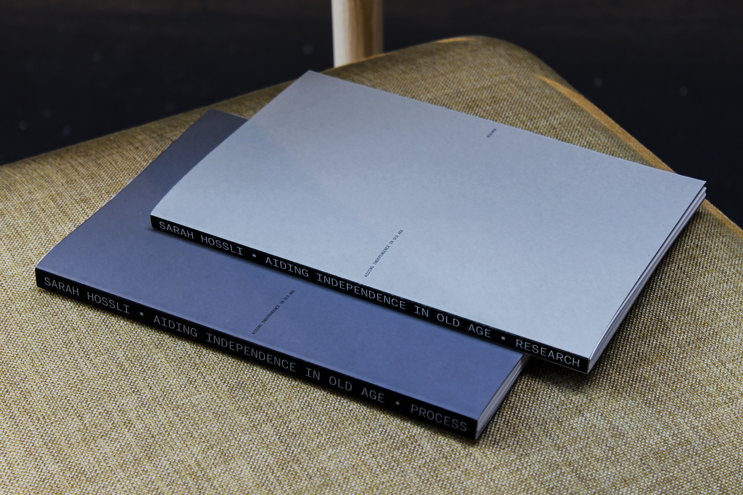
img-057 Lotte Documentation, Cover
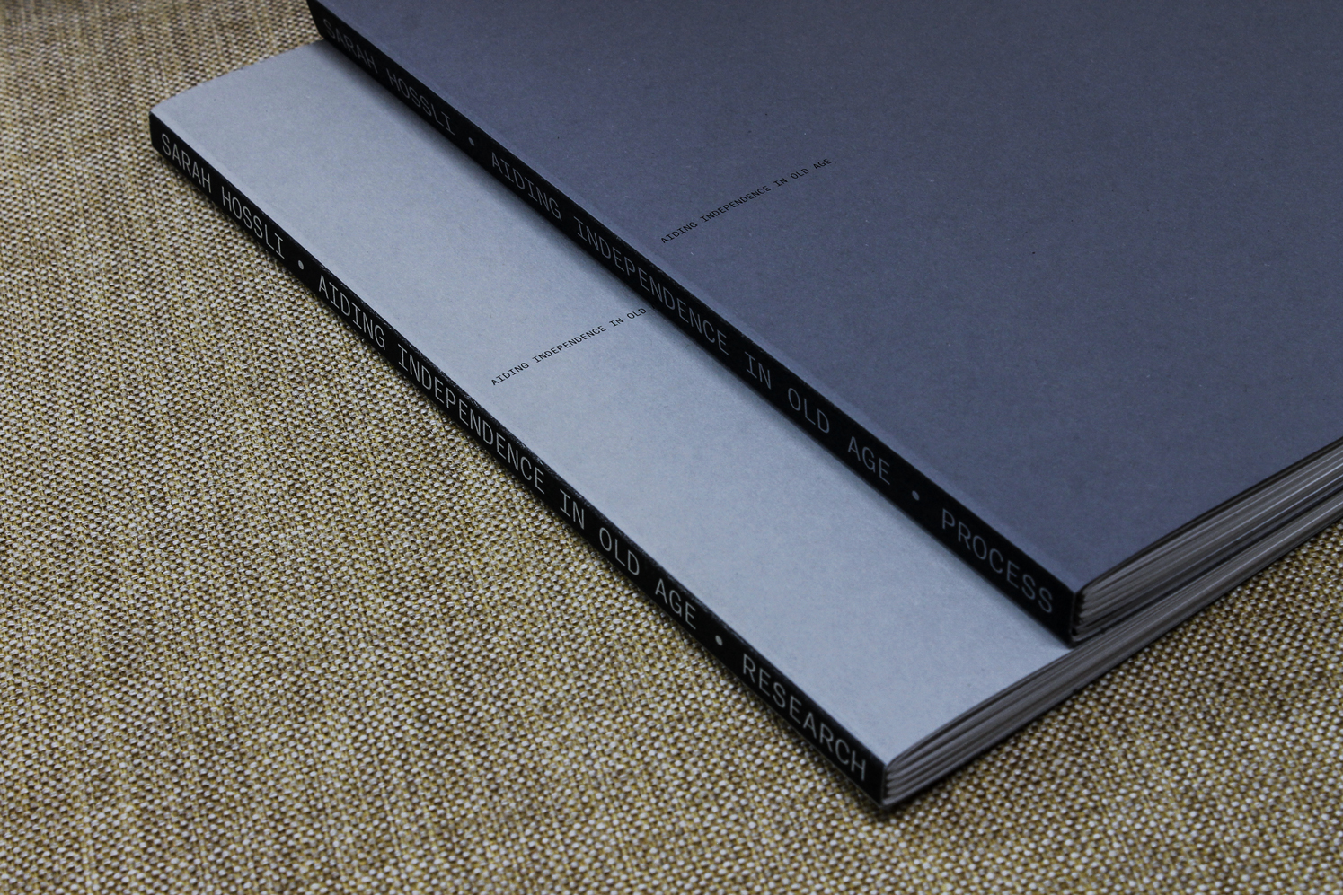
img-058 Lotte Documentation, Spine
img-059 Lotte Documentation, Closeup
img-060 Lotte Documentation, Inside Spread
img-061 Lotte Documentation, Inside Spread
img-062 Lotte Documentation, Closeup
img-063 Lotte Documentation, Inside Spread
img-064 Lotte Documentation, Inside Spread
G
Quantum
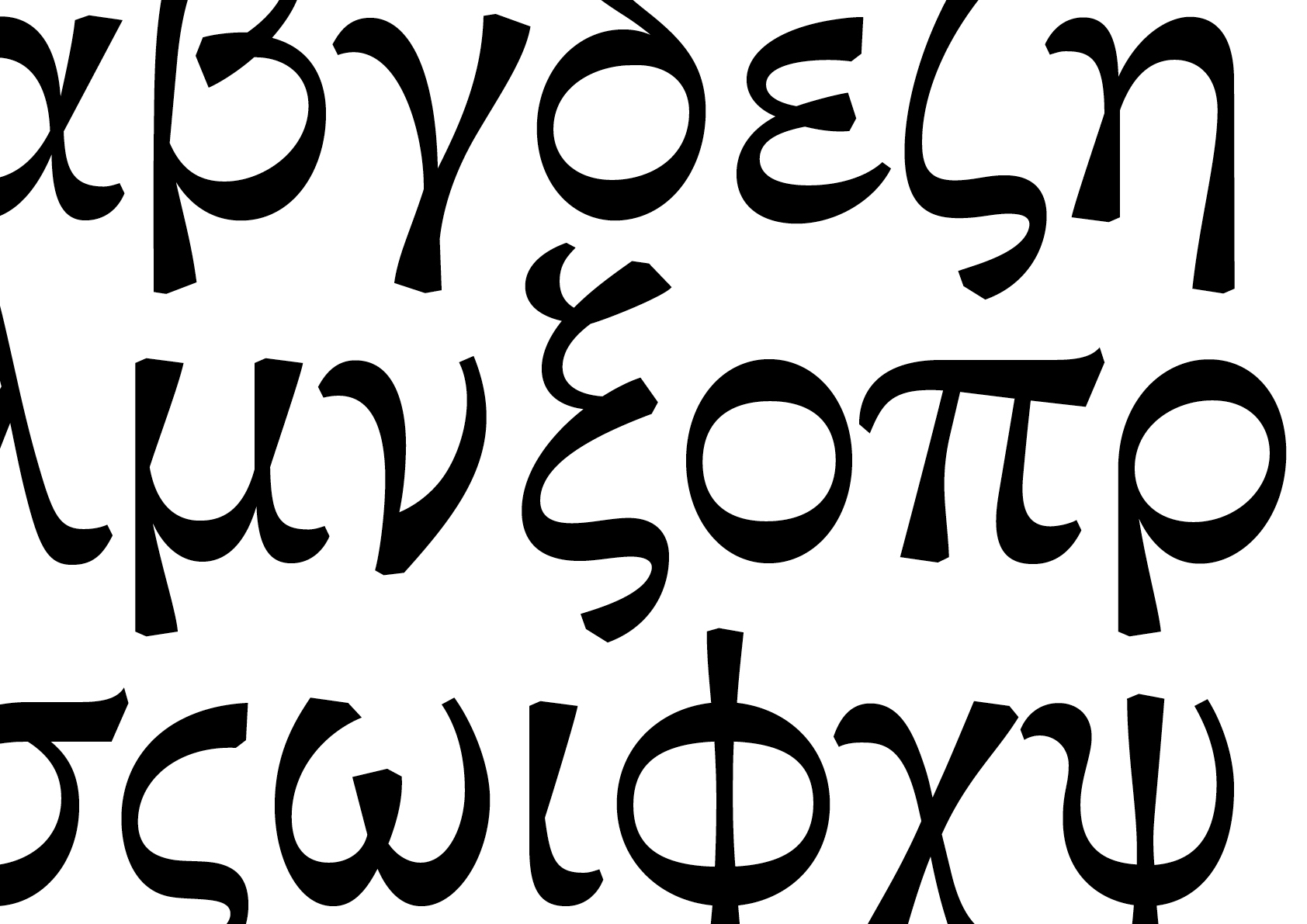
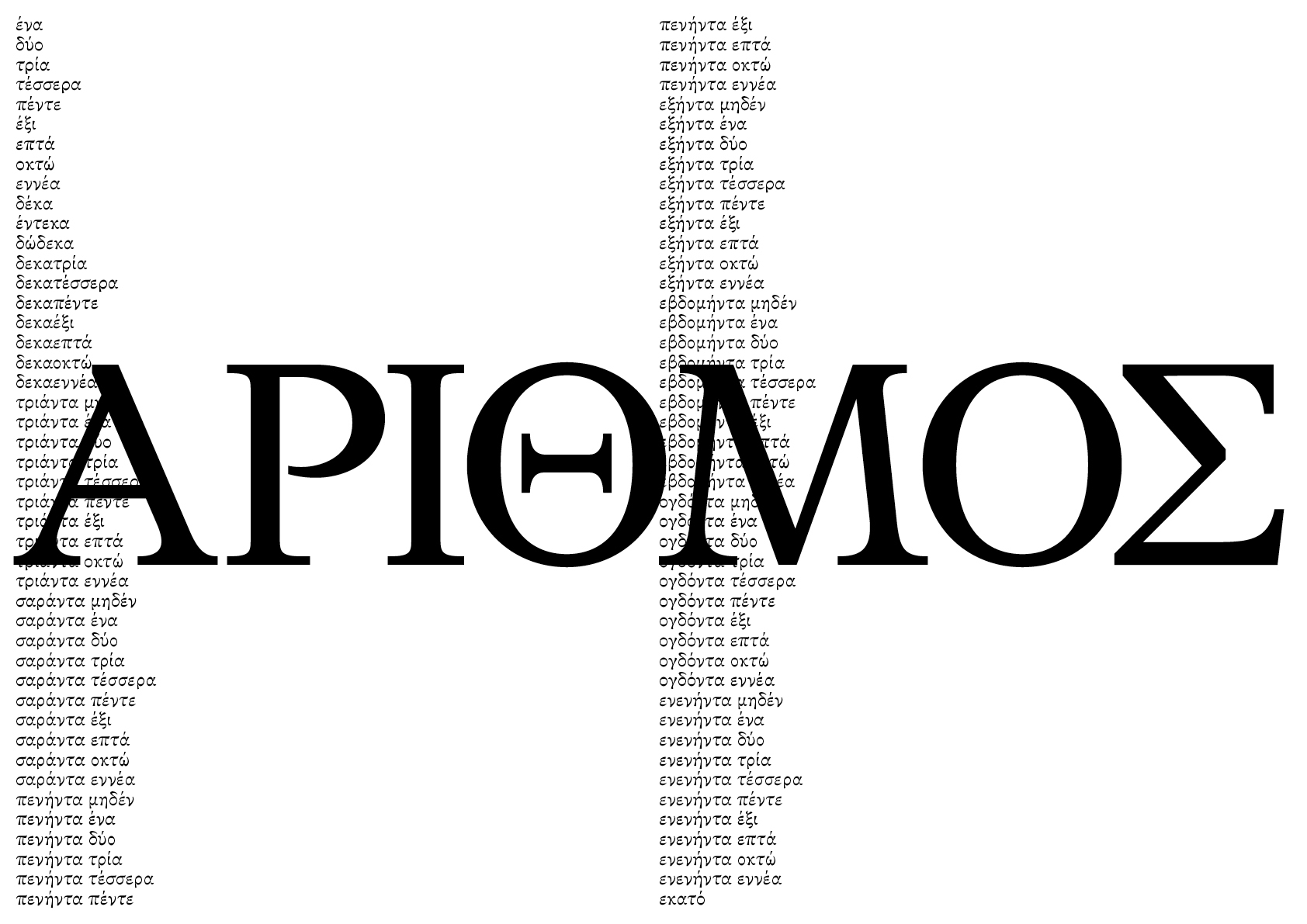
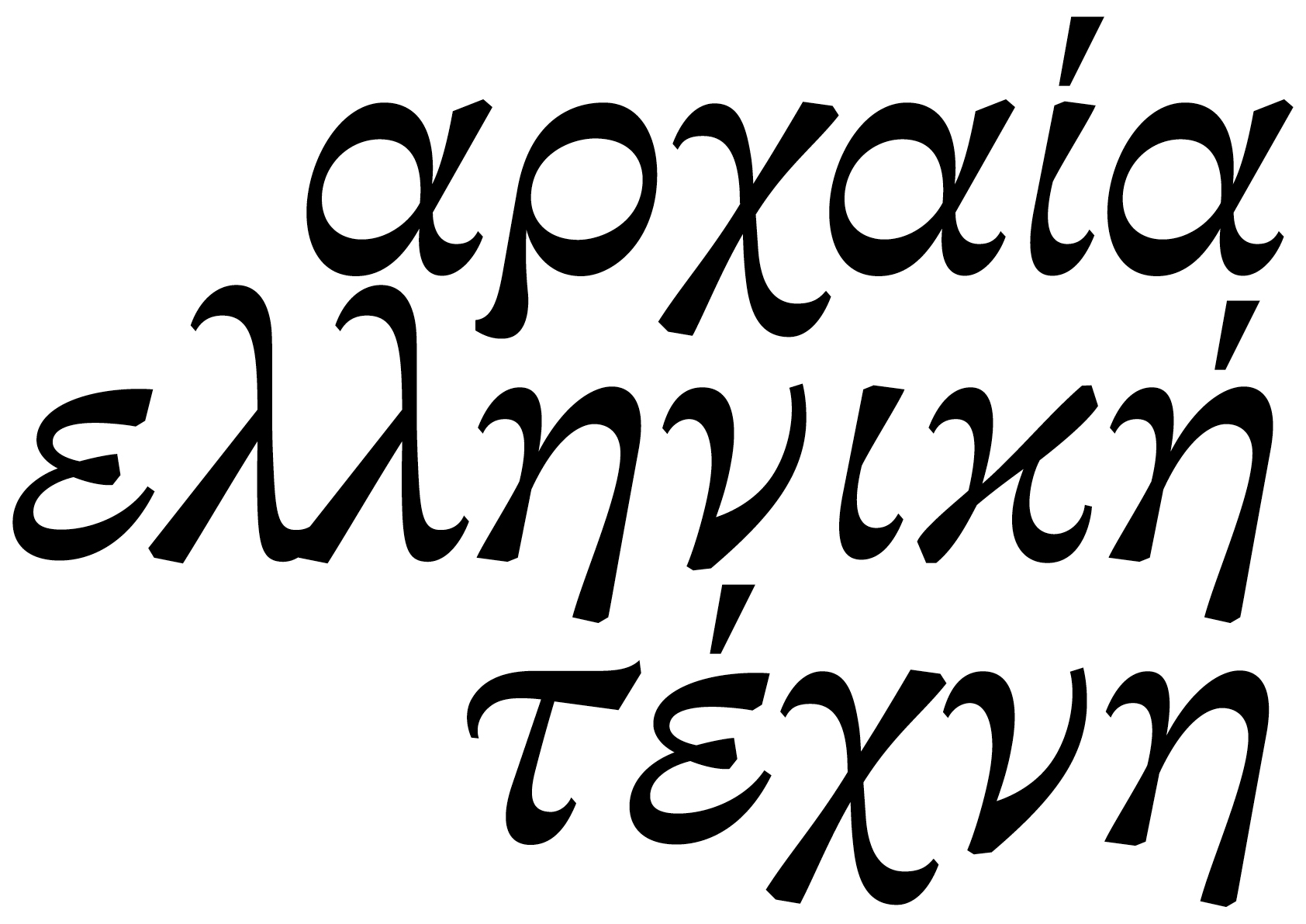
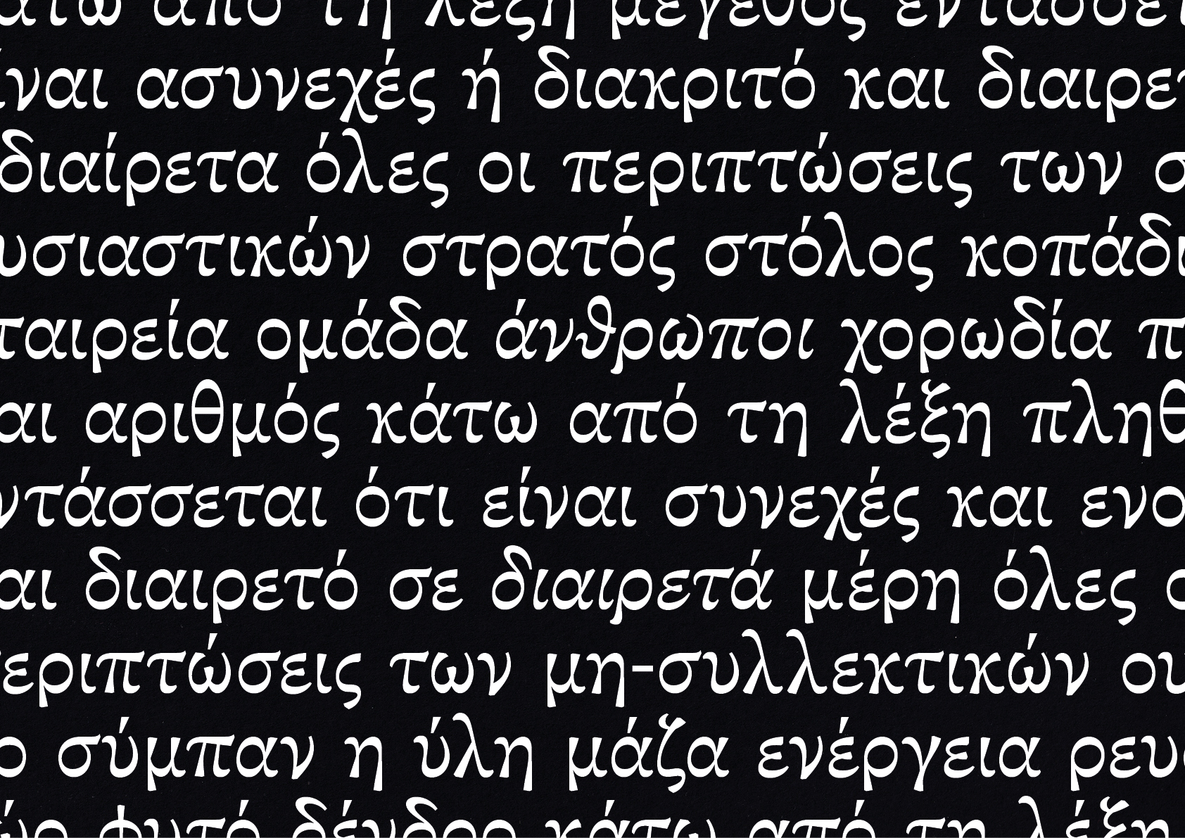
The Greek alphabet has been used to write the Greek language for centuries. It is derived from the earlier Phoenician alphabet and was the first alphabetic script in history to have distinct letters for vowels as well as consonants. Greek combines aspects of a dominant literary language, a widespread second language of exchange and trade, a revered language of sacred or banned texts, a language in exile and under occupation, an instrument of nation-building and political identity, and a vehicle for the ideas of modernity and traditionalism. This nuanced trajectory is reflected in the written and typographic forms of the language, which demands respect by typographers and typeface designers. The structure of Greek lowercase letters visualize a series of connected open loops, derived from a tools with low, almost monolinear stroke contrast. Supervised by Gerry Leonidas I developed a typeface for Greek and Latin script.
img-065 Quantum, Greek, lowercacse
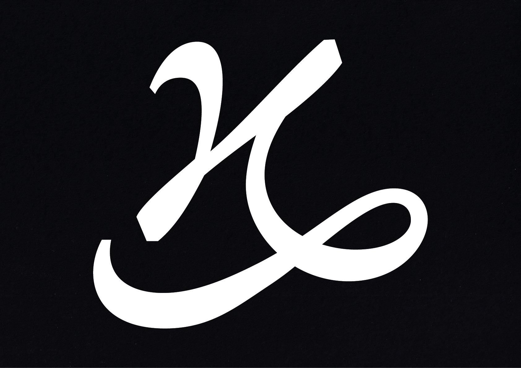
img-066 Quantum, Greek, Kai-Symbol italic
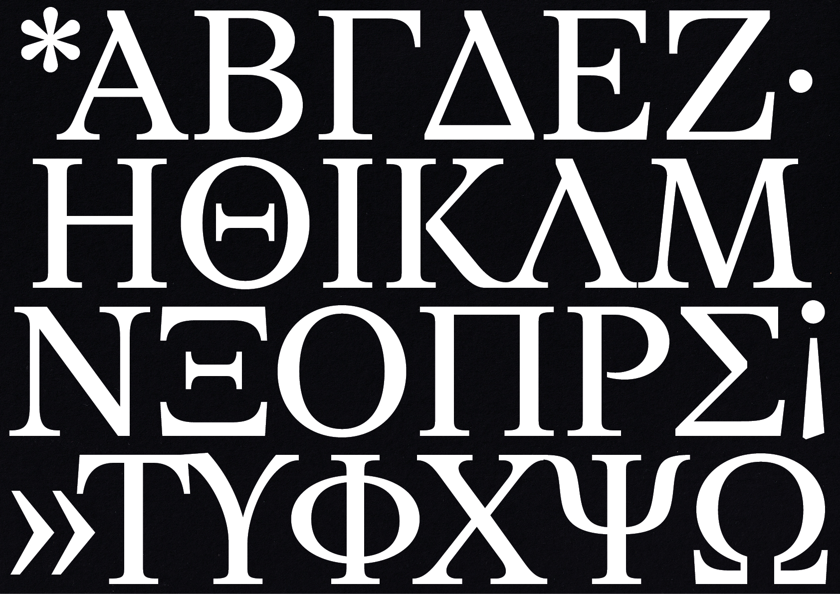
img-067 Quantum, Greek, uppercase
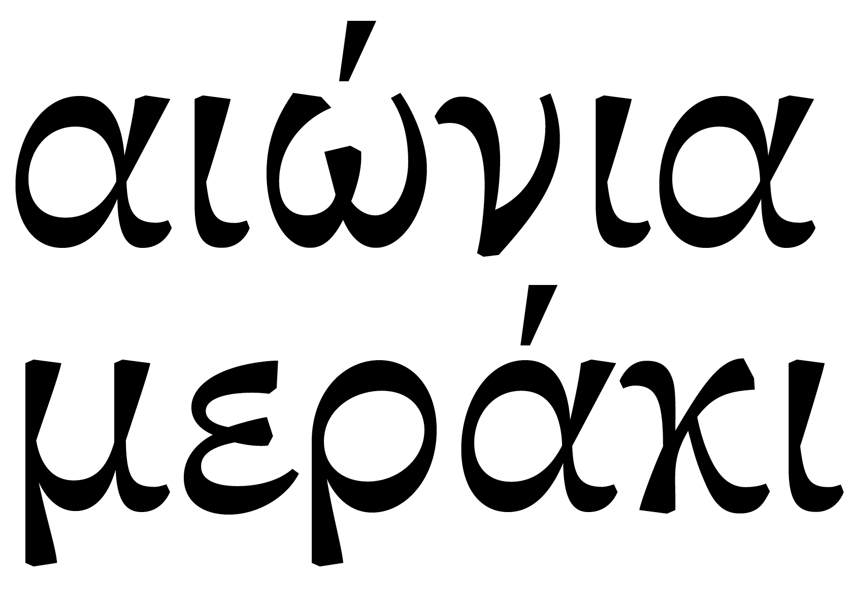
img-068 Quantum, Greek,
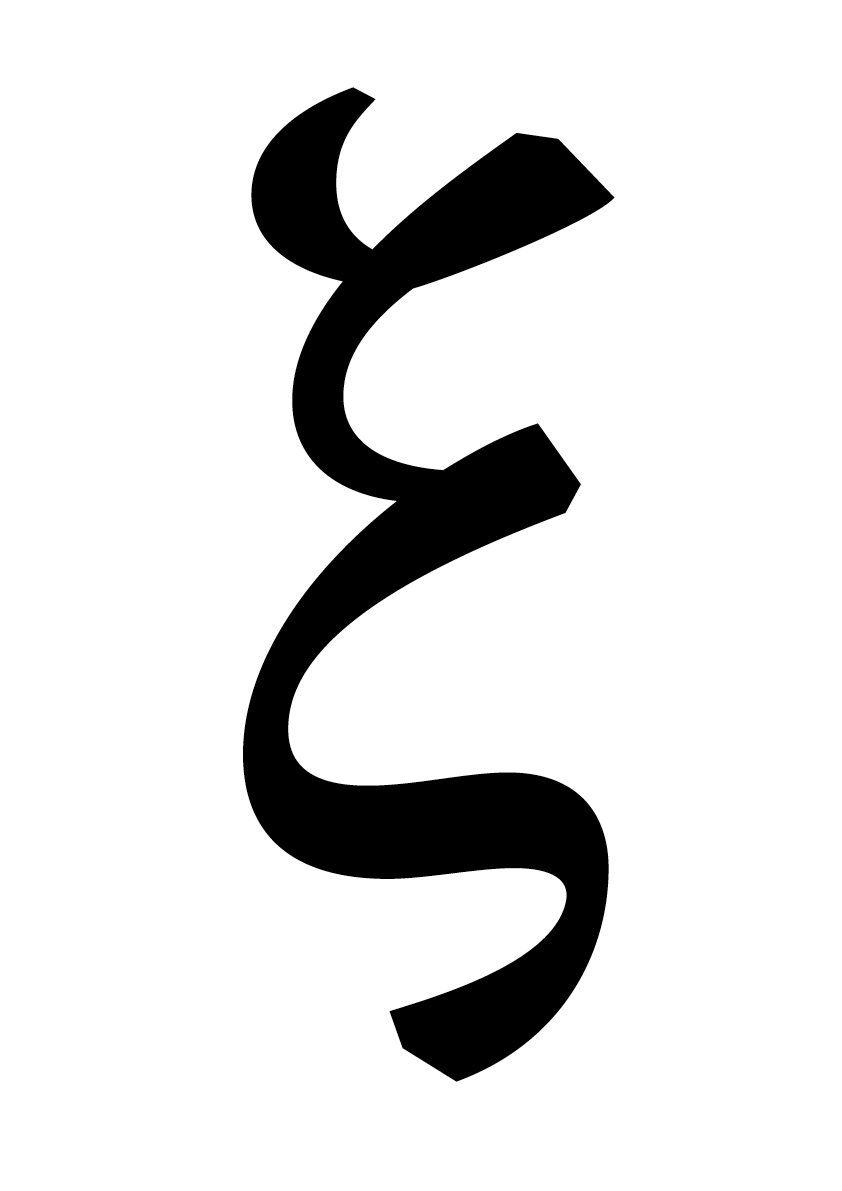
img-069 Quantum, Greek, xi
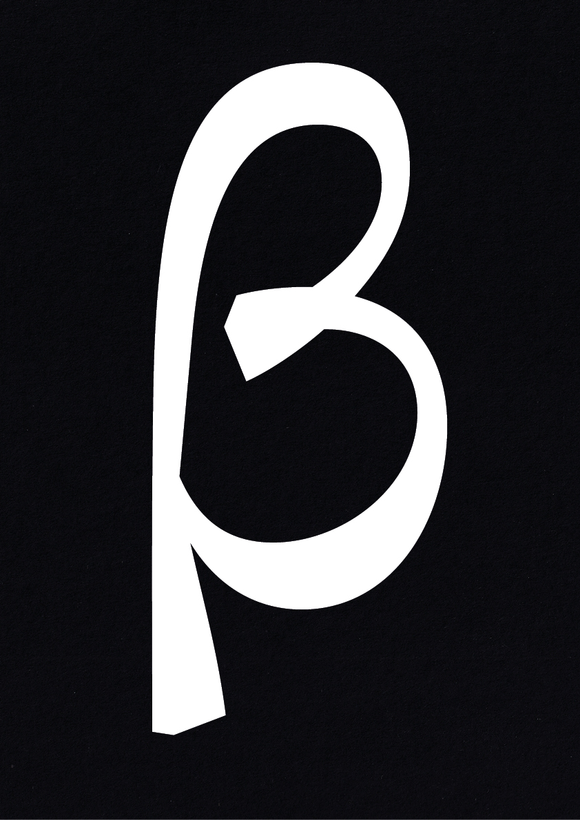
img-070 Quantum, Greek, beta
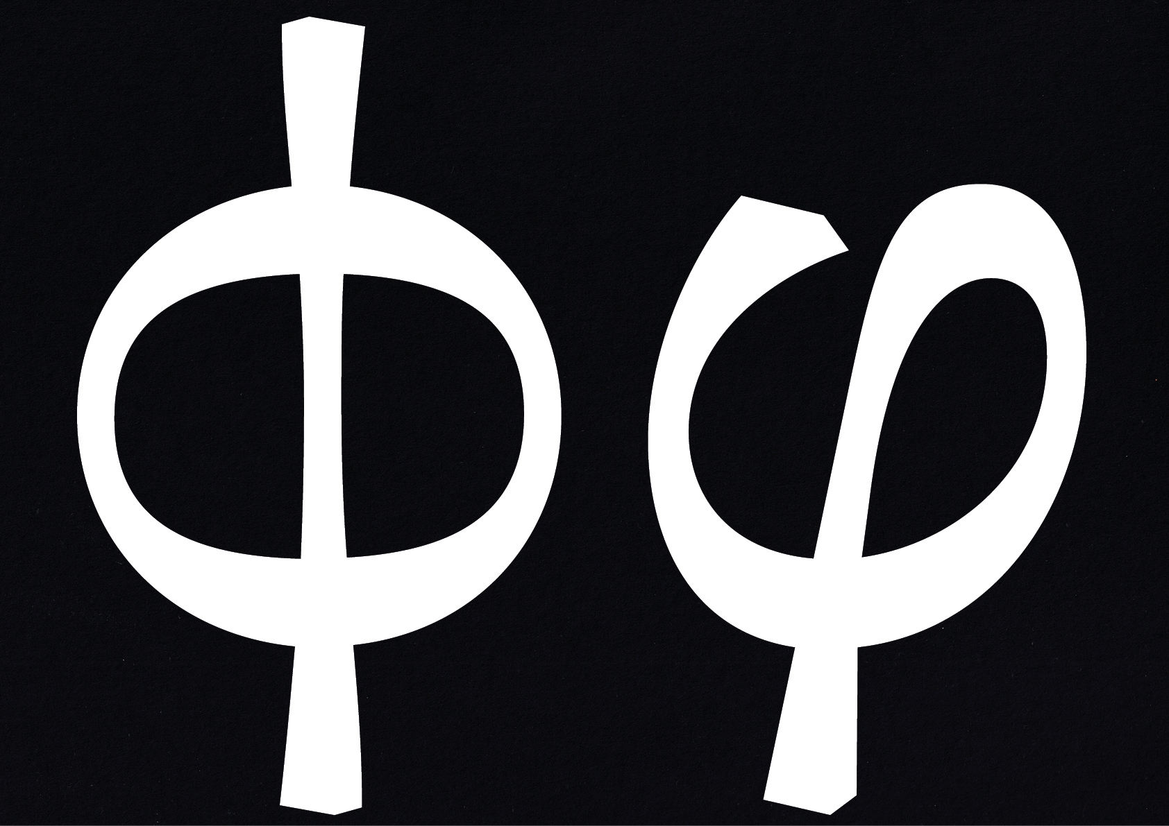
img-071 Quantum, Greek, theta, italic
img-072 Quantum, Greek
img-073 Quantum, Greek, italic
img-074 Quantum, Greek
H
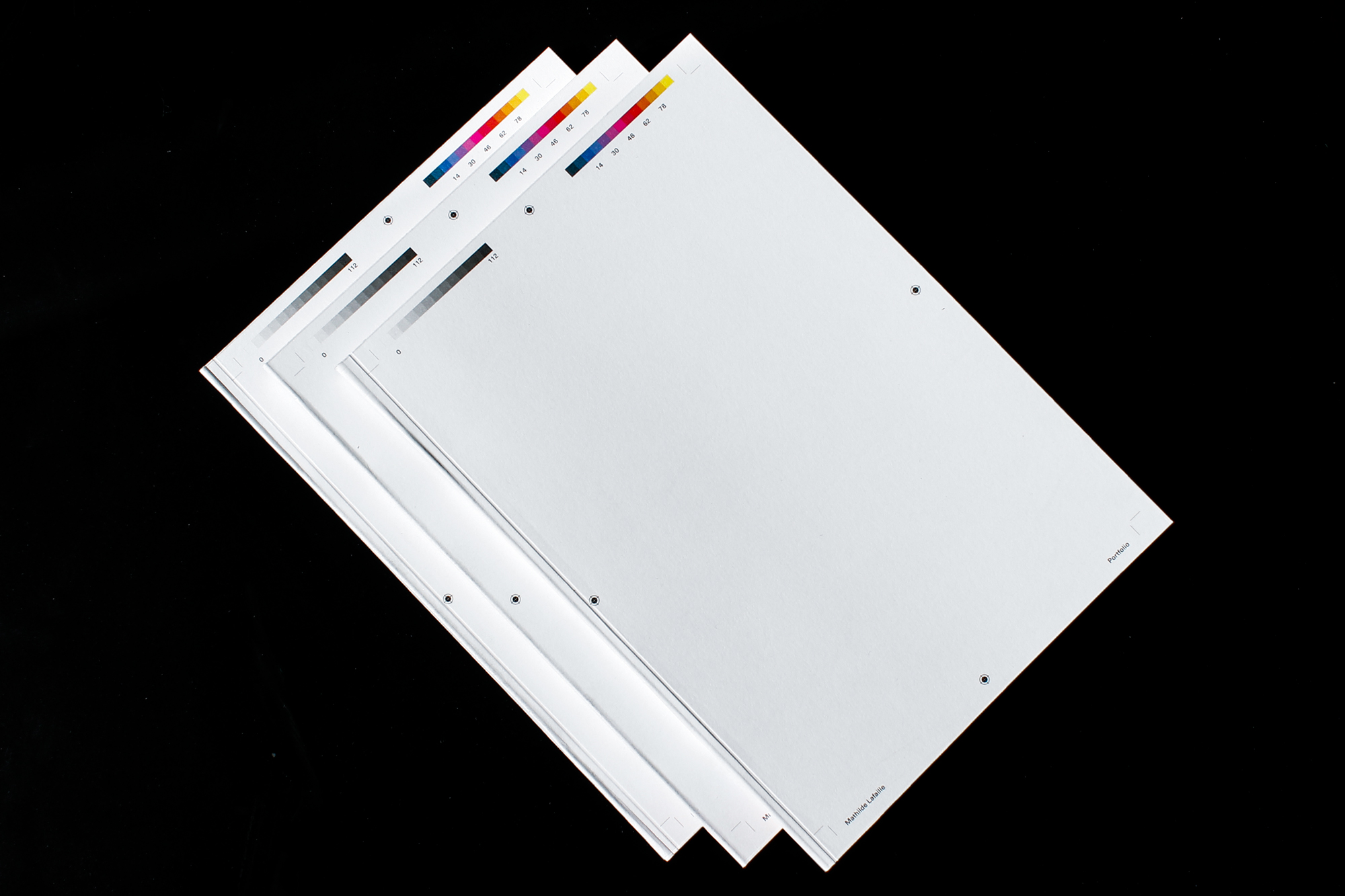
Mathilde Lafaille Portfolio
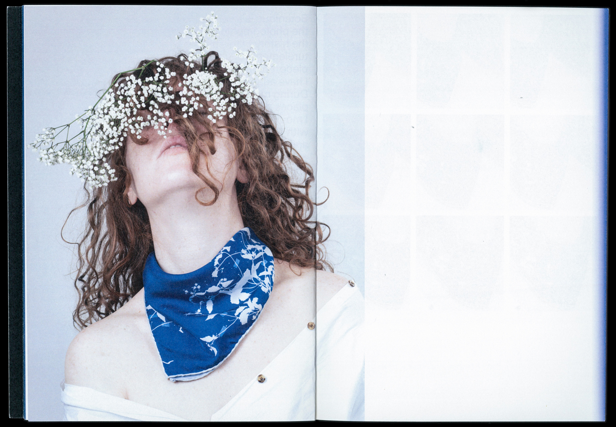
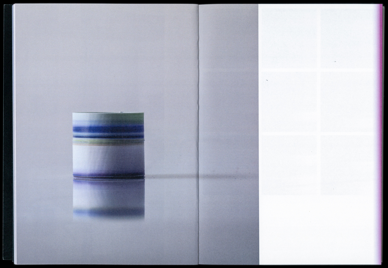
A phenomenon of light. Visual perception that enables one to differentiate something otherwise identical looking. Defining quality of an object or substance by light reflected by the object. The portfolio of the French product designer Mathilde Lafaille was created with the intention to mirror her lively and colorful work and personality. Mathilde has an artistic and experimental approach to objects. Her practice through design is playful, intuitive, and poetic. She is interested in the relationship between objects and visual art. It seems to her that objects are small creatures living and interacting with us and can change our perception of our daily life. Her work distinguishes itself by the sensitivity of colors and processes in design. The spectrum of colors used in this book serve as an index of the portfolio and bestow each project an individual signature. The colors guide the viewer through the book, so to speak, and resonate the aura of each project it contains.
img-075 Mathilde Lafaille Portfolio, Cover
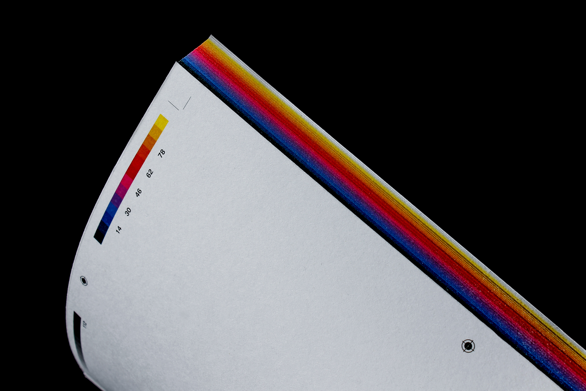
img-076 Mathilde Lafaille Portfolio, book edge
img-077 Mathilde Lafaille Portfolio, Inside
img-078 Mathilde Lafaille Portfolio, Inside Spread
img-079 Mathilde Lafaille Portfolio, Inside Spread
img-080 Mathilde Lafaille Portfolio, Inside Spread
img-081 Mathilde Lafaille Portfolio, Inside Spreads, Gradients
img-082 Mathilde Lafaille Portfolio, Inside Spread
img-083 Mathilde Lafaille Portfolio, Inside Spread
img-084 Mathilde Lafaille Portfolio, Inside Spread
I
Relentless Type Generator
There are thousands of fonts of which every day more are born into the worlds of design. With over 900 fonts, Google Fonts floods the space of typography, especially in web design. However, Google Fonts is a free database that can be used for new purposes. Together with Simon Liétar, I was able to develop a digital tool using Javascript that generates countless typefaces from existing fonts. Fifty typefaces from Google Fonts were used as a database, which were selected by stylistic means. All fonts included can all be interpolated simultaneously to create a randomized and individuell typeface. This means that not only the average of all typefaces is calculated and visualized, but that each font can be given a different value within the interpolation. The number of letterforms possible in purely mathematical terms is in the millions. Each of these fonts can be easily downloaded from this web tool as OTF. A finished individual typeface without the touch of a finger.
img-085 Relentless Type Generator, Website
img-086 Relentless Type Generator, overlapping Master
img-087 Relentless Type Generator, overlapping Master
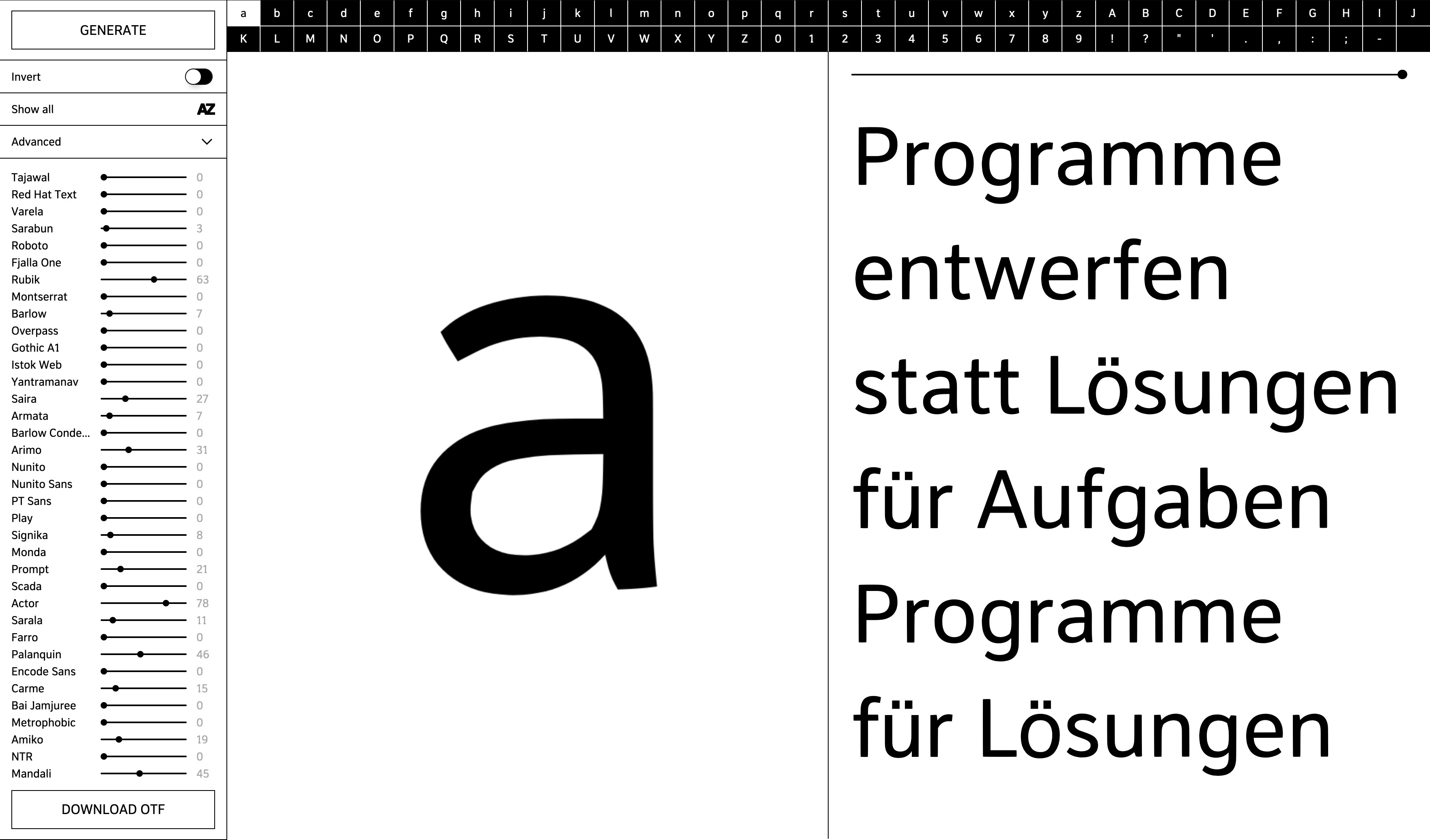
img-088 Relentless Type Generator
img-089 Relentless Type Generator
img-090 Relentless Type Generator, overlapping Master
J
Avant Apres
This Project originated in a workshop led by Karl Nawrot, which was articulated around a predefined object of study titled Böcklin Zoo, in reference to a song by the infamous rapper Ol' Dirty Bastard. The workshop centered on the typeface Arnold Böcklin from Schriftgiesserei Otto Weisert (1904), which in turn was named after the Symbolist Swiss painter Arnold Böcklin. Arnold Böcklin was a Swiss painter, draftsman, graphic artist and sculptor of Symbolism. He is considered one of the most important artists of the 19th century. The Arnold Böcklin typeface is one of the most famous typefaces of Art Nouveau and is characterized by its floral forms. It was created for use in large type sizes. Decorative appearance was more important than legibility. The typeface had great significance for Art Nouveau book design, and was rediscovered in the 1960s and 1970s. The result of the workshop is a giant handprinted composition done in collaboration with Alex Lescieux and Karima Deghayl.
img-091 Avant Apres, Video

img-092 Avant Apres, Letter selection
img-093 Avant Apres, application
img-094 Avant Apres, pulling up, Video
img-095 Avant Apres, Character proofing
img-096 Avant Apres, application
K
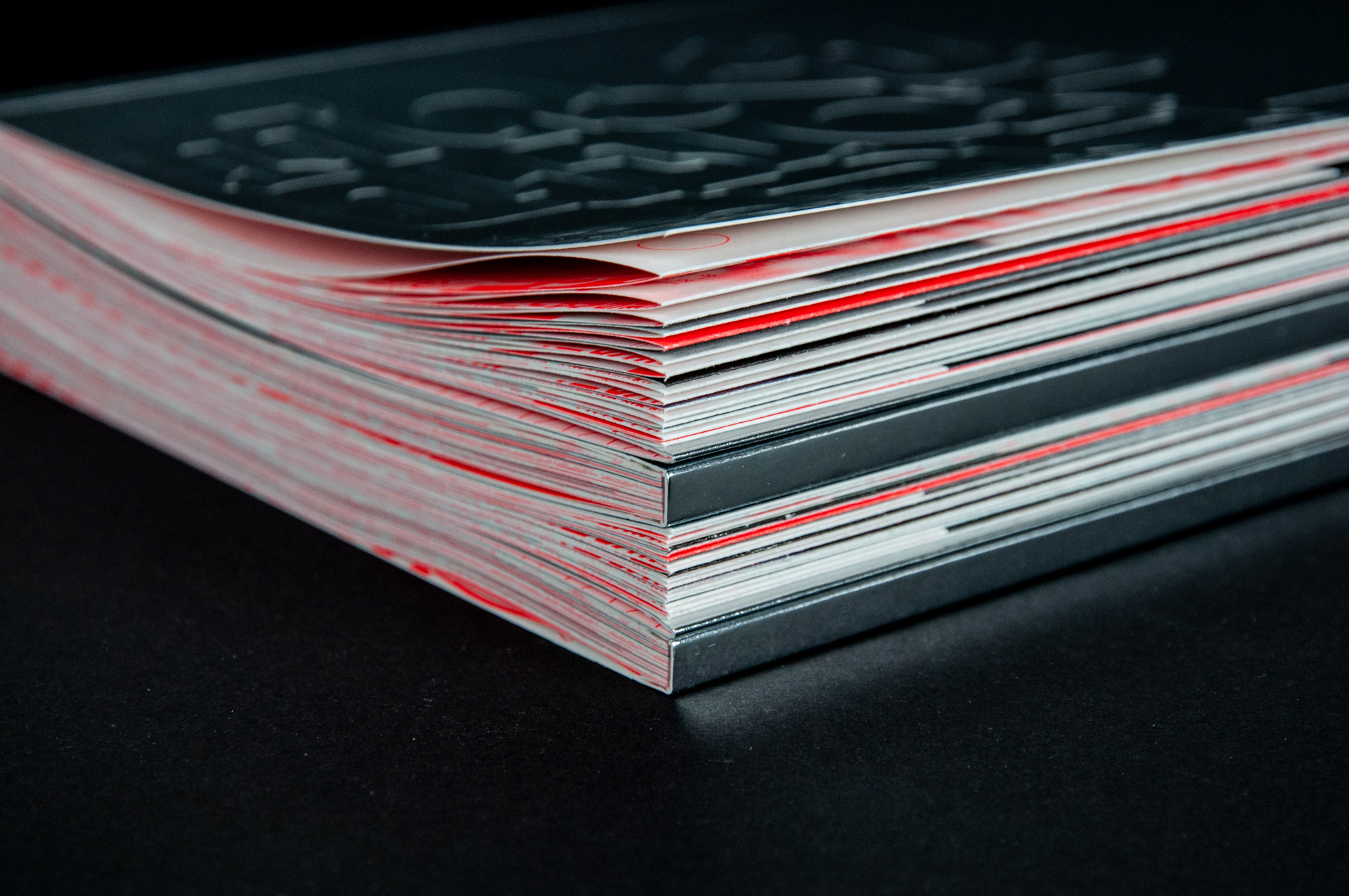
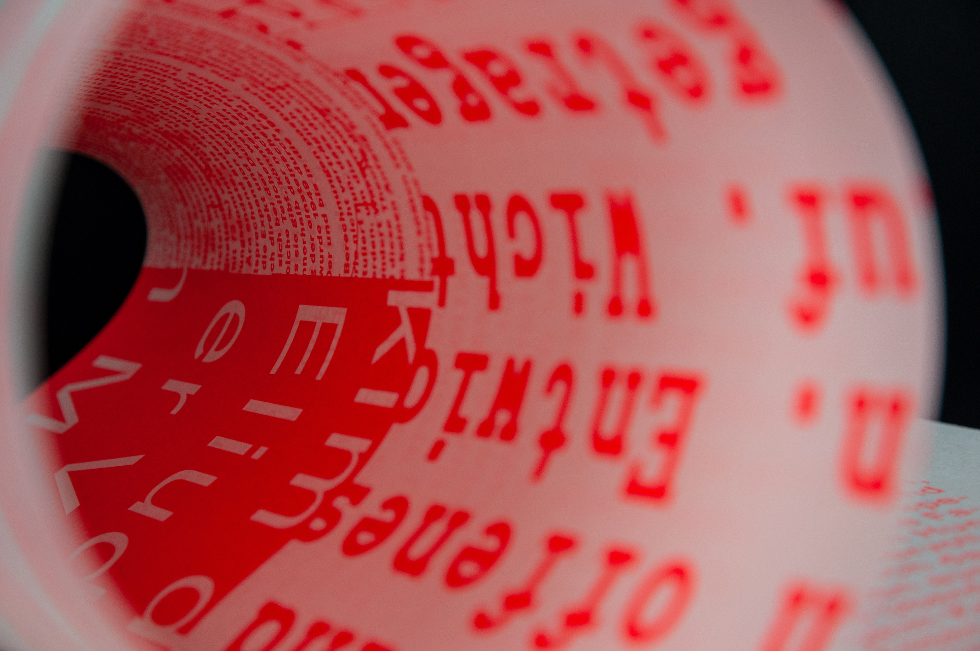
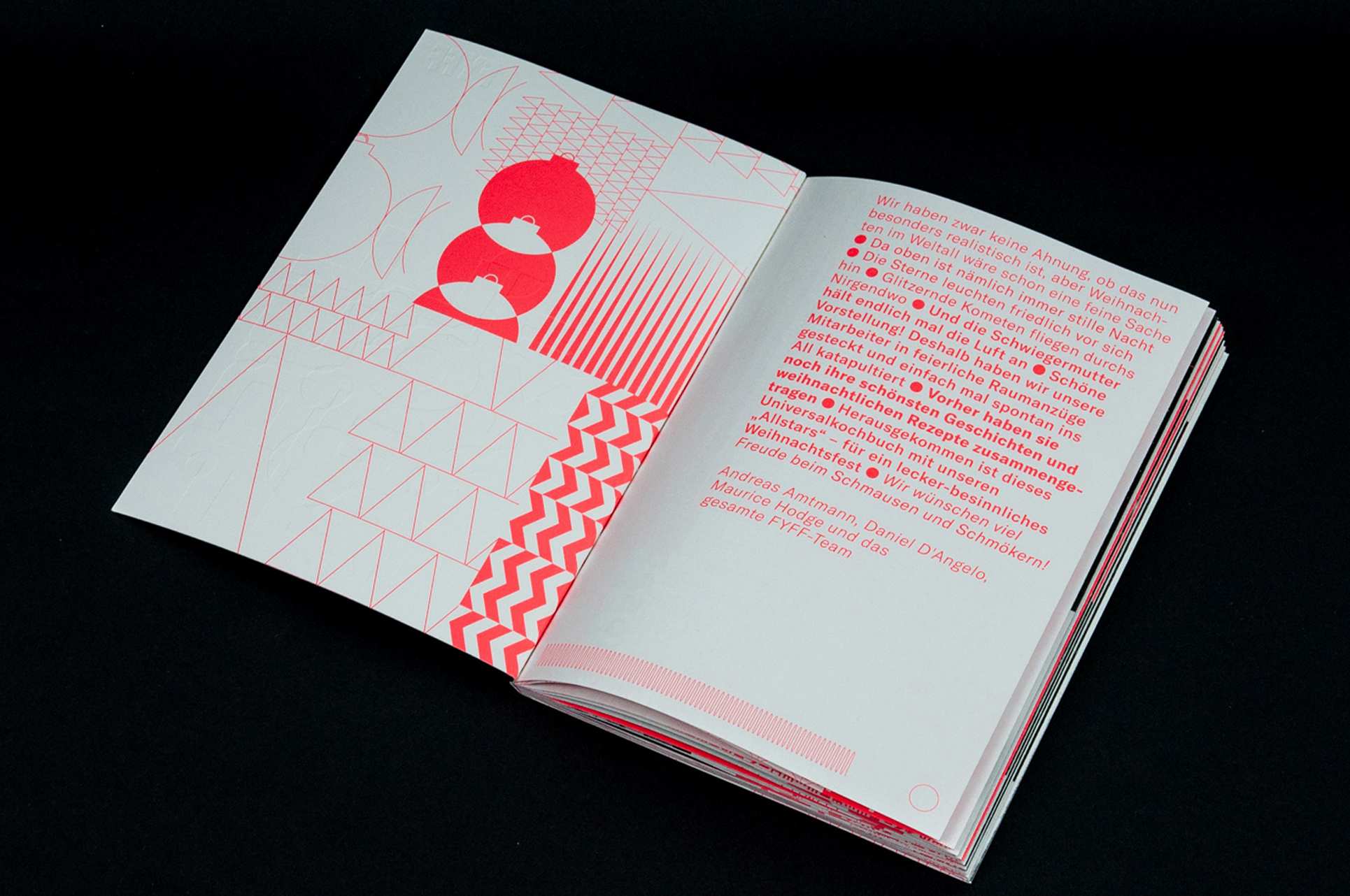
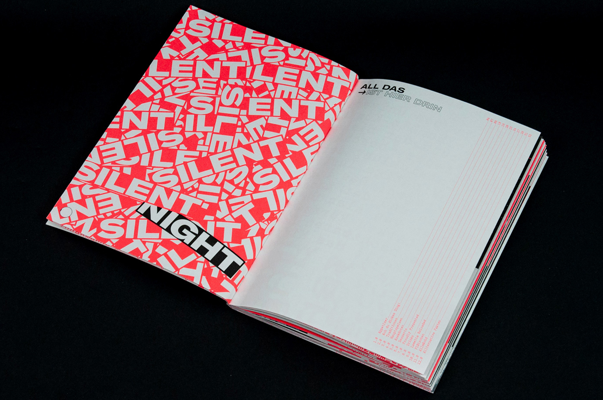
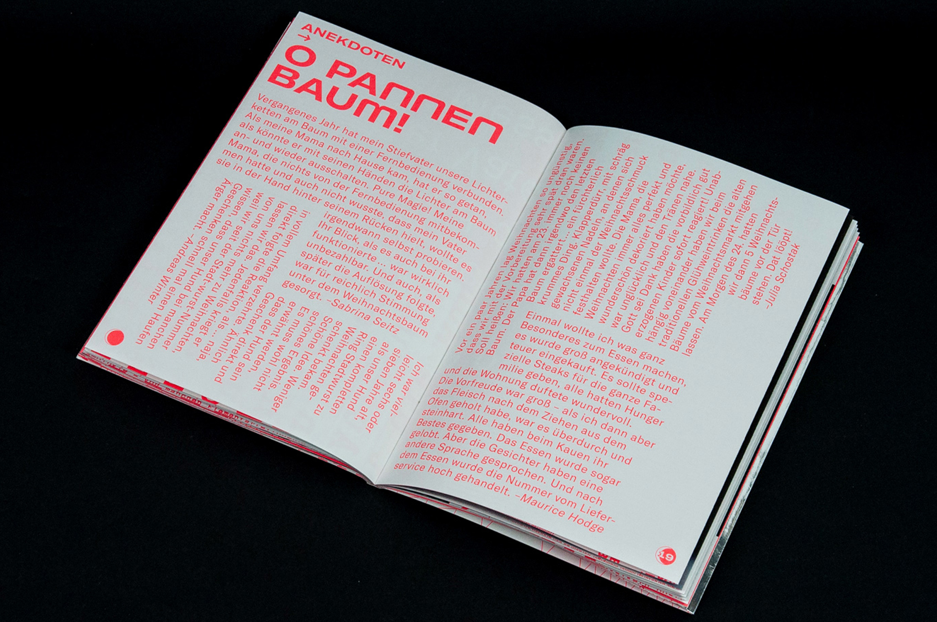
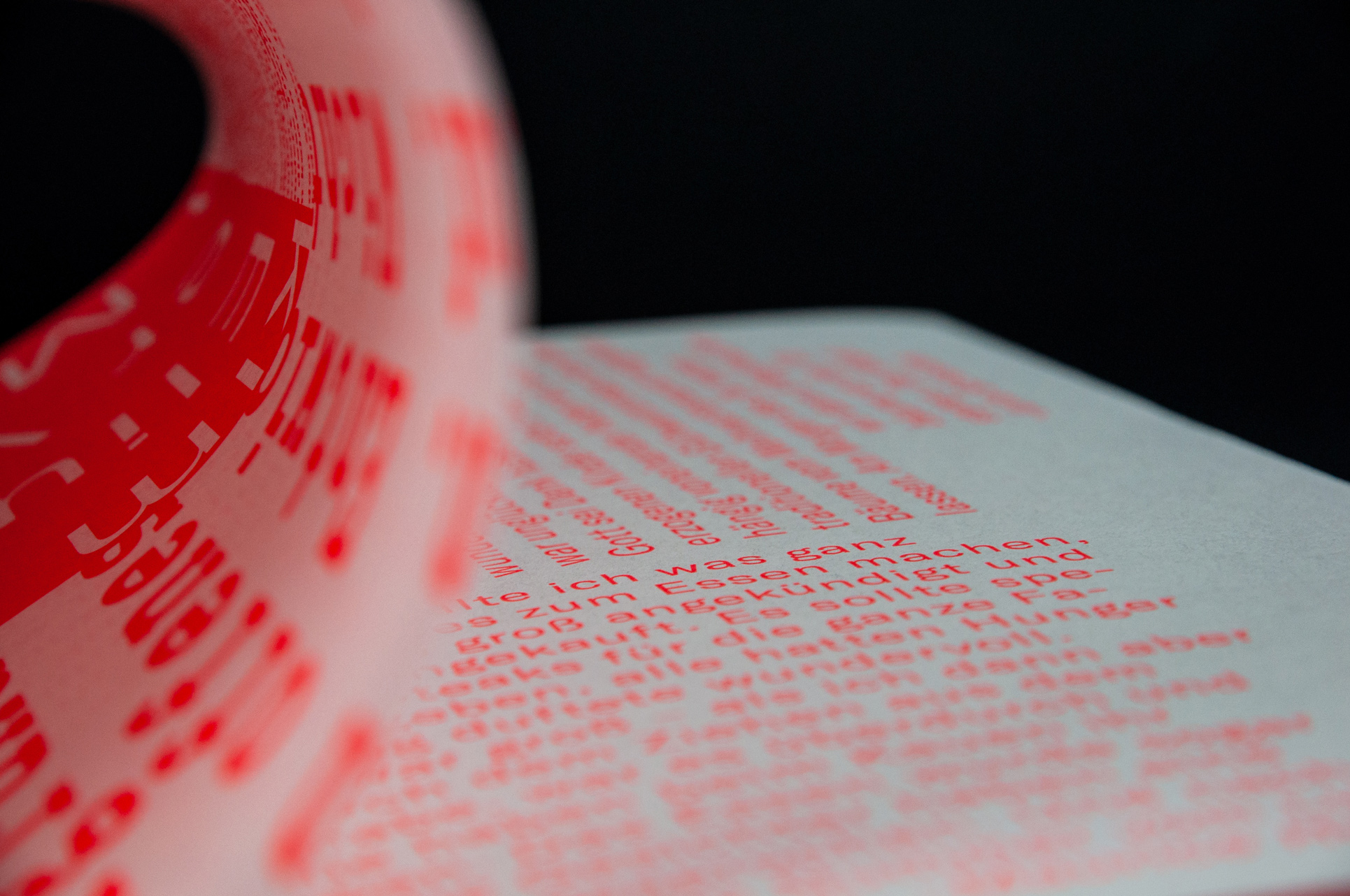
AYCE
Christmas in outer space. Even if this premise seems quite unrealistic, it served as the basis for a visual and creative exploration. By setting up an absurd scenario, a framework was established that does not allow for conventional design. One is thereby forced to take new paths, which one did not consider before. The result could be seen as a design study that tries to find creative solutions for an existing result. The outcome is a christmas/employee/recipe book of Bureau FYFF in Nuremberg. With the help of Photoshop collages, programmed design, typographic experiments, the recipes and Christmas stories of individual employees were presented. Through various finishes such as a vacuum mailing bag made of chrome, blind embossing, chrome cover and neon panton printing, the client's gift was given a unique and futuristic appearance. The project was done in collaboration with various employees of Bureau FYFF in 2018.
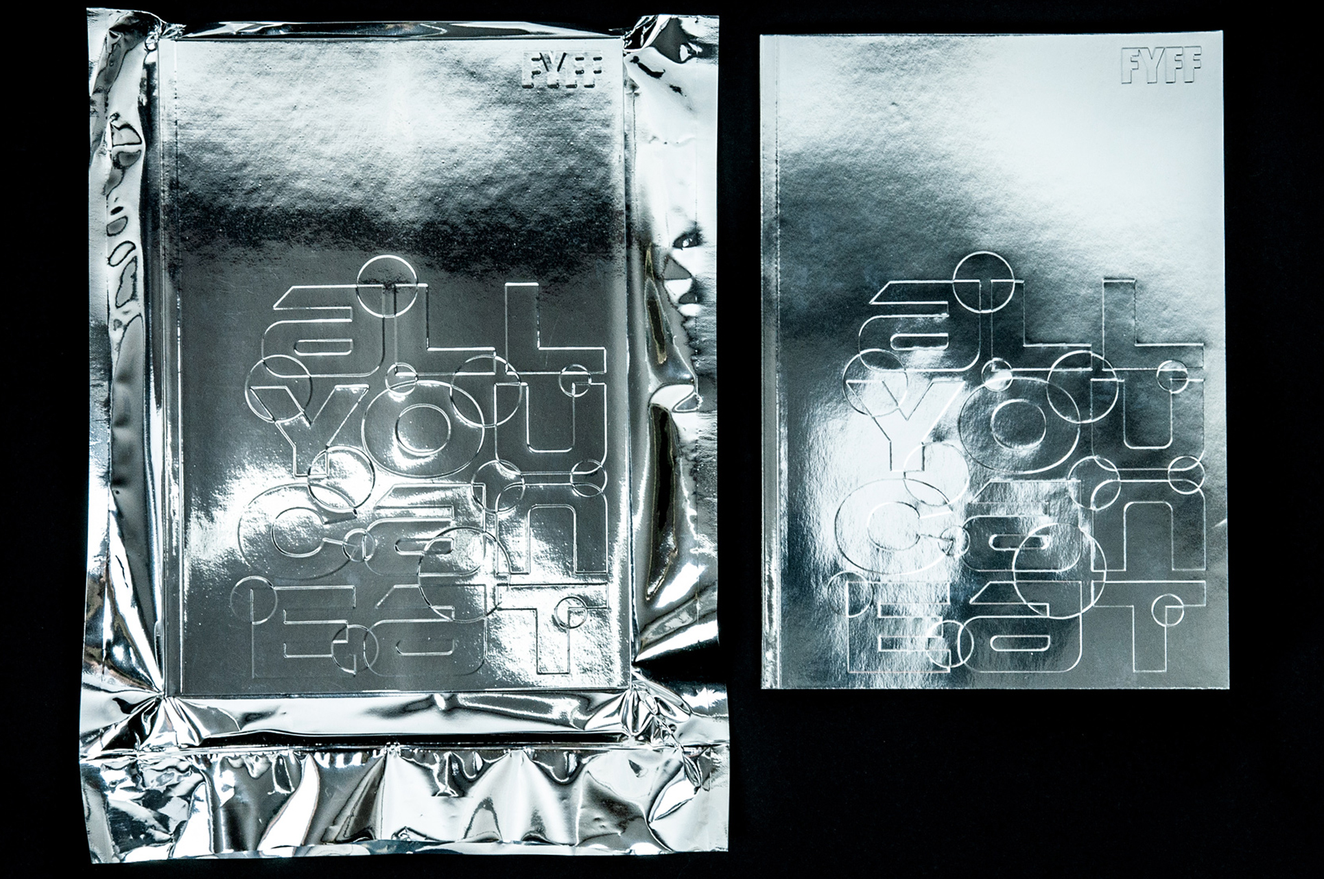
img-097 AYCE, Cover
img-098 AYCE, Closeup
img-099 AYCE, Closeup
img-100 AYCE, Inside Spread
img-101 AYCE, Inside Spread
img-102 AYCE, Inside Spread
img-103 AYCE, Closeup
img-104 AYCE, Closeup
img-105 AYCE, Closeup
img-106 AYCE, Closeup
L
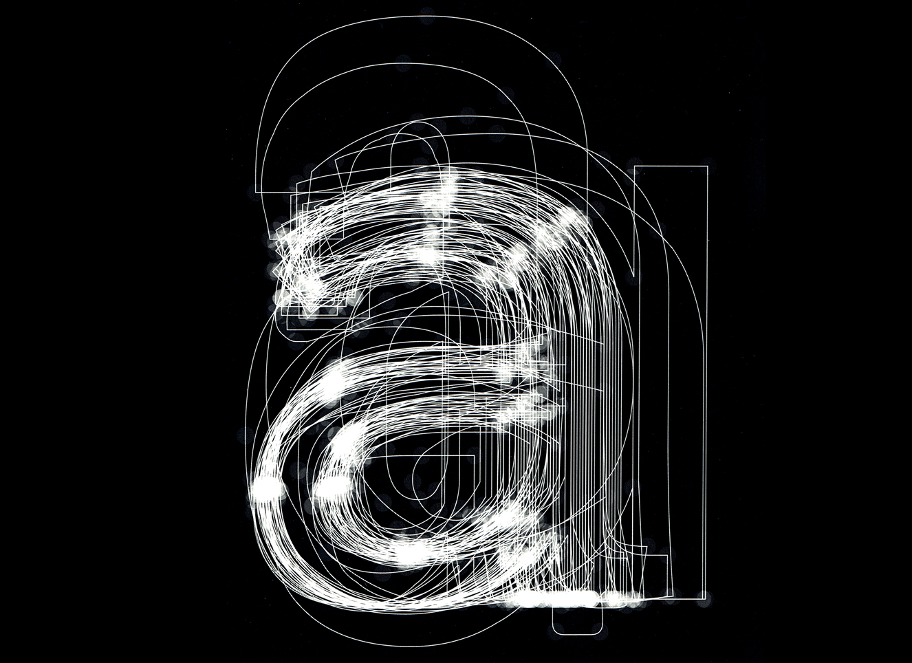
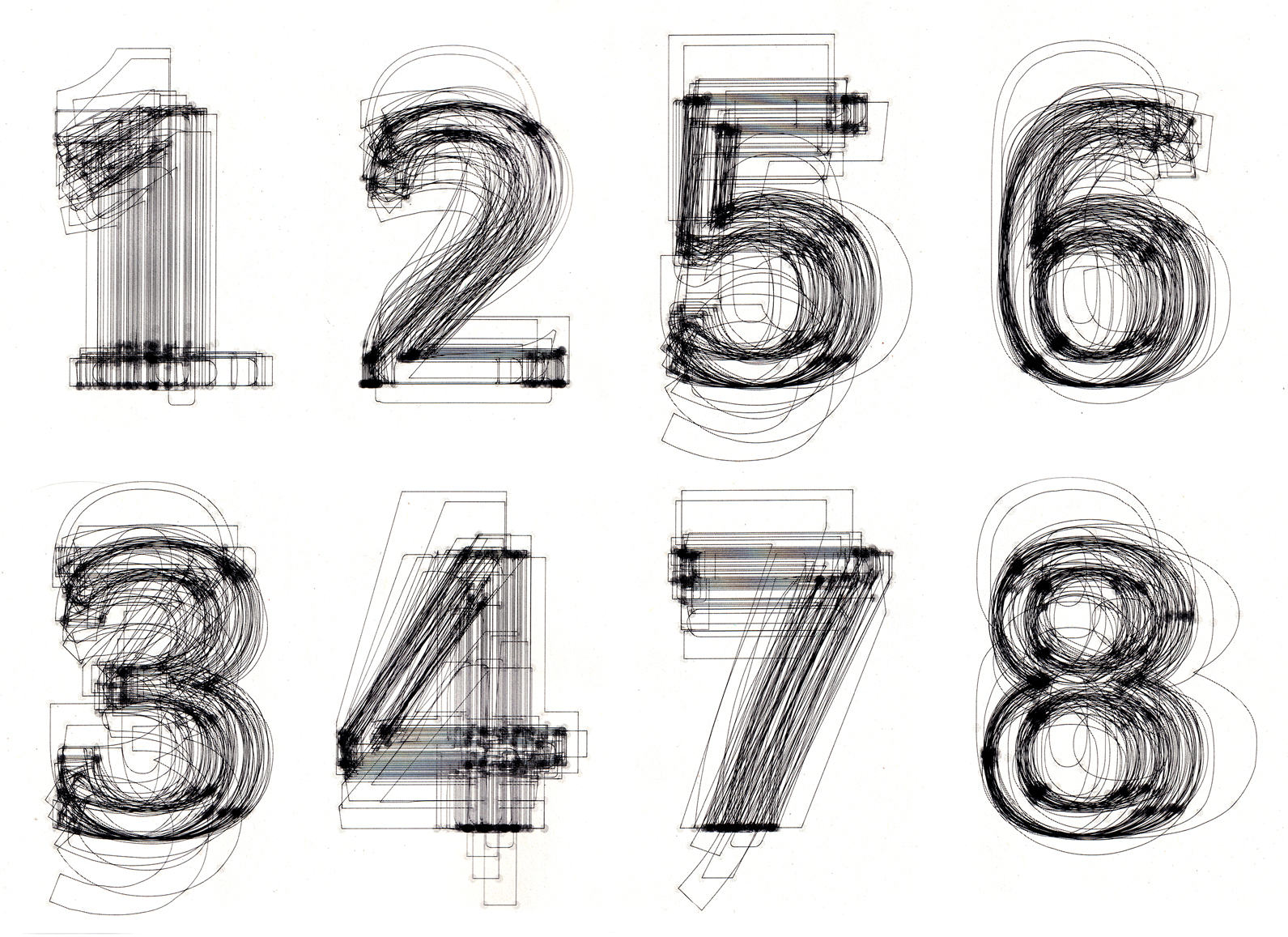
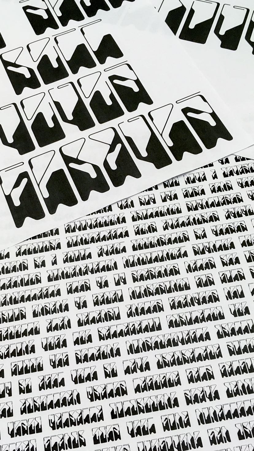
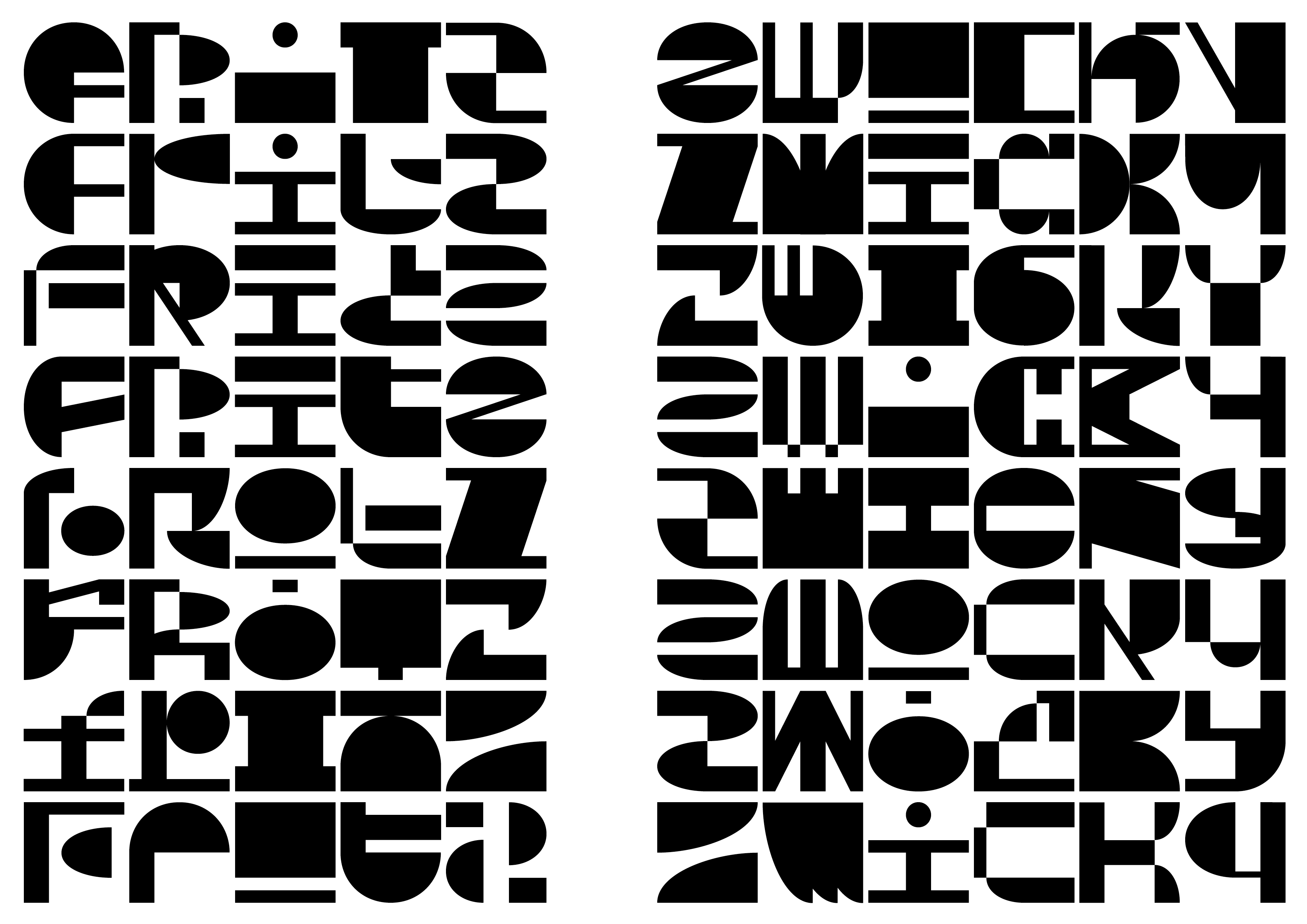
Zwicky
Instead of solutions for problems programs for solutions. Programming fonts has been elaborated in several ways in the history of type design. My project is a continuation of those projects that generate fonts from components. The project as well as the title was inspired by the morphological analysis of the swiss physicist Fritz Zwicky. With the help of processing I developed a program that adapts basic shapes to a multitude of letter skeletons. By stretching and compressing squares, circles, semicircle and quarter circle on an 8X8 grid according to the respective skeleton a multitude of shapes are generated. This resulted in countless different letters that are composed like molecules. This molecular composition of shapes produced a display font that randomly uses alternates as open-type features. The project initially started from a workshop and was later on continued as a semester project at ECAL supervised by Radim Peško.
img-107 Zwicky, Animation
img-108 Zwicky, Alternates
img-109 Zwicky, molecular compositions
img-110 Zwicky, molecular compositions
img-111 Zwicky, molecular compositions
img-112 Zwicky, molecular compositions
img-113 Zwicky, molecular compositions
img-114 Zwicky, molecular compositions
img-115 Zwicky, Alternates
img-116 Zwicky, Text
M
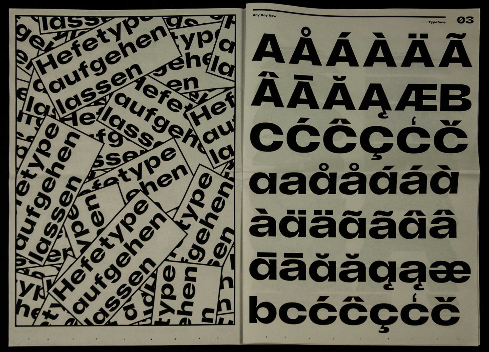
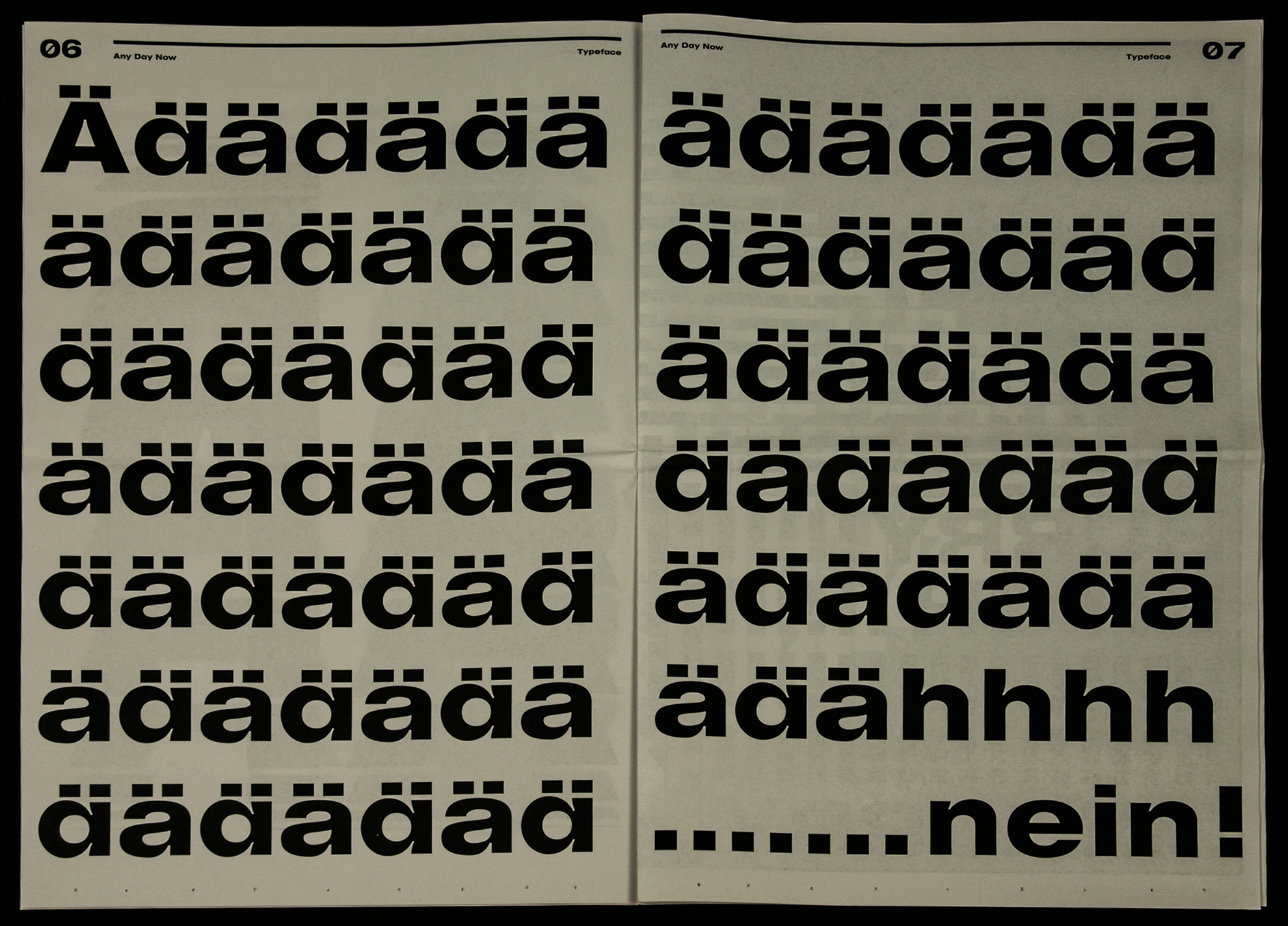
ADN
Any Day Now - sometimes projects stand still for a while. Free works often have the problem that they have to take a back seat to commercial works. The original idea and consequently its realization suffer from this. This process and the final result reflect a discourse of lack of time and waste of time. These opposites are more than ever omnipresent in today's society, due to the excess of distractions and creative impulses in social media. Recognizing procrastination and using it productively for one's own purposes by maturing and perfusing ideas while not working on them is a challenge that probably faces every designer. Using this positive perspective on procrastination is the theme of the design of an extended Grotesk typeface. This concept is reflected in the shape of the letters as well as in the application of the typeface in the specimen in newspaper form. The project was realized over a way too long time period which ended in 2019.
img-117 ADN, Closeup
img-118 ADN, Inside Spreads
img-119 ADN, Cover
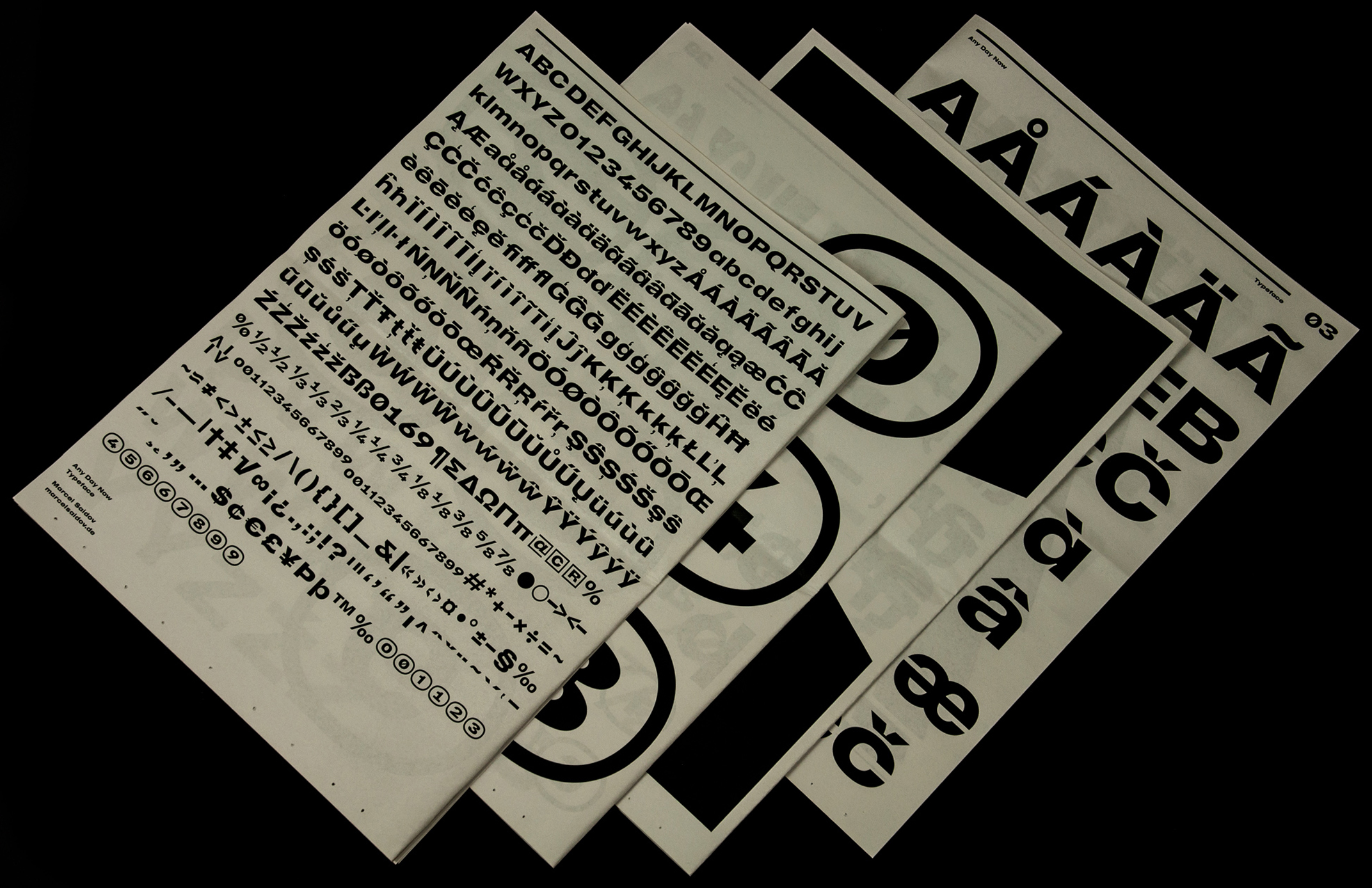
img-120 ADN, Overview
img-121 ADN, Inside Spread
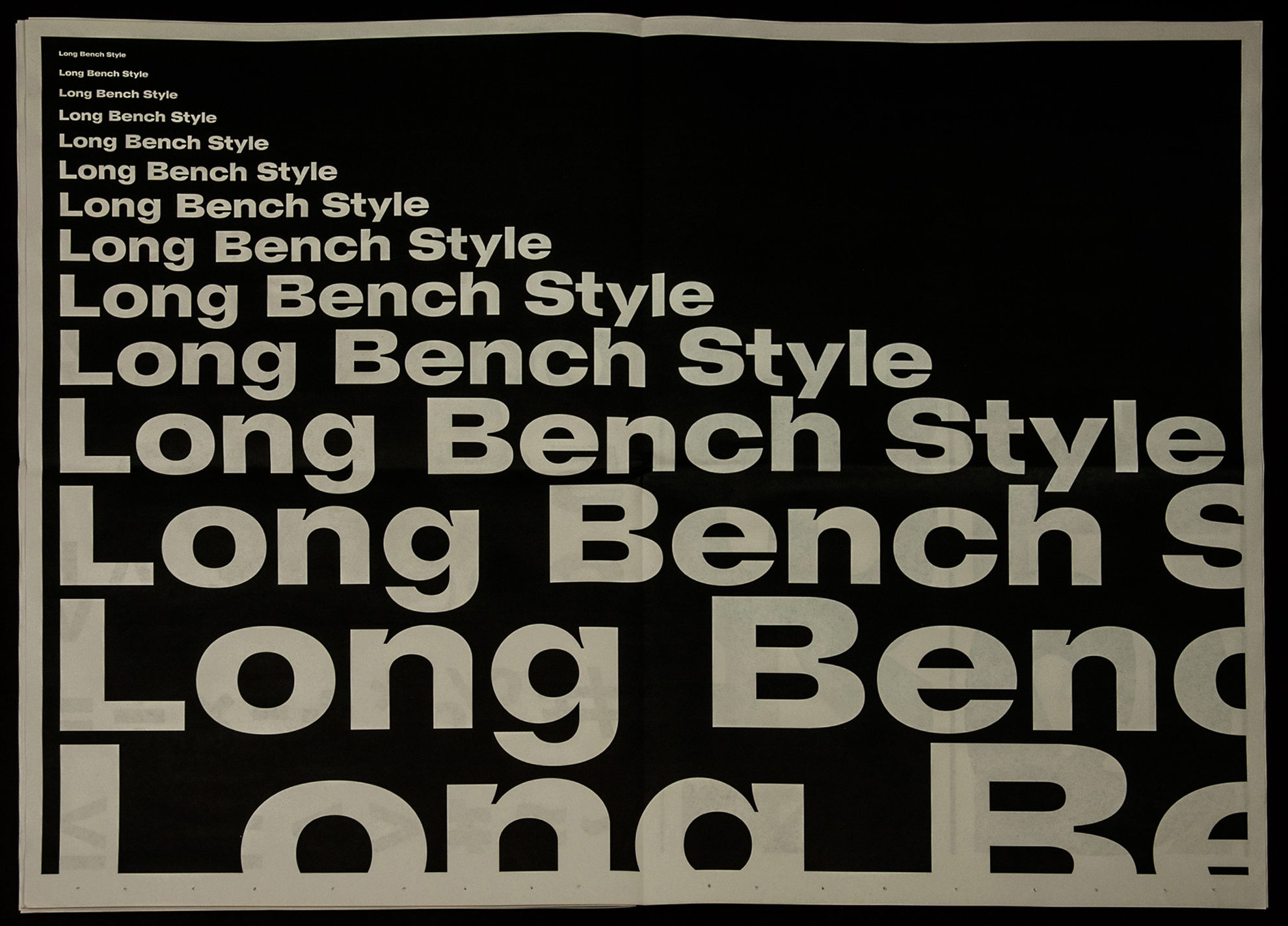
img-122 ADN, Inside Spread
img-123 ADN, Inside Spread
img-124 ADN, Closeup
Imprint
Archive